My project is based on the works of Lothar Quinte, whose most known work is featured on First Impressions of Earth by the Strokes. I decided to animate and apply what we’ve learned in class to his images. Throughout the project I kept updating the images with what we’ve learned in class. Quinte’s works are simple and vivid. The goal of my project was to alter this fundamental theme of his artwork. The most common concepts I incorporated were noise and dimension.
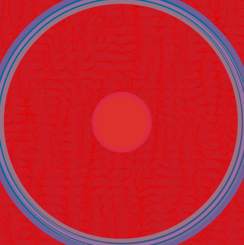
In Kreisformation in Rot auf Violettem Grund (Circular Formation in Red on Violet Ground,1965), I added noise to the circle so that the size would change. In order to make it look like the circle is moving in and out of itself I incremented x2 and y2 by y. At first it was just something I had tried out in another sketch; however the result of a circle struggling to maintain a size was something that I wanted to include. I added dimension to the background to create a sort of texture. I wanted the end image to look like a record button since my project is based on an album. This is the sketch a featured at the top of this post.
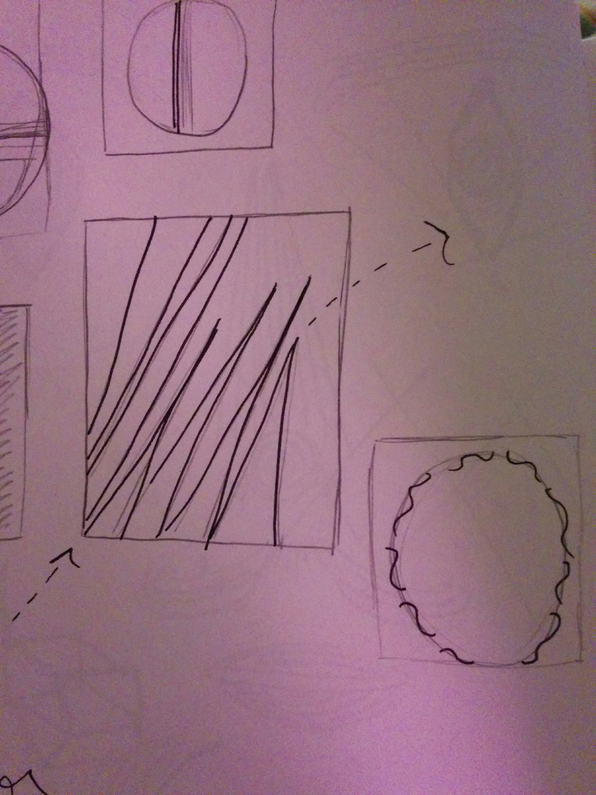
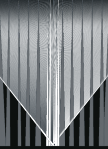
In Untitled (1965), the artwork featured on First Impressions of Earth, I played around with incrementing the diagonal lines into a swinging motion and reset the framecount. I added dimension to this image as well to create a textured background. The one part I found difficult was to fix was how slow the lines swing. I wanted it to be more of gradual pace but once I added dimension it moved much slower than the original sketch.
In Quinte’s Untitled (1969) and played around with incrementing again – the end result created a textured background when two of the triangles swing down.

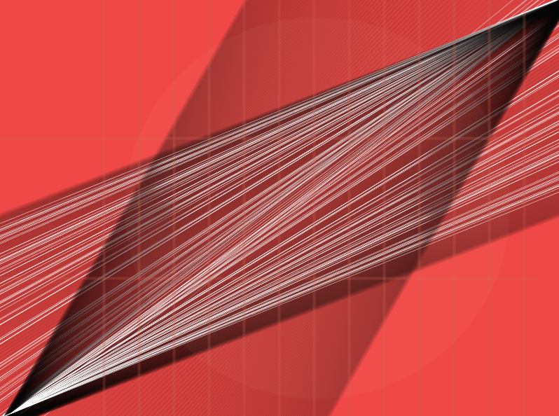
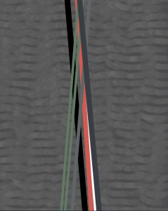
In Ohne Titel (also “Untitled”), I used alpha and noise to exchange the singular diagonal lines in the original for multiple lines extended to the corners of the canvas. Furthermore, to add a subtlety, I included an animated ellipse at the background of the image. In the original image there is lighter red spot on the right side of the image. To reflect this in my sketch I used alpha and animated the ellipse to move back and forth throughout the canvas.
Finally, in Blue Fields, III I tried to maintain Quinte’s simplicity in it’s entirety other than moving around the boxes and adding a repeat count.
It was a lot of fun adding the things we learned in class to this sketches. I was particularly surprised by how easy it was to add dimension into a sketch. I really love the way it adds a texture – especially one that is almost feathery and light. It was challenging to figure out how to adapt Quinte’s paintings and retain his style. As a new coder that is still learning about Processing, I was interested in chaotic, complicated sketches that contain a lot of detail. With Quinte’s work I had to try to be more subtle about it because I didn’t want to estrange myself from his simplicity. I don’t think that I’ll ever be truly done with this project – just like Quinte was never finished with his series of untitled images.