I will be making 10 animated gifs that will be focusing on color, line, and viewer perception. I want to manipulate viewer perception by creating movement/moire effects and producing an interference of colors.
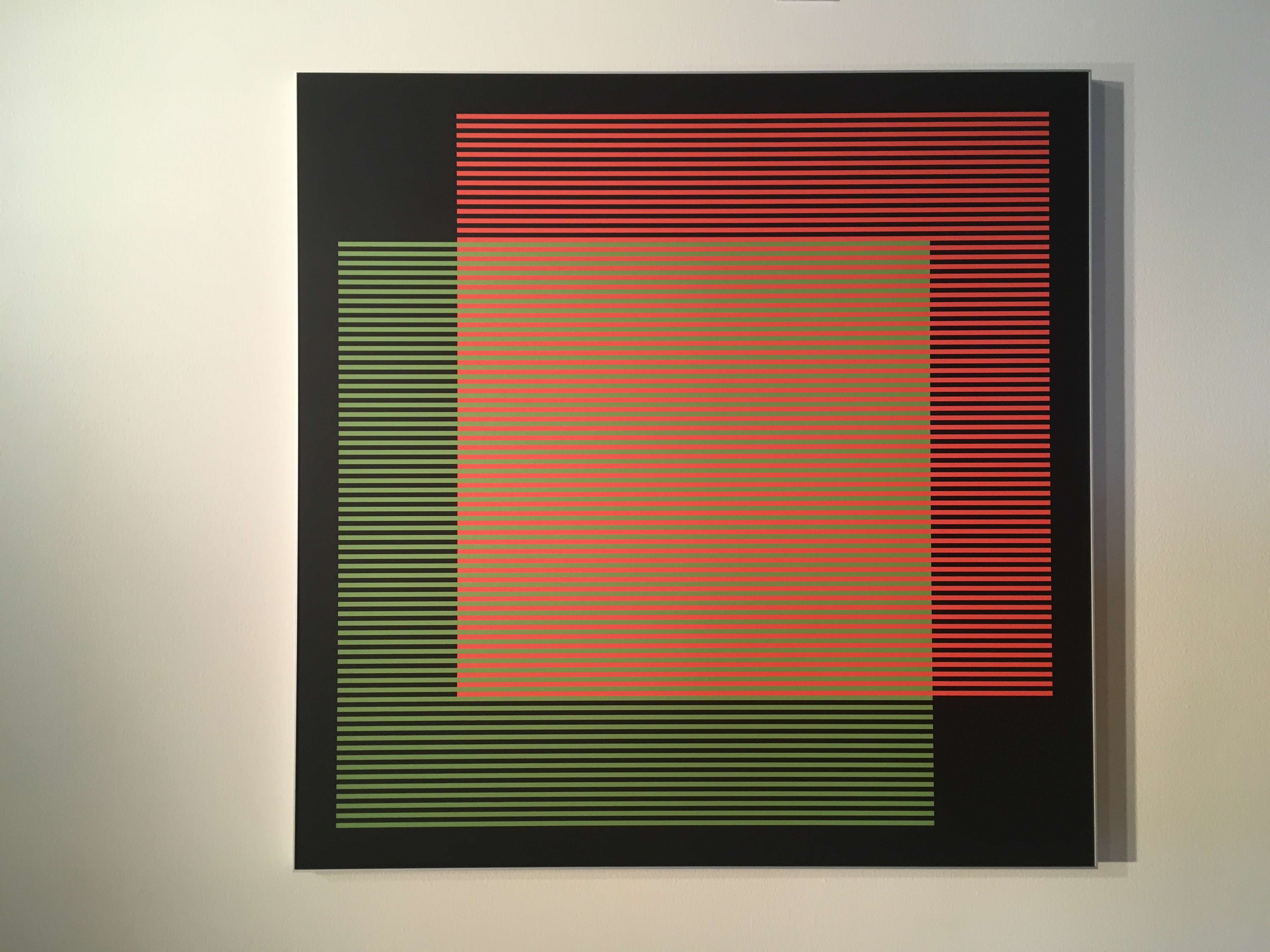
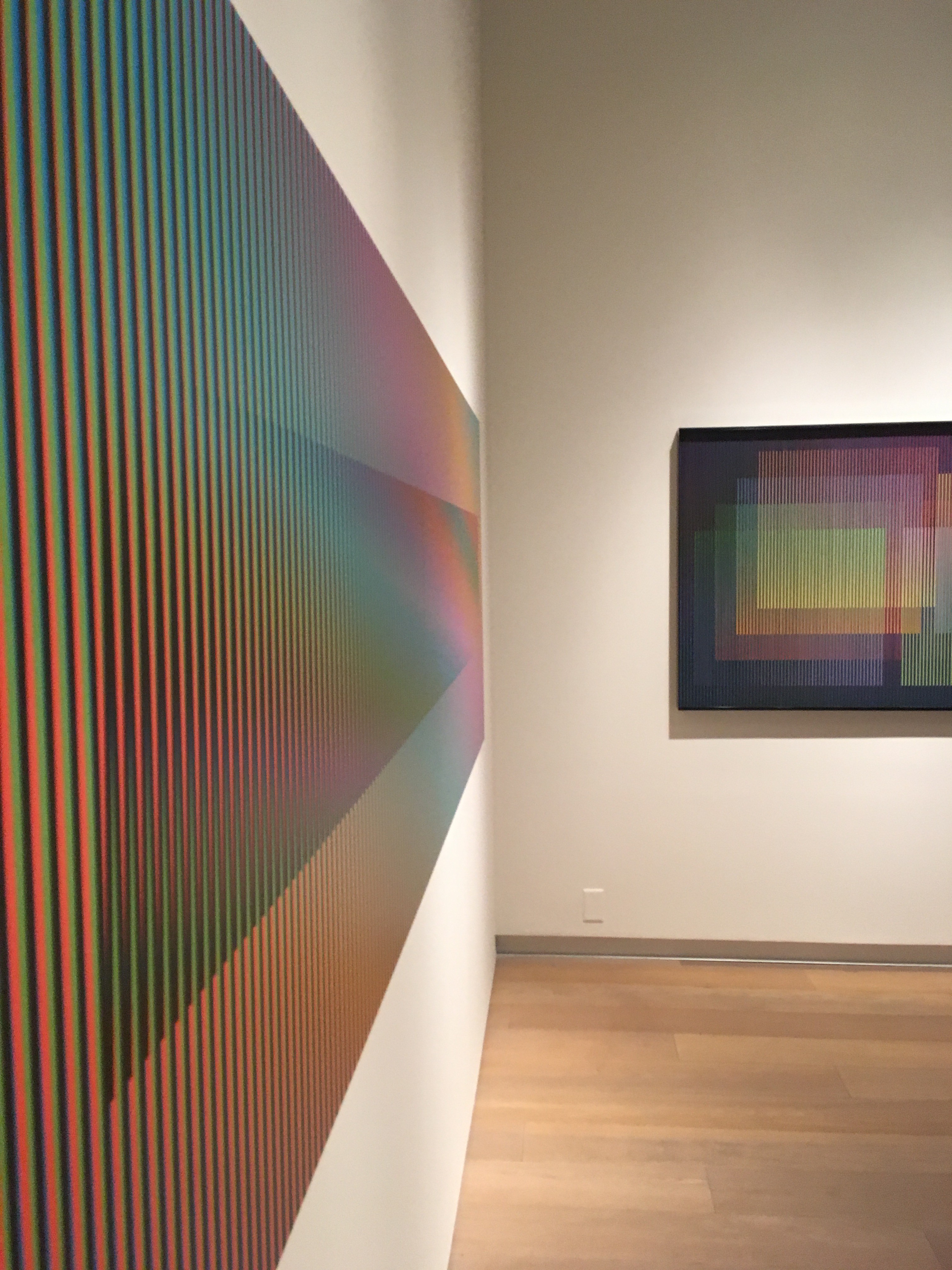
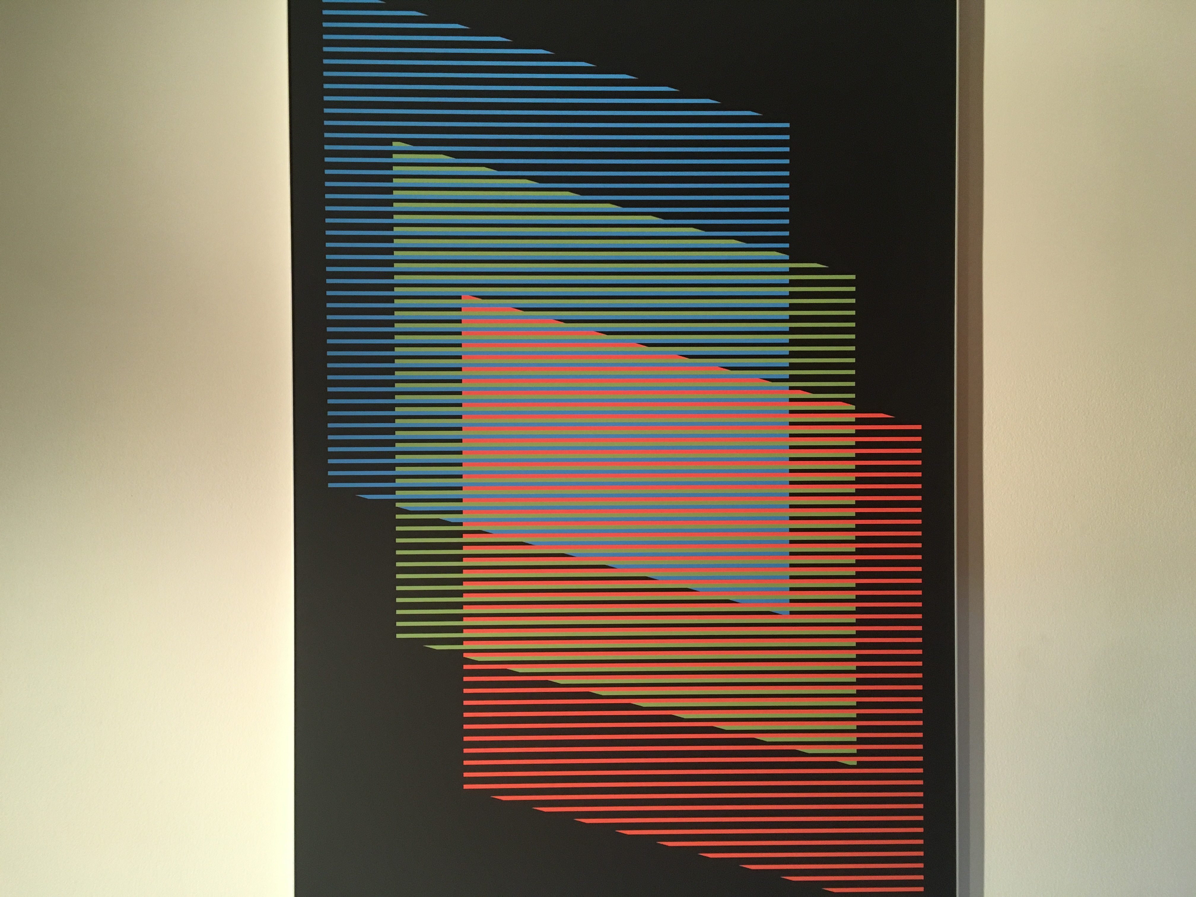
During a trip to Savannah, GA I went to the Savannah College of Art and Design Museum (SCAD Museum). It was there I saw an exhibition of Carlos Cruz-Diez’s work and learned about what he calls, “chromointerference”. He places colors side by side and their unique wavelengths add up to a new color, a color that isn’t actually there but only a perception of the eye due to interference and light. I’ve always been fascinated by optical illusions and graphic art. Most of my work is in neutrals, or black and white. I was very inspired by the use of color in Cruz-Diez’s work and want to implement more color into my work as well. Carlos Cruz-Diez worked as a graphic designer and taught graphic design for many years and was inspired by other op artists and studied the work of Georges Seurat and Josef Albers. Josef Alber’s wife Anni Albers was a great textile artist and printmaker and produced patterns with optical illusion effects, like in her Second Movement II.
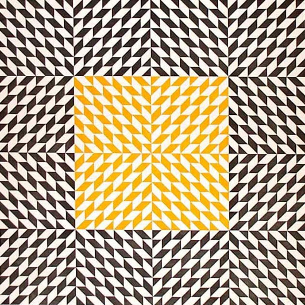
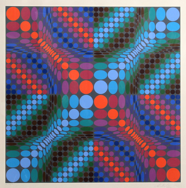
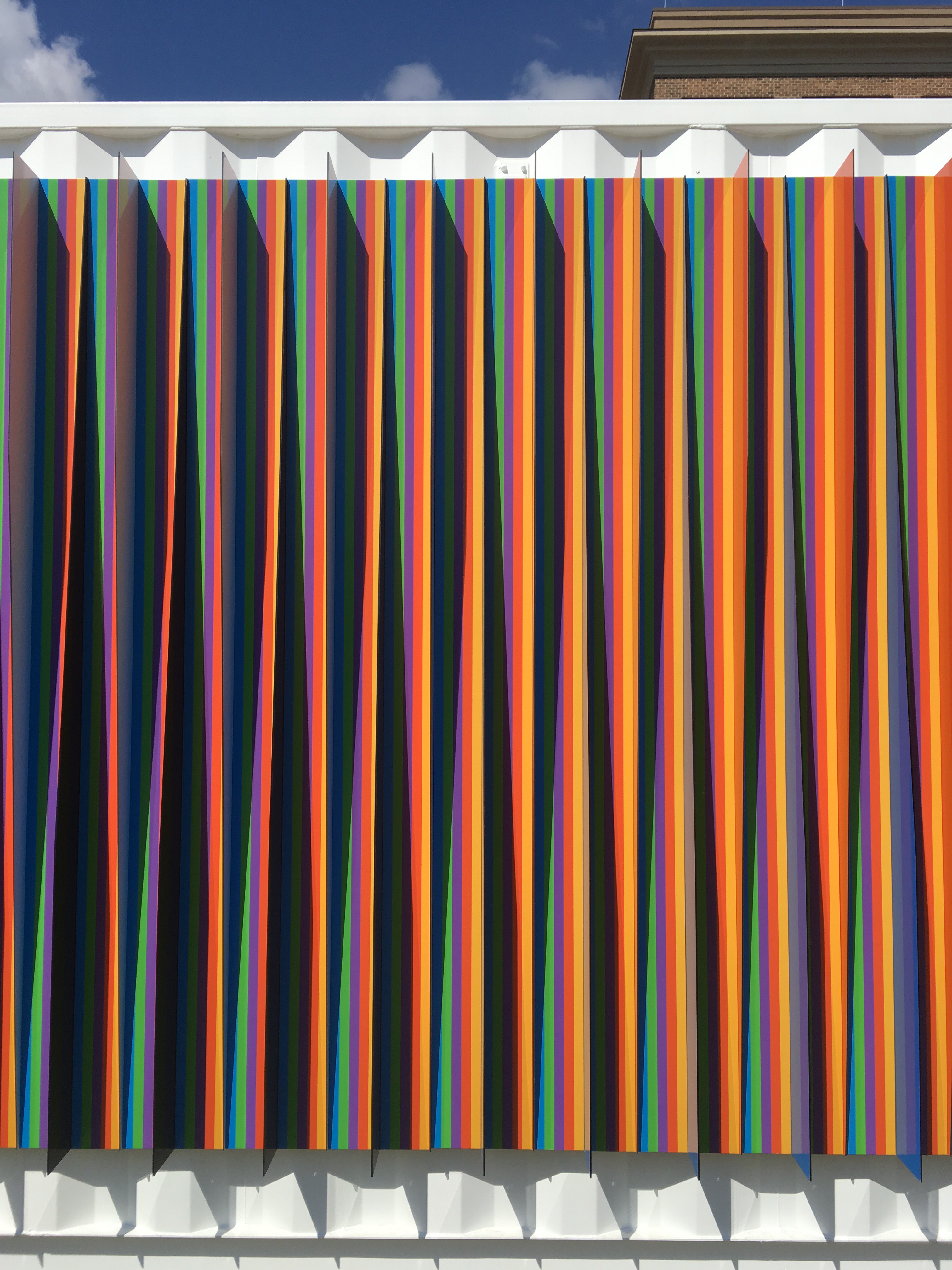
Victor Vasarely has also been an inspiration for me during the course. I’m especially fond of his Delocta serigraph.
Graphically moire effects speak to me because they produce a sense of movement and sensation that isn’t actually present. As your eye moves across Second Movement II some tiles seem to recede and others move to the forefront. Also, there is a wave sensation that makes me quite uneasy, which to me, tells me her effect works! I too want to create a sense of uneasiness and motion like Anni Albers and Carlos Cruz-Diez. For me, I will be working more with lines though as opposed to primarily geometric shapes.
My previous work and practice with chromointerference have informed me that the movement produced by moire helps to enhance the interference. With gifs, at least the ones I create, the movement is very fast paced. It’s very easy to perceive things being there when they aren’t actually. It’s only until you really take your time and study something that the truth reveals itself. By interchanging lines of orange and cobalt blue, if small enough or far away enough in distance, the eye will perceive the color as pink. By interchanging lines of green and cobalt blue, under the same terms, the eye will perceive the color as turquoise or a light blue. I want to further explore this interaction in my conference work and also try and produce new interferences.
My previous work in creating rhythms in tile and patternmaking has been “regular”. I hope that working to produce a moire effect will take me out of the regular rhythm. With this project there is so much that can be done outside of the geometric scope that I’m used to so I will try to also broaden my choice of rhythms.
My first plan of action is to work on the colors and their interferences. I will use at least three colors in each gif and each gif will have different predominant colors. The world is my oyster here, so to speak, so in Photoshop I will be experimenting with different interferences. Only until I come up with enough different ones I will start designing my gifs. I like to sketch first before going right to creating in the software. So I will come up with different effects I want. Perhaps one will be more wave-like, another jump out at you, one appear to get smaller etc. By studying the work of op artist like Victor Vasarely, Bridget Riley, Josef Albers, as well as Anni Albers, and Carlos Cruz-Diez most prominently, I hope to not only be inspired by what different visual perceptions can be created but also create my own.
I think my work as a whole will be very striking. I understand that Op Art is not everyone’s cup of tea, but I hope that by using more color in my work it will resonate more with a wider audience. I personally think that the use of moire effects, as well as, chromointerfernce will create a double visual effect that will be a little more different than what most people might see or think of as Op Art. This conference work will make me a better graphic designer, not only due to the graphic quality of the work but also due to the use of color that I’m not accustomed to and the emphasis of trying to work a little bit more abstractly. I think at least the chromointerference will encourage curiosity. That’s exactly what I like to do. I like to make work that makes the viewer ask “how?” as well as question the the work and themselves. I’m not afraid or upset when someone might say, “What exactly is going on here?!”.