My slow-going conference project came together with a rather quick and late-arriving jolt of inspiration. While working on a separate project based on mid-20th Century Italian design, it occurred to me that the streamlined simplicity of a modern Italian aesthetic could be serviceable (and feasible) to my conference project. I began referencing old Olivetti typewriter ads which had long captured my attention. Playful and colorful and yet almost bitingly muted and subdued, I felt that these ads could form aesthetic guidelines that would at once allow for the necessary looseness and experimentation of an AfterEffects Animation project, while establishing firm chromatic, textural, and shape-based motifs.
Out of this line of thinking I created three animations: two strictly shape motions and the last a kinetic text accompanying an Italian language song by Brazilian electronic artist Emmanuelle. The latter plays most interpretively with the Olivetti inspiration but maintains a cohesive color scheme while juxtaposing fluid and dynamic motions against industrial-feeling rigidity. The first animation largely came together as it went, while I imposed upon the second a measured and languid decorative function.
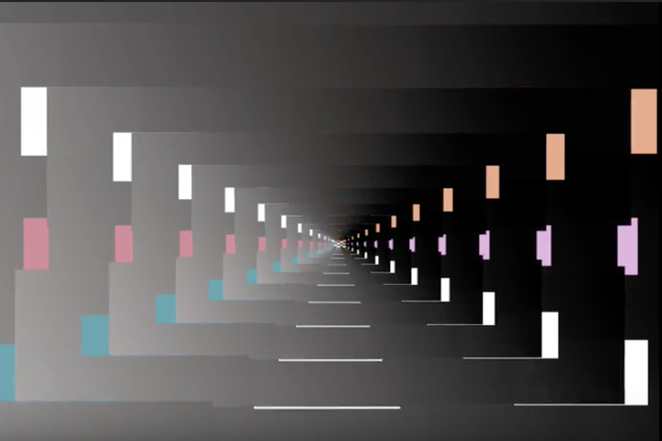
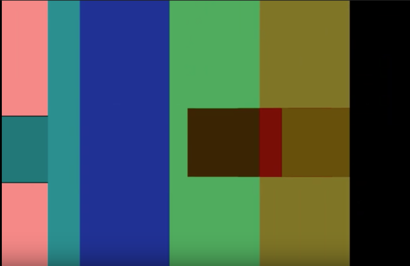
Many Olivetti ads interprete simple, rectangular shapes in dynamic and vibrantly colored ways. For this first animation, I decided to limit myself (at least initially) to rectangles and squares of a simple color palette. Experimenting with duplicated layers and overlay effects, I managed to create shapes whose colors changed or inverted as I made them interact. The effect initially produced by this was, to my mind, one of negative film moving across a page of color swatches. From here I used repeaters to create a sort of hall-of-mirrors which continually reshaped itself and morphed into something new, including a gradient-filled spiral reminiscent of art-deco and futurist themes.
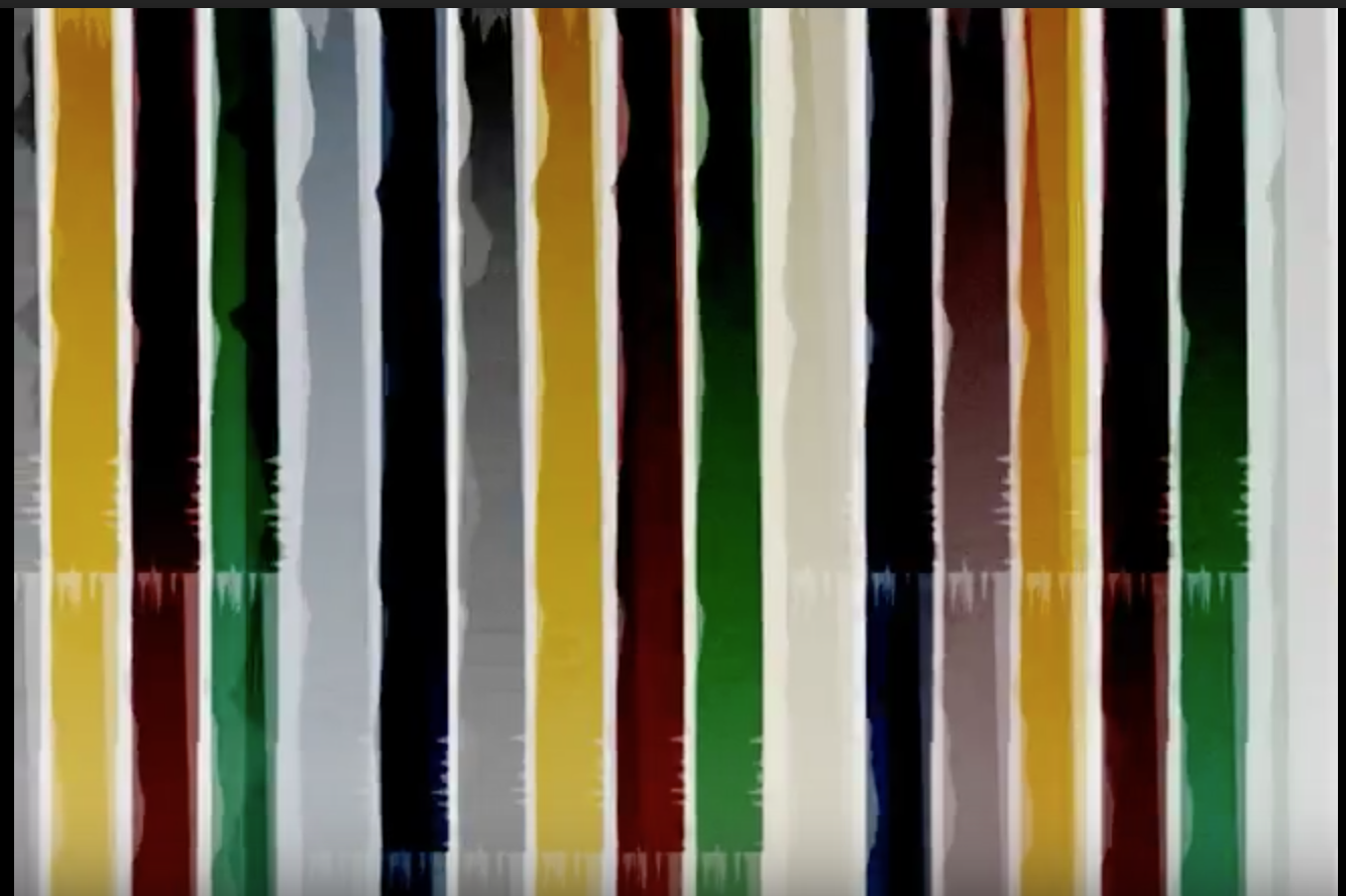
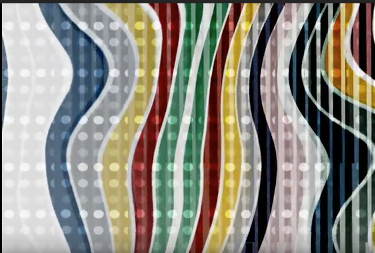
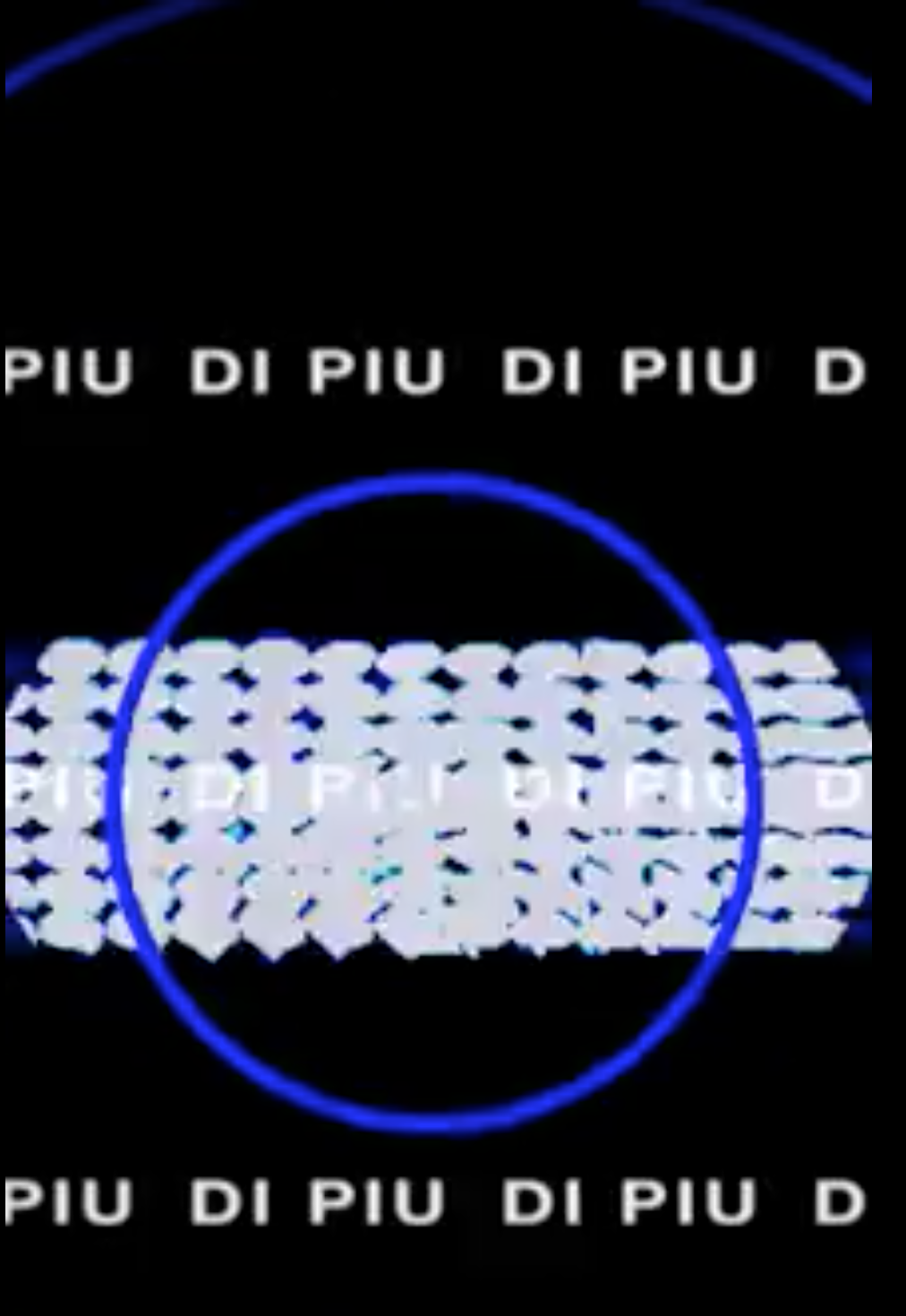
For my second animation I once again limited myself to simple shapes, but this time actually went in and isolated my color palette from a specific ad. I utilized many of the same effects (such as variations of overlay settings), while moving the shapes over one another. Later I employed a distortion effect (featured in the top image) which gives the impression of the shapes being slowly melted down. Above those shapes I placed a wall of circular shapes with oscillating opacity, which to me recall the glistening effect of sequins or a beaded curtain. I was very pleased with the elegance of this animation, and regard at as my first in which I felt I was able to execute a vision, rather than having the work define itself as I went along.
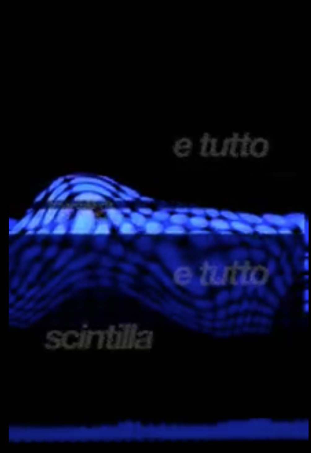
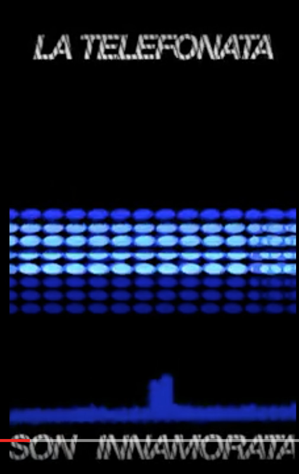
I have to say that I was most pleased with the final animation, which was sequenced with an audio track. While it still has some choppy bits in it, I think that I succeeded in evoking a particular mood and managed to rein in the dynamism of the text-effects (I feel that failure to do so often renders the fact of its being produced in AfterEffects too obvious). I once again used my “sequined,” circular repeater pattern, gradually overlaying it with a transparent, distorted layer which gives an effect of a mesh fabric floating in water. The color scheme is decidedly aquatic— a no brainer, considering the song’s chorus features the lyric “è tutto blu (it’s all blue)” I intended to create a dark, trippy atmosphere which crescendoed, culminating ultimately in the arrival of the chorus. At that point I made use of the strobe effect and a duplicate overlay to create an impactful lyric text repetition. I especially enjoyed syncing the piece to audio, as I felt that the rhythm and melody gave me a direction and structure for the motions. This allowed me to create an animation which felt less scattered and haphazard and instead proceeded with a degree of logic.
Throughout the development in this project there were certainly issues of time management, lack of inspiration, lack of control, and insecurity. I at first felt that my skills in AfterEffects were too remedial to follow any concept or narrative. The tool at times has seemed insurmountable; the more complex a piece becomes, the harder it is to stay in control. At times I would find myself making adjustments at the end of the piece that would completely change the beginning of it, but lost among layers upon layers of adjustments the problem would become difficult to diagnose. As I continued it felt like a game of Jenga— wondering which small modification would cause the piece to topple.
I am, however, proud of the progress I’ve made with the tool in a short span of time. I still find the process to be maddeningly time consuming, but I at least now feel confident in my ability to make something that’s visually beautiful and enticing. There is a lot of tension in conceptualizing work for this program: to what extent do we hold to our ideas and visions, and to what extent do we release it to a fundamentally experimental process? I don’t have an answer, but what I do believe is that we must both grapple with this tool and release ourselves to the creative possibilities of frustration.
