
When we first started making animated GIFs in Photoshop, I had no idea what direction I wanted to take mine, but I was excited by the possibility of depicting a short and whimsical narrative, as well as playing with color. This GIF, which I’ve come to refer to as “starbirth,” was an experimentation with both of those concepts. It tells the story of a star that falls through the dark blue sky and out of sight, where it crashes to the ground of a planet. The crash knocks up star debris which billows in bright green and rainbow clouds and then shoots up into the sky, lighting it up with the birth of new stars. I had never made any animated art before, so making this forced me to consider color’s relationship with an evolving narrative.
When the star fell, it was a semi-transparent bright green with a lavender shadow against the dark blue background which made the whole “sky” appear dimly lit. After the star disappeared, I used the same shade of bright green, but now at full opacity, to build the elements of the aftermath, and the story ends once the whole sky changes to that shade of bright green. I found the juxtaposition between the dark and the bright to be visually appealing and support the narrative, especially at the end when the bright green takes over the sky, signifying the brightness of the new birth and contrasting the dimness of the first set of frames. Most of the frames for this GIF were drawn using the paintbrush tool, but the stars were made using a brush I had created during one of our first lessons in Photoshop. Since the star shape was rough and sketchy looking, I felt that it paired well with the casual hand drawings and made the whole GIF kind of abstract and whimsical, like something from a child’s imagination. One struggle with this one was the hand-drawn illustrations though, because I had initially wanted them to be much neater, and found it difficult to draw using a laptop and the paintbrush tool. In the end however, I grew to like the imperfections in the way it is drawn, and am happy with it as a first exploration in GIF-making.
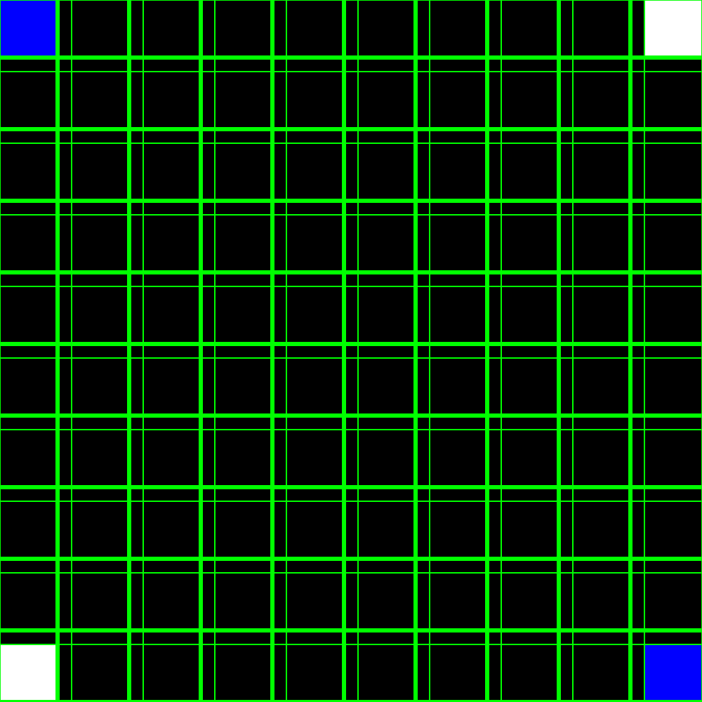
As I continued my exploration with GIF-making, I considered ways to work around my problem of illustrating with a computer mouse, and decided I would try different styles that involved more shapes and premade graphics. I began creating lines and playing with how I could animate them. When I was trying to space them evenly, I discovered the grid lines and the ability to snap graphics to these grid lines. This sparked the idea of making a gridded pattern and having shapes pass up and down through the grid. So I created a black background with green gridlines and filled in the corner boxes with blue and white, creating squares that I would move diagonally toward the center, and then back. Inspired by the theme of the class, “club visuals,” I flipped the grid colors in every frame, to create a strobelike effect. I found it really satisfying to make a GIF that appealed to the digital nature of this form of art-making. This GIF also seems like one that I could expand on if I want my work to go in that direction. Part of its appeal is the flashing effect it creates, which makes it almost difficult to look at, and creates subtle color effects as a result of the rapidly changing colors. I could build a series of these GIFs that grow in complexity through modifications to the color palette, grid, and motion of squares, creating different visual effects that affect the way the viewer perceives them.
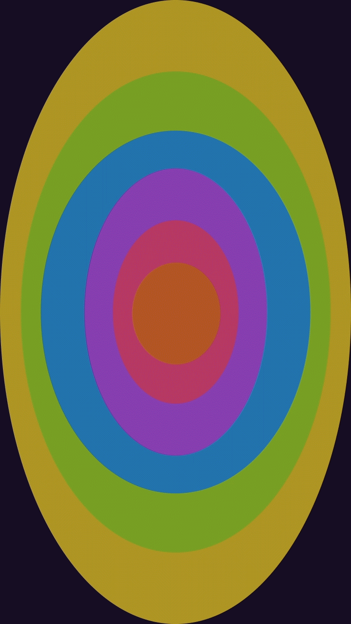
This GIF could be considered a product of all my experimentations in digital art thus far. Previously, the GIFs I made were building on my skills in Photoshop, but this one came later, after we had begun working in After Effects. As I produced more digital art, an interest in color and the way it can affect perception emerged. When we started with After Effects, we had an assignment to use the LoopOut(); command. In class, we had used it in conjunction with motion paths, to make the motions repeat themselves. I took in interest in applying this to color. Inspired by the work of http://flrngif.tumblr.com/ as well as psychedelic posters designed by Victor Moscoso in the 60s and 70s,I picked a rainbow color palette and assigned each oval a color. Then I created keyframes where the colors would change to the next color in the rainbow order, and applied the LoopOut(“pingpong”); command so that the ovals cycled through the rainbow palette and then cycle back for the duration of the movie.
Since the assignment was dealing with motion paths and not color, and also because I wanted to add some more interest, I decided to add some bright yellow stars that would meander from the top of the frame to the bottom as the colors went through their cycle. This was challenging because it was difficult to design the motion paths exactly how I envisioned them in my mind. My goal was to make them whimsical and floaty, but their motion ended up much more quirky than I had intended. When it was finished, it was just existing as an After Effects movie, so when I decided to turn it into a GIF, I dragged it into Photoshop and saved it using Photoshop’s GIF format. While it seems less complex than all the others, this GIF ties together a lot of the skills I have developed in both Photoshop and After Effects, and is starting to solidify the direction that I am going to take my future digital art.


