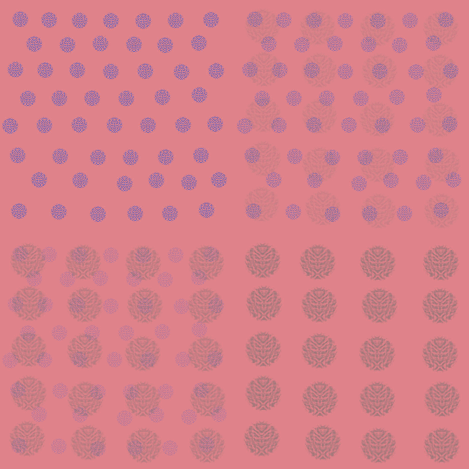
I had nothing more than a few hours’ worth of Photoshop experience at the beginning of this course. Since creating an animated GIF was one of the first assignments, I had to spend a large chunk of time learning the software, becoming frustrated, and then attempting to learn it again. I am a complete perfectionist, but one thing that art assignments continue to force me to is to let go of my perfectionist nature and to instead explore what the software allows me to create. While making these GIFS, I found a few different brushes that I really liked, ones that if I enlarged, created patterns almost a stamp. This is how I created the Polka Dot GIF. For the Purple & Orange GIF, I used a wallpaper and tile that I made for previous assignments. The wallpaper began with a drawing. My sole goal with this drawing was to practice using the brush tool, but my professor advised me to select one piece of the drawing and create a wallpaper with it. I used this piece to create a pattern overlay which became a wallpaper. I wasn’t a huge fan of this piece of the drawing originally, but I love it when it’s smaller and repeated like it is in the wallpaper and GIF.
I really did not have a plan for this project. I had a ‘just get it done’ mentality, which probably wasn’t the best thing, but now that I have more experience with the software and am caught up to the level of the rest of my class, I can spend more time with the details of my art. I can create pieces and then go back and revise them, but I think it took just completing a few assignments for me to be able to get to that place. My art-process for this class has been less planned out, which is completely out of my comfort zone, but I’ve learned that it works better for me to have maybe a slight idea of what I want my piece to look like, but then to be flexible and see what I can create digitally. It doesn’t always exactly match my vision but usually, I like the end-product better anyway.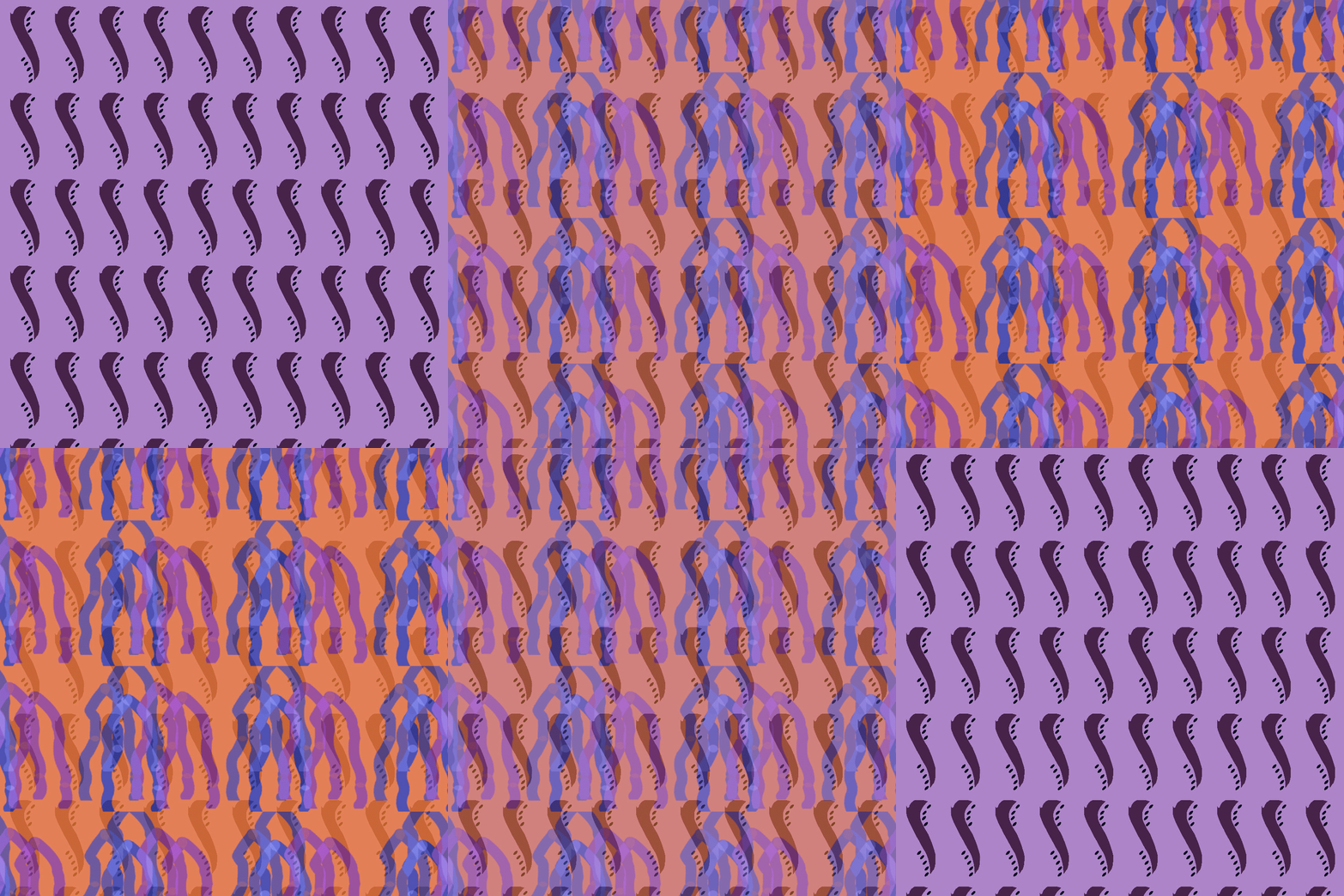
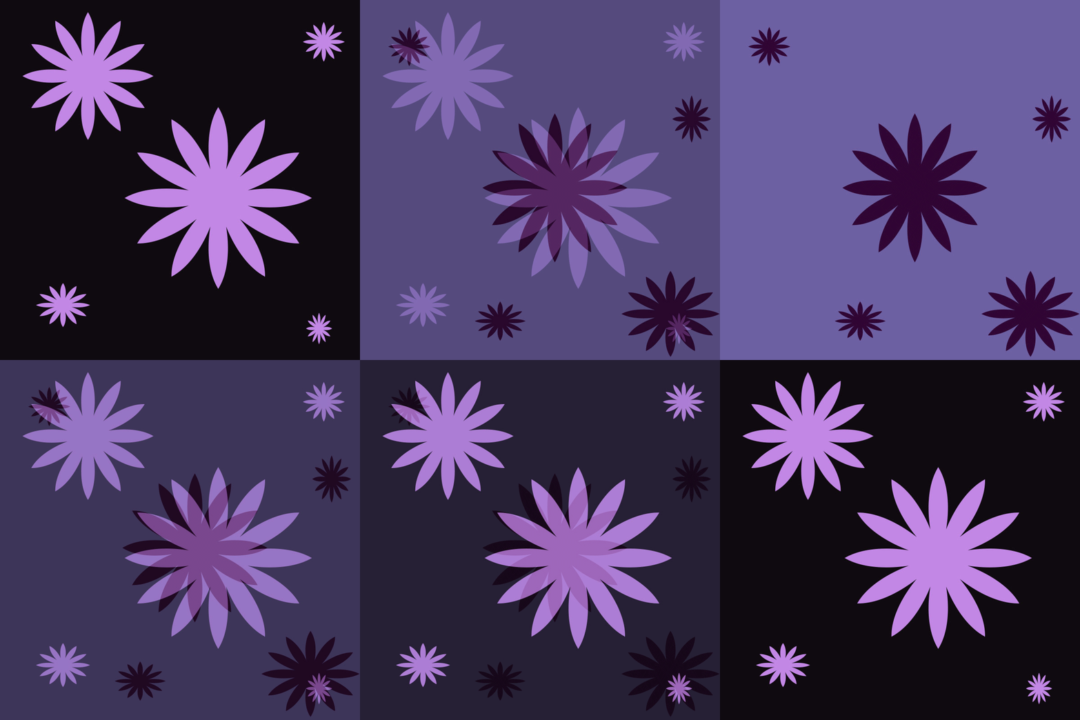
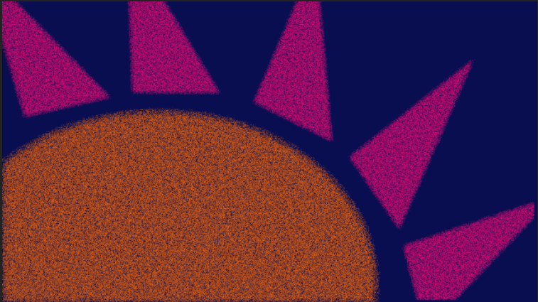
Another part of my process was trial and error. I had to spend time just playing and experimenting in Photoshop and I had to learn what patterns and colors appealed to my eye. I prefer GIFs that don’t have too sharp of a contrast in color or pattern, which I learned by making a GIF that I absolutely hate. One layer of this GIF is blue & orange and the other is a layer from the Polka Dot GIF. The combination of a drawing that doesn’t appeal to me, two vastly different patterns/designs, and a completely different set of colors made this GIF one of my least favorites. On the other hand, I’m proudest of the salmon background GIF and the Flower GIF because the colors change slightly, while the pattern remains very similar. Through making the Polka Dot GIF, I also realized that I often like images that are symmetrical and have a sense of order to them.
