My collection assignment of three things – five instances are shown below:
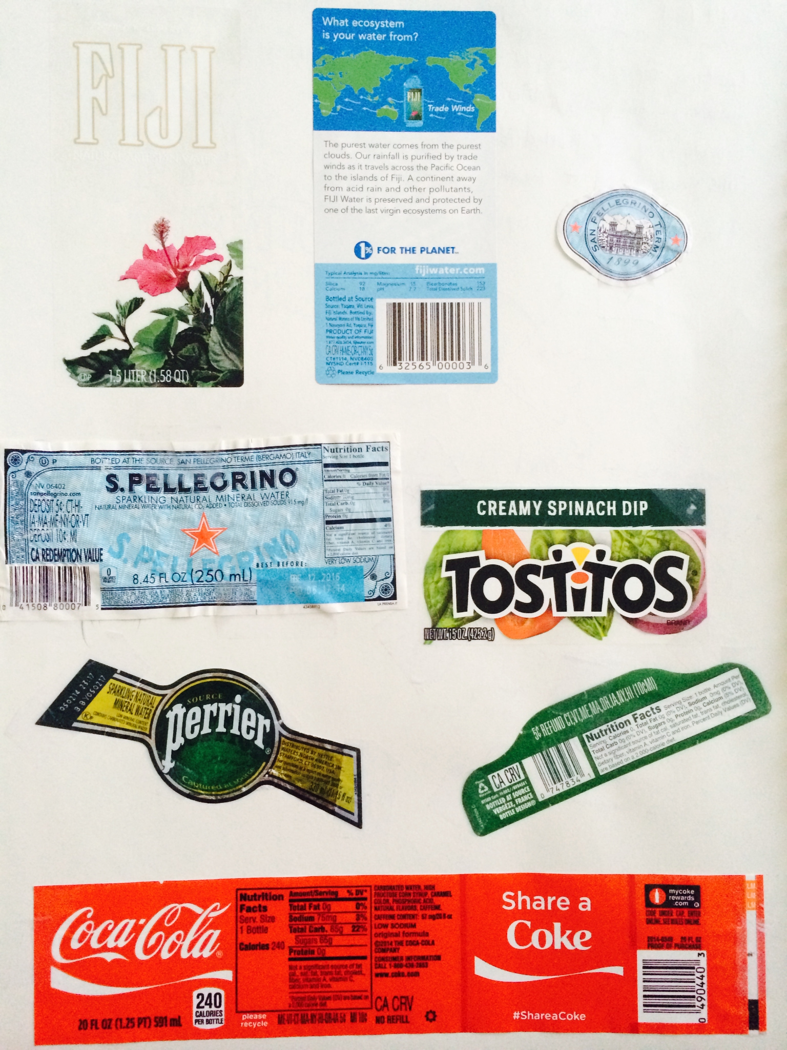
My first collection is wrapping paper on food or drinks bottles, which contains FIGI, S.PELLEORINO, TOSTITOS, PERRIER, and Coca Cola. For me, the significant about this collection is that I have the habit of taking a glance of the Nutrition Facts Column. Most of the brands choose to make their logos more fancy by choosing more dramatic fonts to attract customers. Nevertheless, the texts on the Nutrition Facts Column are always simpler so that they are easy to read. It is a revelation of the importance of typology in advertisement.
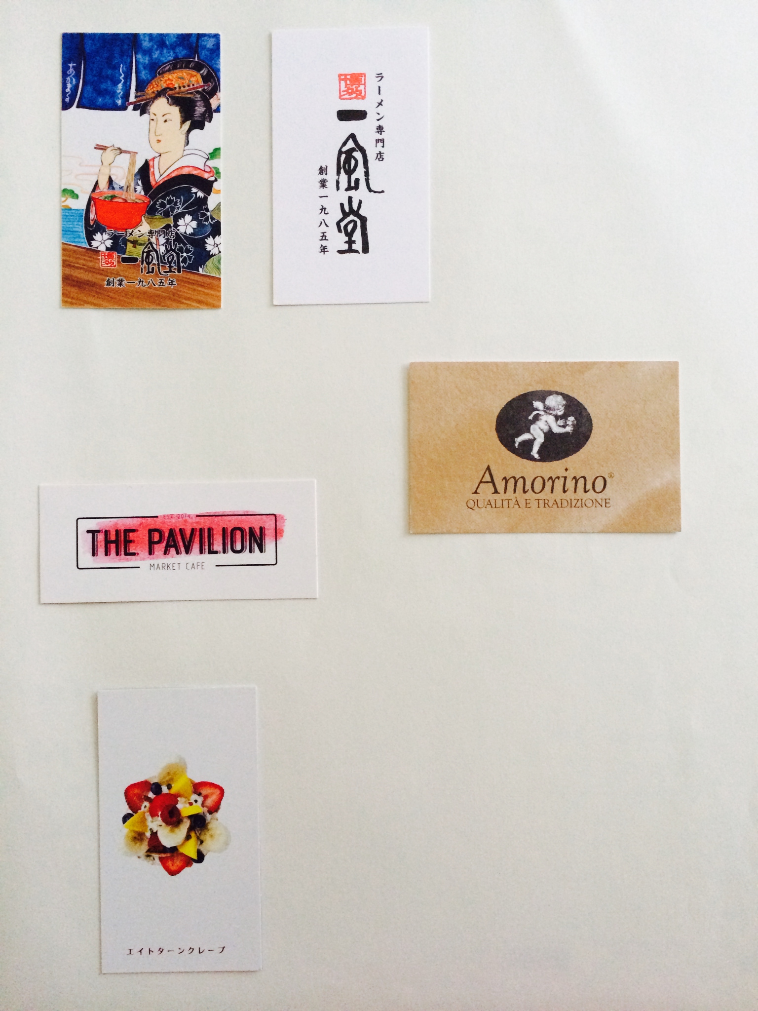
My Second collection is cards of restaurants or pastry stores in NYC. I always take a card of a place when I enjoy the food or atmosphere of that place. These five instances attract me with their designs. Take an example of eight turn crêpe. The design is set vertically with a photo of the crêpe taken from straight above. The crêpe looks like a flower. The color of red, yellow, blue, and white works great to brings out customers’ appetites.
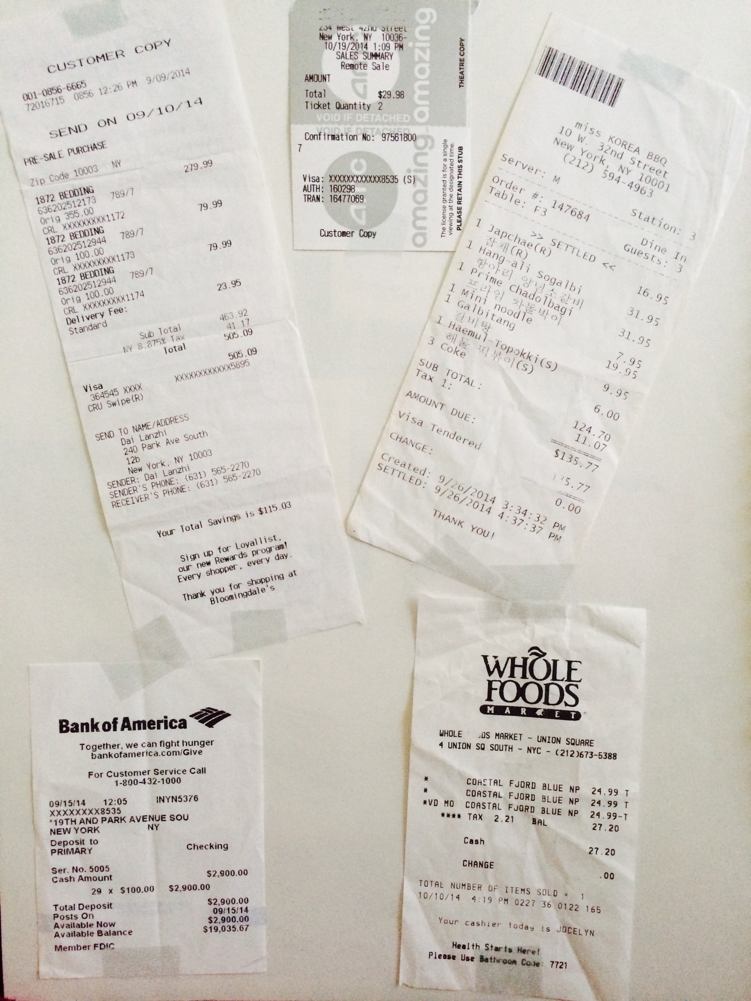
And finally, my third collection is invoices. This collection is a representation of my daily routine. I take tracks of my expense to manage my personal finance. These invoices are always a way for me to recollect my memory of the day. You don’t know the fun of it until you try to do so ;P


