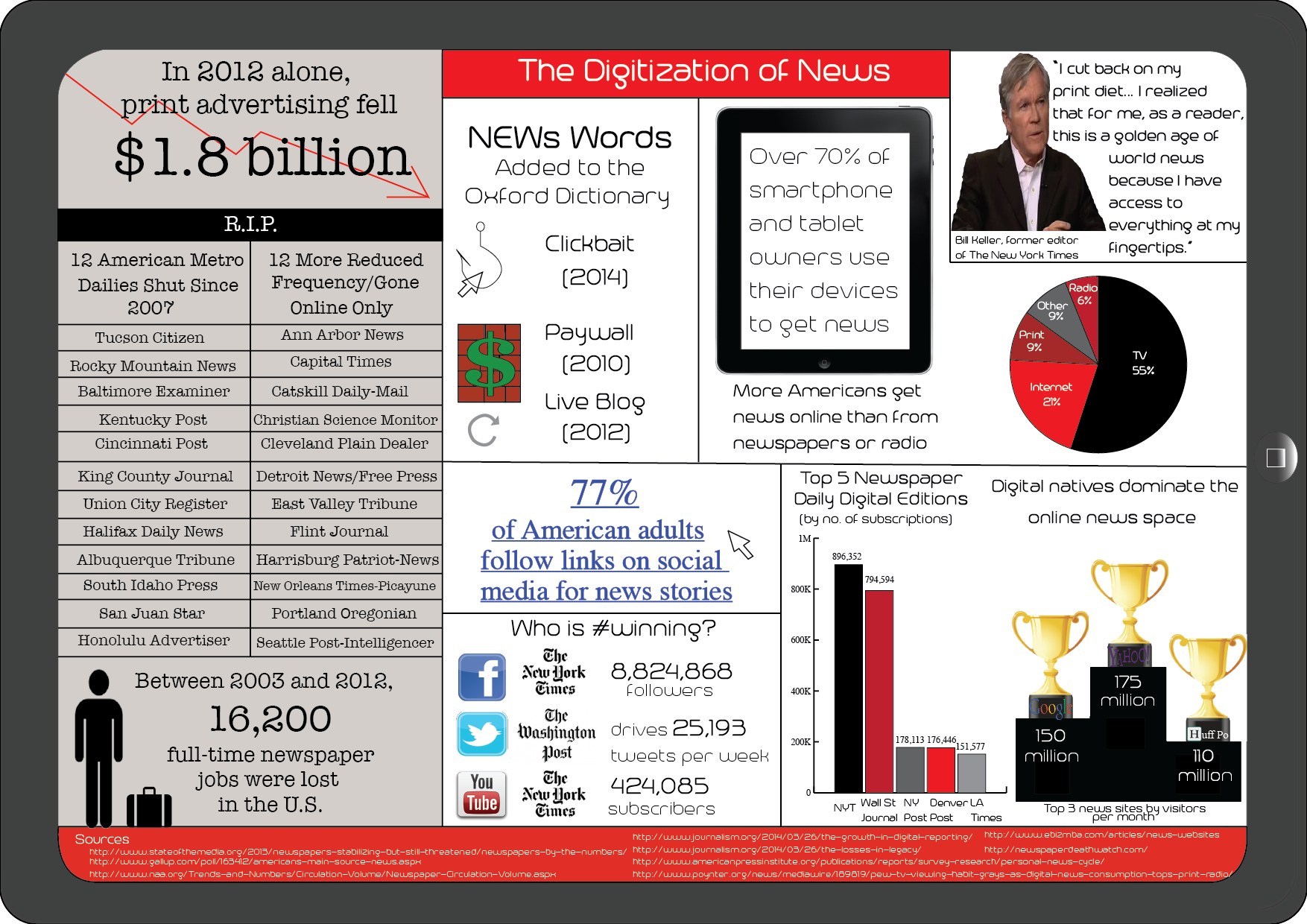
This is my completed infographic; it’s meant to look like a news site/app within an ipad screen. One of my concerns with this project was that it would end up looking too text-heavy, and I wouldn’t succeed with the data visualization part. Since the subject is news, it’s text-heavy by nature, but I made sure that each section had a visual representation/component.
I chose a red, white and black color scheme for the infographic, since breaking news banners (and the BBC and CNN logos) use red and white, and black goes with text and the ipad border.
The left side represents ‘old’ media, or newspapers, and I used a Typewriter front and a newsprint-type background to distinguish that segment. I tried to use interesting visual elements to represent kind of boring facts, like the R.I.P. section, which is meant to look like a news story.
For the right side, or new media side of the infographic, I used a white background and Trench font. I chose the font because it’s a pretty modern looking sans serif font, and because it’s thin, which allowed me to play around with stroke (boldness) and font size to emphasize certain points.
I also drew all the images except for the social media logos and trophies, which was a little challenging, especially with making curves. Working with Illustrator was a series of huge frustrations and small victories. Nothing much changed between my sketch and my final version, though I did get rid of the timeline because there wasn’t enough space. I also tried to avoid making the graphic too complicated and noisy by keeping to two fonts and three colors, though I did use blue for the hyperlink.
Overall, I’m pretty happy with how it turned out, and I don’t think there’s anything I’d do differently.


