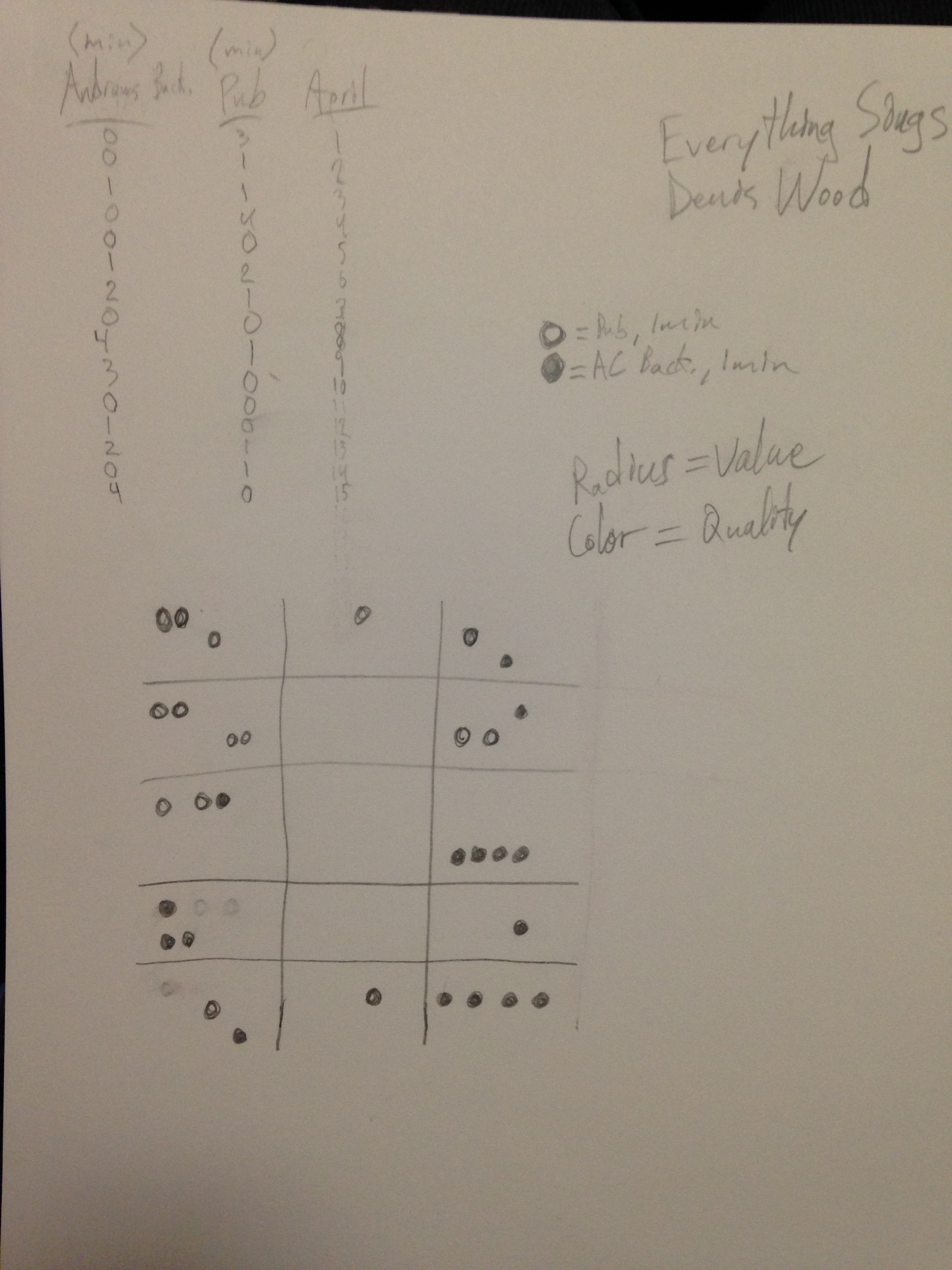
By the end of the fifteen days, the amount of time spent was flipped and I had spent more time in the backyard than I did in the pub (at around day 6 I got food poisoning from one of their sandwiches, which caused a huge drop-off in my attendance). Quality resulted pretty much how I expected: the pub didn’t break past COOL, and the backyard got to HOT later in the timeline.
In terms of the visualization, I wanted the map to have a timeline feel to it, since the information being shown is inherently linear and progressive. Lines seemed like the best option for this as they exaggerate linearity and make your eyes move from A to B naturally. I decided that color should indicate quality, and that thickness should correspond to time spent. I wanted there to be an easy way to compare the days of both places, so I had the lines from both days fork away from each other in a mirrored way.
Numerous visual changes need to be made to my map over this weekend. For one, I’ve decided that emphasizing linearity is less important than providing a gestalt impression of both places. Therefore, I plan to arrange the lines into more circular shapes, and I will be eliminating the days in which I did not go to a location. This way, one place will be immediately recognized as providing a more positive experience than the other. I will also implement the thickness as a measurement of time that I previously mentioned I would utilize.


