
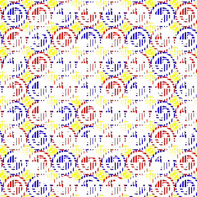
When making my GIFs, I drew inspiration from the styles of Paula Scher, Daniel Buren, and Anni Albers. Paula Scher and Daniel Buren often evoke bright color schemes, which was something I wanted to experiment with this semester. Albers created patterns that were very concerned with movement on the page – some of her designs are almost optical illusions – and I wanted to carry that concept over to my GIFs.
My first attempt at a GIF as the one below – I call it “The Disappearing Button.” l started by creating the red and black button background, then overlaid a large white button across the top. Because of the way that the background moves and the white spaces connect, the white button on top seems to disappear and reappear – even though only the background is moving.
This ended up being one of my simplest GIFs, but one of my favorites, and I thought, most successful. It’s able to create the appearance of more movement than is actually happening within the frames. Compared to the first GIF in this post, it was fairly simple to make – I just kept transforming and wrapping the background by about 25 px every frame. It only took me about an hour to make, but it looks complex. I ended up trying to recreate the success of this GIF for the rest of the GIF assignment, though I don’t know if I succeeded.
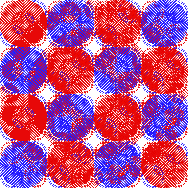
I continued to play with white space and movement, but also focused on color palettes. I generally have a very dark color palette in my artwork but after seeing Daniel Buren’s experiments with light and color, I decided to experiment as well. I decided to continue playing with empty space and overlaps and made the GIF below, which I call, “Red and Blue All Over,” which is a play on bruising. I wanted to just use red and blue but also attempt to make a third color, purple, out of them. I used the same layer-transform-wrap process as in Disappearing Button, except I had the red and blue circles moving in opposite directions, rather than the same direction.
I think it works to some degree, but is not as successful as I would have liked. Ultimately, to get the brighter purple that I wanted, I would have had to devote some time to make sure the thinly striped red and blue circles lined up more perfectly – so that only red and blue, no white, showed. This GIF ended up being a lot more stagnant than I wanted it to be – it’s cool, but because the background isn’t moving, the top layer doesn’t get much of a sense of transformation. If I had to remake this GIF I would have had the background moving, rather than the individual circle layers. It was a lot more tedious to have both those layers moving in opposing directions, and not enough payoff.
I had a lot of fun playing with movement and colors in these GIFs. If I could go back, I wouldn’t have stuck so rigidly to a primary color palette. It definitely got me out of my comfort zone and into areas that I wanted to explore, but it would have been cool to look at some other bright colors. Buren and Scher both play with bright colors a lot but certainly don’t just stick to primary colors – I think their work might be less successful that way.


