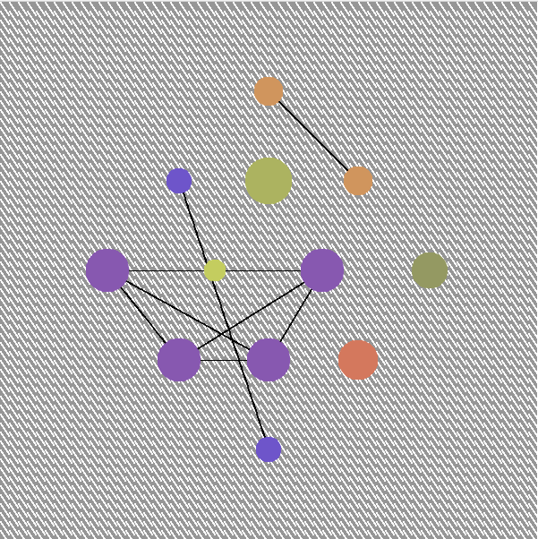
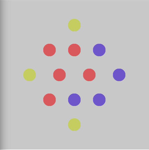
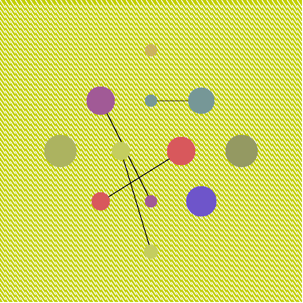
I knew going into this project that I wanted to try and create a map of a social network, based on Nicholas Christakis’ Ted Talk entitled “The hidden influence of social networks.” I decided to have a set 12 circles representing people for my map and to show the connections between people I would have them be different colors and then the circles of the same color would be connected. After some consideration of using a RGB color wheel, I decided to use a traditional red-yellow-blue color wheel for my colors because it seemed more natural, and I thought a user would be able to see what was happening with the colors more easily.
The most difficult part of this project was to get the pressing of the “a” and “s” keys to complicate and simplify the system. I had to figure out how to get the colors to change at the press of the key while simultaneously having the previous circle not show up and the lines continue to change. I had difficulty having the circles change color randomly while also having the draw and undraw line functions work correctly in conjunction with the button press.
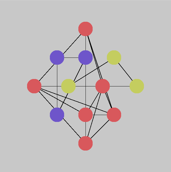
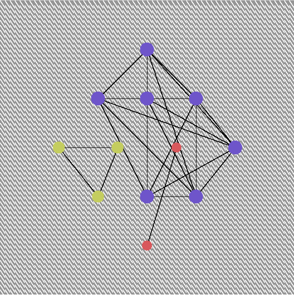
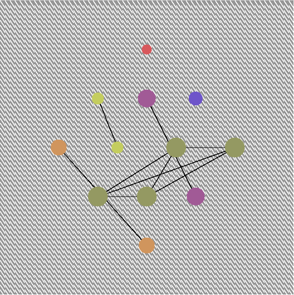
To simplify and complicate are the main two rules of the system, and they are also the ones that the user can interact with. The other rule is to connect, which is done through the lines that connect the people of the same colors in the system. This part of writing my system was easier than I anticipated because I formed a loop that would find the color of each circle and draw a line to all other circles of the same color. The removal of the lines with each complication and change of the system was slightly more complicated but I set the lines so that they were a much higher stroke weight and were the color of the background when performing the undraw function.
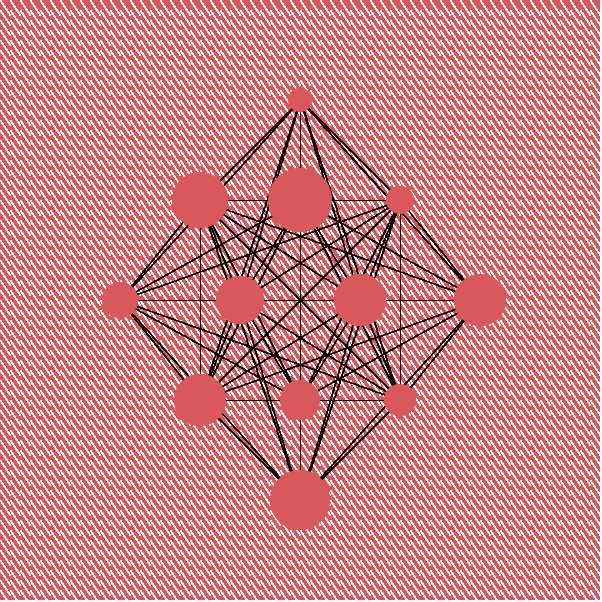
I based the decision of what colors to make the backgrounds based on the reading I did by Josef Albers about the relation of colors to each other. When colors are placed on top of one another they react in such a way where sometimes one color can take away from the other, making the other color look different than it should based on the actual color value. I chose to make the “error” screen the same red of the red from my list of colors. I refer to this as the “error” screen because when the system has that color for the background the system cannot be simplified anymore. All of the circles on the error screen are also red, directly showing that the group of people cannot be simplified anymore because they are all represented by the same color. With the white pattern on top of the background color, I wanted to see how the colors of the people interacted with the color of the background when the white pattern was in between. For the “error” screen, the red circles seem to look darker than the background, and I think that the circles in contrast with the white lines cause this effect.
I had a similar thought process for choosing the yellow for the other background. I would normally never use the color yellow that I picked because it’s too bright for the type of color palette I prefer. I chose this because I thought it would perhaps make the somewhat more subdued colors of the people look even more soft and also perhaps darker. This worked out somewhat, although the colors with yellow tints became somewhat more difficult to see or tell the difference between. I think also the background yellow looks more green-tinted in relation with the colors of the people.
I really enjoyed doing this project because this idea of the human social network is one that I think about often and have thought about since I first watched this Ted Talk two years ago. I am really intrigued by the idea of the idea of being influenced by people who are far away from me in terms of social connections, plus I really like seeing human relationships mapped out. Independent of this project I have considered drawing the relationships in my house as a map multiple times this semester. Making this piece has really been wonderful and I really enjoyed seeing this concept I’ve thought so much about come to life. I’m planning on researching force directed graphs so that I can possibly continue to make other pieces like this that are more complicated in the future.


