I am not a writer, but I chose to write text that describes myself so that I would be happy with my words. I decided to explain “where I am from?” through this work because this question has bothered me and my family all the time. I felt awkward, embarrassed, annoyed by answering this question because my answer is so specific and detailed that might put stress on the people who are asking. However, it is necessary to explain myself to meet new people as I move to different places almost every year. I thought creating a video for this question I encounter frequently could be a wise and fun solution.
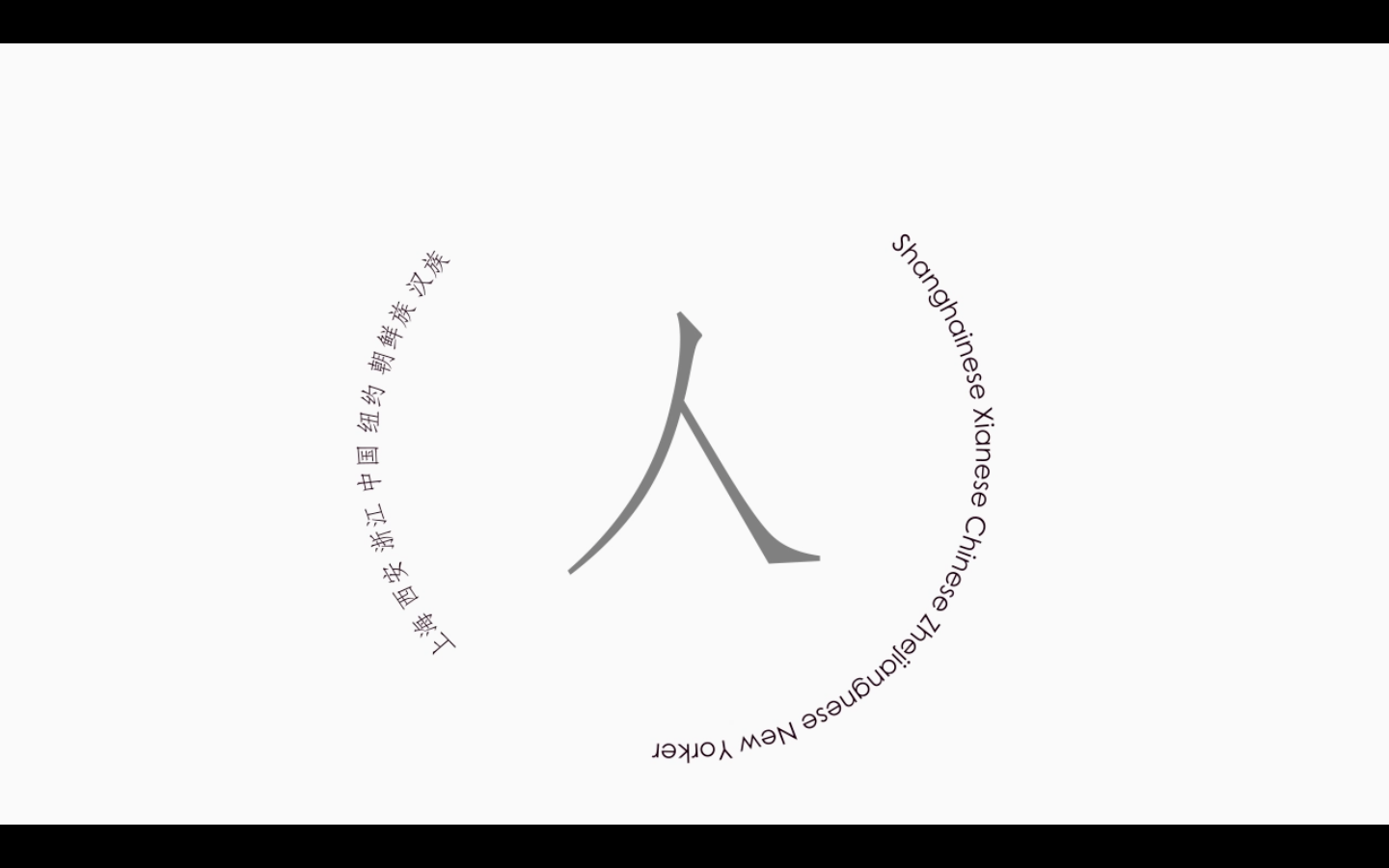
The title and the palette are representational of the text. I named the piece “Tillandsia”, the Latin name for Air plant, a kind of plant that has no root. I thought I share the similarity of not having a fixative “root”, or a “home”, with the plant. In addition, I had one air plant in my room. I appreciated its accompany, so I want to dedicate this piece to my air plant too. I kept the palette for the piece to be black and white because these colors are either a result of mixing all the colors or having no “color” in it. This is the same as my hometowns. I can from everywhere, but nowhere.
I kept the whole piece the minimalism style because I wanted to try making something “clean” instead of the complex effect combination in the first prompt. I find limiting myself with certain fonts, effects, pattern and motion to be very useful in organizing a long piece. It can make my piece feel more polished and finished instead of a project made by a beginner in after effects who wants to try out all the cool things. I intended to let the audiences to focus on the meaning of the words and the graphics. Moreover, by doing this, the visual effect will incorporate with the music very well. In this video, I used regular and alternating rhythms frequently. I have my words contrasting in the direction of up and down, left and right, clockwise and counter clockwise. I repeated the rotating and typewriter motion throughout the piece. These strategies make reading text in various directions more dynamic.
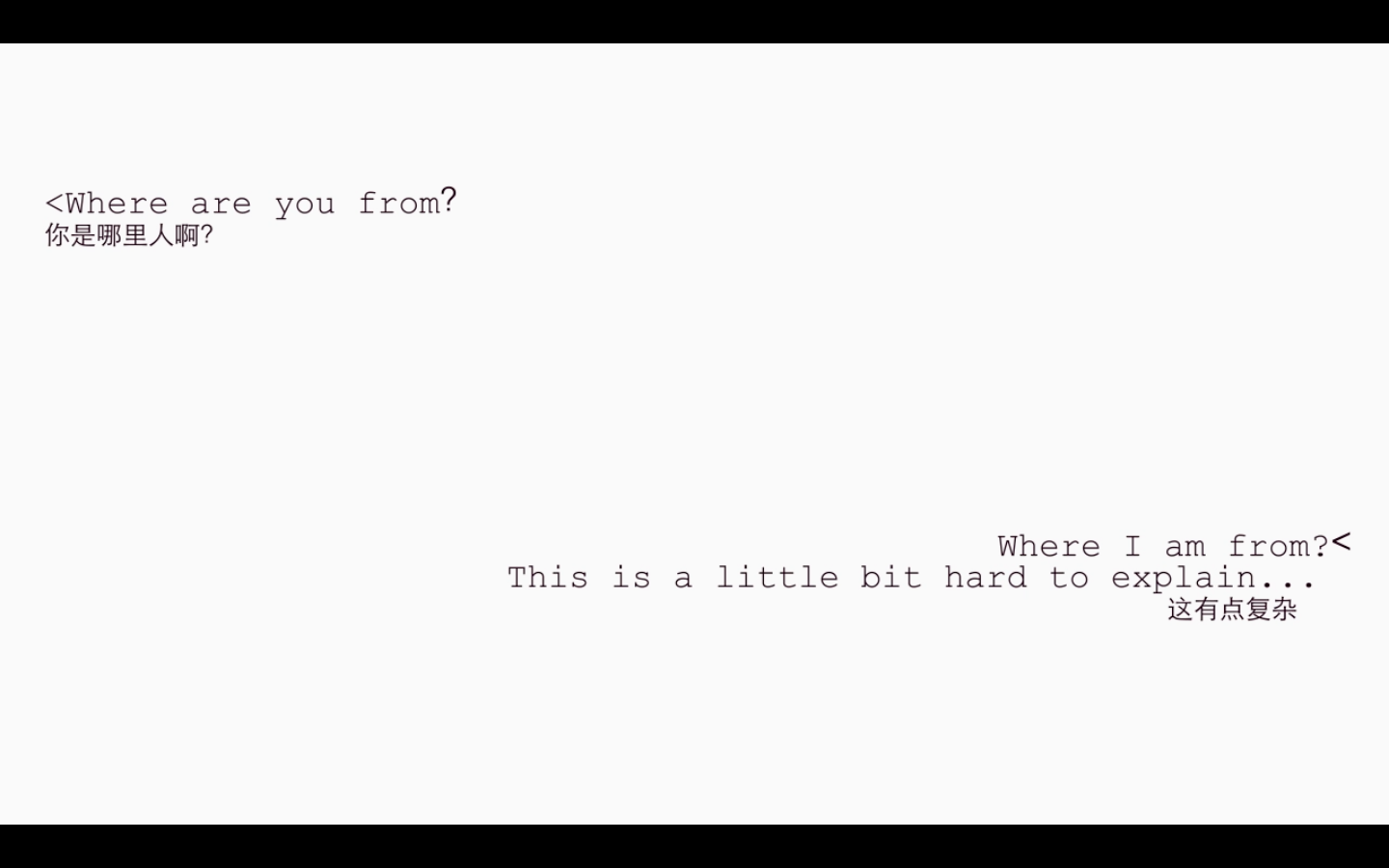
In the beginning, I organized my text into four sections so that each section will have its own signature motion. The first part is the conversation between the asker and me. Originally, I was planning to use two different colors to distinguish the asker and me, but I gave up the idea because I wanted to keep my video as simple as possible. I decided to layout according to the messages on our phone with the same font. I adjusted the pace of typewriter in “…” to strengthen my hesitation in answering the question, just like how I feel in a normal conversation. For the part where there are multiple detailed questions, I used variations of grey and eight different fonts to suggest that they are asked by different people. Still, I insisted on organizing them into vertical lines and using the same trim line effect while introducing the questions and fading out them. Toward the end of the first part, I changed the reading direction of the text to circular. The crossing and almost unreadable text is to suggest that I am a combination of the answers and the answers are not important to me. It also became the transition to the third part of the piece.
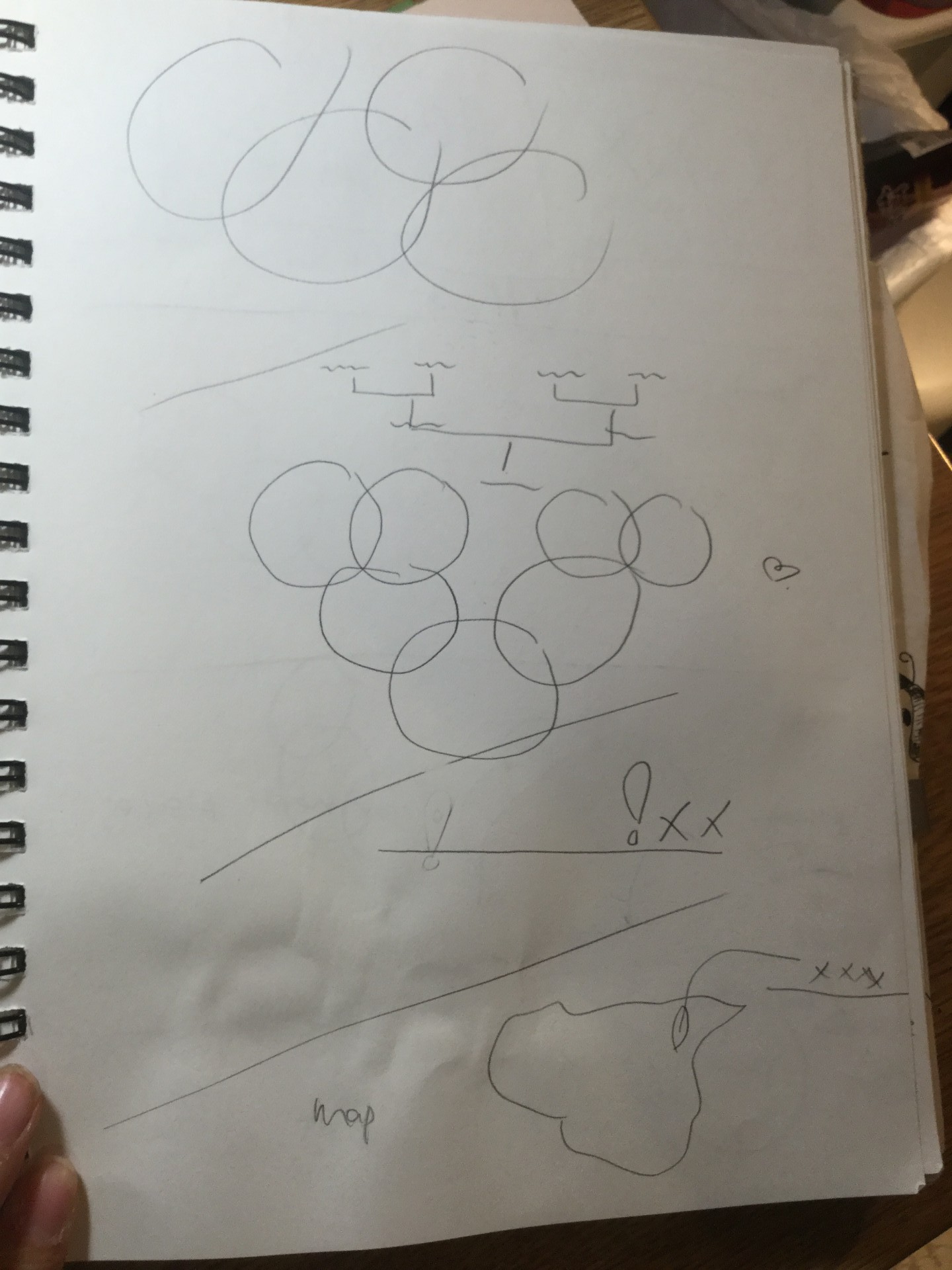
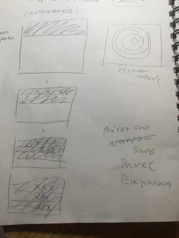
The second part is the explanation of places that are important to me. I struggled about the layout for the text for the origins of my family members. At first, I wanted to create paths with outlines of provinces on the map, or making a shape of the map of china, or using signs that marks locations on google map, or making a family tree. Yet, I reminded myself not to over design the video, so I continued using the same effect from the last section and modified a bit. I varied the fonts and changed the size and pattern of the circle to keep the piece connected and moving. It was difficult to layout the circles on a diagonal in rectangle too. I’ve thought of multiple ways in putting them. When it comes to introducing my story, I brought back the typewriter effect and enlarged the locations to fill the screen. This was inspired by Young Hae Chang. It should be noted that each line with the typewriter effect follows order throughout the video. The asker is always on the left. I am always on the right. The latest sentence is always closer to the bottom of the screen than the previous one.
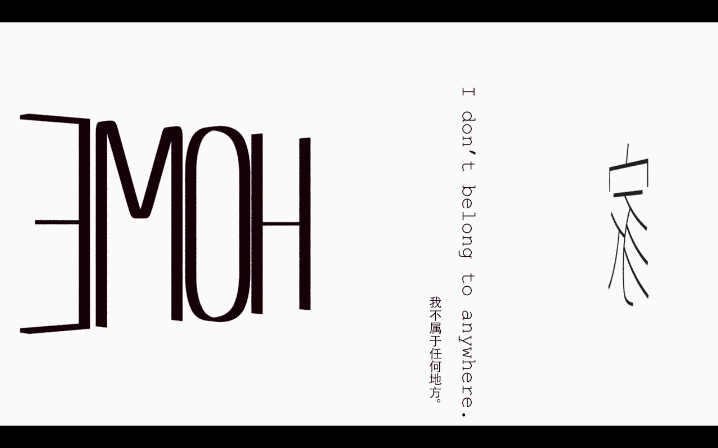
The third part is my reflection on the experience. I kept the keywords, Home and 家, large because they appear frequently in the text of this section. I incorporated rotation on 3d layers to bring in some changes. The keywords rotate by themselves instead of following a path of a circle. Toward to the end of this section, I introduced the particle effect to create changes on the background. I lost some patience in keeping the text graphical so I just threw in a number of animation presets that follow the meaning of some words. The last part is my own ultimate answer to where my home is. I laid them out on the central axis, kept each word far away and used three languages.
The only other two difficulties I haven’t mentioned are deciding where to use masks and adjusting the speed of key frames on the text. Especially, at the end of the third section, I rushed on some lines. I am planning to make my video smoother this week.


