The sheer variety and depth of detail that can be created through text animation in After Effects is one of the aspects of the program I find most appealing, so this particular project was quite exciting. In choosing what text to work with, I knew I wanted to use one of my original poems, as animating my own writing struck me as a fascinating challenge. I began by quickly selecting three of my already written and polished poems for more detailed consideration. Two of the three are slam poems in a very direct, personal, confrontational style. One of these, Bias Society, is a reflective piece on gun violence, and the other is an untitled piece in the style of an open letter, written as an assertion of self-identity in claiming the label autistic. Both of these poems are deeply personal and rather emotionally fraught, and once I determined that I was more interested in working on lighter subject-matter at the time, I decided to work with the third poem, Roses. Roses is a Shakespearean sonnet, written as a playful allegory, and is one of my favorite poems I have ever written, so it was a rather ideal choice overall.

In my ideation process, I began by going through the poem line by line, thinking about how I would visualize the feelings and rhythm that the sonnet evokes in my mind, and making notes on how I might go about animating those things. While brainstorming for the animation of my poem, I focused on emphasizing motifs in the imagery I sought to create. These motifs include that of the sprout effect indicating that text refers to one of the types of flowers, and the background reflecting the shift in seasons over the course of the poem. I was extremely conflicted over what sort of sound to use in this piece. I normally strongly prefer to work with music, but my sonnets have a very definite sound and rhythm in my mind, one with which any music would inevitably conflict. Eventually, I settled on using subtle background sound effects, in order to very gently reinforce the theme of changing seasons, without detracting from the poem’s inherent rhythm.
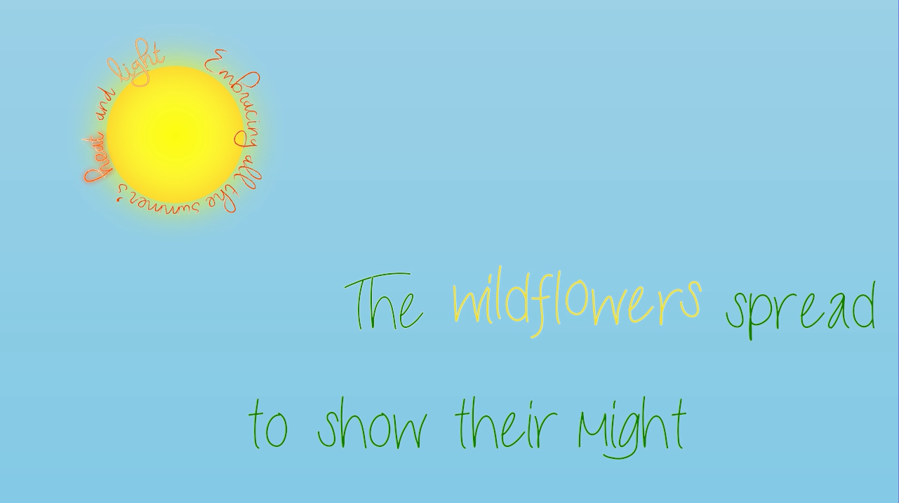
I personally find that every font feels different to me, and so I put a lot of thought into what fonts I would use. The baseline font, Nueva Std Italic, is meant to be smooth and flowing, like the patterned structure of a sonnet, without being too complex, so as not to distract from animations and other imagery. The two accent fonts, Script MT Bold for emphasis and Courier New for orderliness, are each used very sparingly, in order to better convey the meaning of specific phrases. The roses font, Lucida Calligraphy, is one that I find evocative of aristocratic mannerisms, chosen to subtly convey that the roses in the poem are representative of a ruling class, in the poem’s allegorical structure. As I was unsatisfied with any fonts available on my computer already for the wildflower and weather fonts, I went looking for fonts which are evocative of nature online, eventually deciding on LiveLaughLove for wildflowers, and Virginia Sky for weather. The irregular size and sans-serif letters of LiveLaughLove, along with its slightly rough edges, felt just wild enough to evoke the transgressive feeling of encountering wildflowers, while still being readable. The plentiful loops and feathering of Virginia Sky felt evocative of clouds and the sense of changing weather to me, making this font perfectly suited for weather.
Once I moved from ideation into animating this poem in after effects, I found it was both incredibly time consuming and highly engaging. Most of my time in the software was spent working without sound, as the rhythm of the project is fundamentally independent from the sound elements. Through this process, I noticed that I tend to compress my effects over a shorter amount to time than I initially anticipate, which made my project short but very dense.
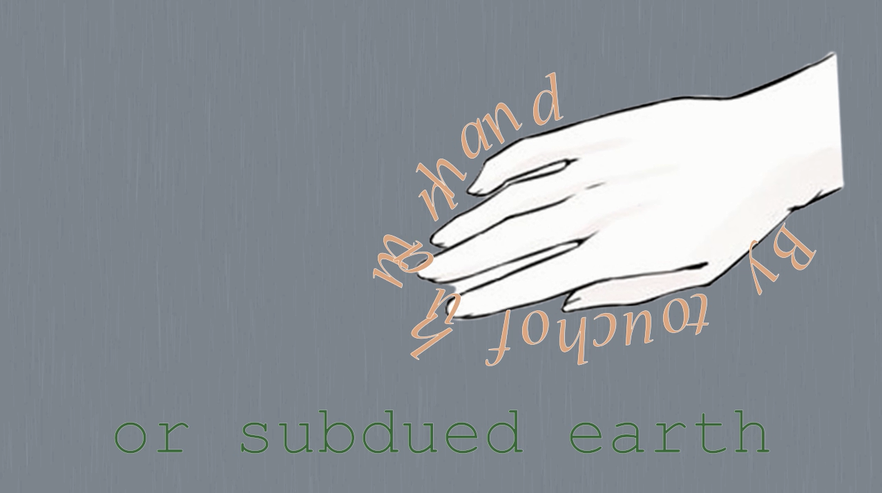
Figuring out how to animate text around the path of an irregular image in a way that looked sufficiently smooth, as I did for the phrase “By touch of human hand”, was especially challenging. I first tried to convert the image of the hand to a path in illustrator, but quickly realized that the outline without the image made for a very strange looking animation in after effects. I then made several iterations of the image of the hand in photoshop, eventually determining, through trial and error, that leaving whitespace inside the hand for contrast, and some whitespace between the fingers to smooth the path for animation purposes, worked best.
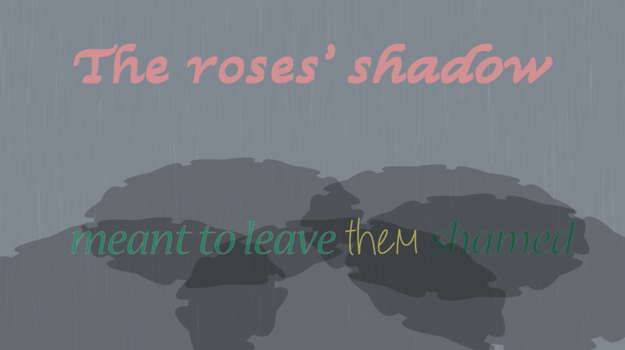
The animation of the line pictured above was also quite challenging. I knew from the start that I definitely wanted the phrase “The roses’ shadow” to be in ray traced 3D, which was a bit of a pain to work with, but not the main challenge. I originally intended to use the shadow of the actual words “The roses’ shadow” as the shadow element in this scene, before realizing while working with the image that that isn’t how shadows in after effects work. I improvised, making the shadow shapes from inverted, curved star shapes, and lowering the opacity of the shape layer so it looked like a shadow. This improvisation allowed me to layer text on top of and underneath the shadow layer, creating a subtle darkening effect on certain words.
Upon reflection, while this project has been incredibly time consuming, I am reasonably happy with the result. I was able to produce a satisfactory approximation of what I imagined in my ideation, and did not encounter any problems that I found insurmountable along the way.
Update: Conference Edits
My goal in editing my Kinetic Text project was to refine the composition, making it more fluid in general, and making the transition section smoother and less awkward. The first step I took in doing this was to get feedback on the first version of the composition from several people. This feedback indicated that text transitions were too fast on two of the lines, such that I needed to extend their animation over more time, some of the green text did not contrast enough with the background, the transition section was too long and slow, and the sound transition was not noticeable enough. Implementing changes based on this feedback was straightforward, the challenge coming from learning how to change the timing of one section, while not impacting the timing of subsequent sections. I also realized I could pre-render individual precomps during this process, and this was extremely helpful, as it allowed me to reduce the strain on my computer’s resources from such a large and complex composition, drastically reducing overall time spent rendering, and preventing further After Effects crashes. Overall, I’m quite satisfied with the finished composition. As it was my first time doing detailed text animation work, I’m very pleased at the degree to which the composition resembles what I initially imagined while brainstorming, and look forward to using the skills I learned in future projects.

