To be rather frank, I went into this project not knowing what I want to do. I knew I’d like to experiment with something new (be it code syntax, shapes, colors or effects), but coming up with a concept that could be well executed in Processing did seem a bit daunting. However, I stumbled upon Op Art while doing research, and my instinct sends out a huge “Yes”. If art is anything that stimulates and excites the eye, then there’s nothing more powerful in that regard than Op Art. It heavily relies on optical illusions and repetitive forms to create foreground-background confusion and an unprecedented sense of depth. Using mostly mathematically derived methods, Op Art operates on a high level of precision and calculation. Artists constantly push the boundaries of our perception, creating a new language for visual communication. Therefore, for my conference work, I decided to combine film with computer-generated art to explore the limits of perception, as well as the spatial illusions and motion in an optical world.
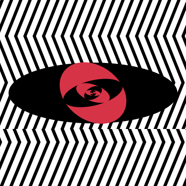
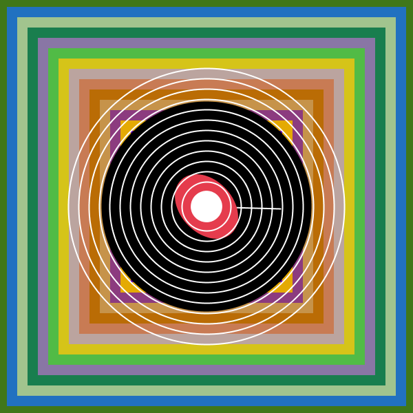
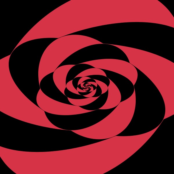
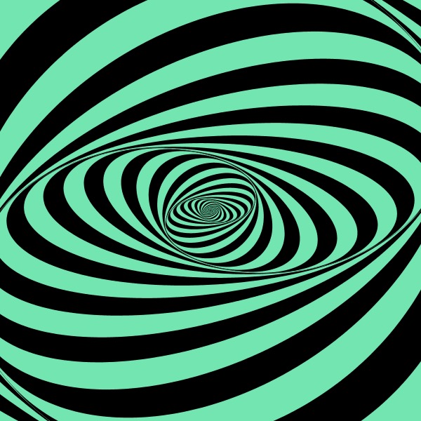
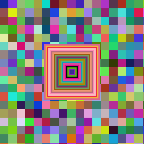
I started with shapes. For some reason, an image of 100 eyes keeps popping up in my head. It was an assignment for John’s class several years back, and as its title suggests, we were asked to draw 100 eyes. It wasn’t until later did I realize how paradoxical it is, that is, using the “eye” to challenge the perception of the eye, which is why I made the blinking eye my opening sequence. The sequence was called “nervous eyes.” In order to convey a kinetic energy to the viewers, I employed geometric abstraction—lines, circles, ellipses, spirals—to create illusions of depth. At this stage, color came into play. Originally, I kept it simple with the classics: black, white and red. Though the trio combination has a certain hypnotic element to it, the palette becomes drab after a few repetitions. Optical changes occur when a variety of high-intensity colors are implemented in the same geometric configurations, and thus, I change the color parameter to make appear more colorfully engaging patterns. It also makes colors seem more luminous, adding an almost three-dimensional effect.
That’s when I encountered the first major obstacle—editing—-how to stitch these sketches together. Contrary to what’s expected, as a film student, I struggled with making transitions. The difficult part is not about creating transition effects, but instead, making the transition with codes, which means, every parameter has to be highly controlled and be relevant to each other in itself. The second problem remains in the audio department. I first asked a composer friend to send me some of her discarded score, and I was satisfied with one piece that’s jarring and chaotic, until its rhythm takes a turn in the middle and couldn’t play in sync with the animation. My desire for depersonalization in art arose around this time and opted for computer generated music. It is one of those decisions that only make sense after it is completed. The austere quality I have always pushed for finally is taken effect now. The third struggle is the amount of repetition to put in. I’ve been trying to find a balance where the repetition allows us to gaze through a portal into a grander illusion but not too much as it might become dull to watch.
In general, I’m pretty happy with what I’ve put together, though I can still see a lot of flaws, it is largely close to my vision and artistic values. I will continue to work on more sketches and make it a series, because there are indeed more to explore: our systems of logic, our perception of depth, motion, and three-dimensionality…And my next step is to break through that boundless space beyond our dimension and create something that really asks us see more carefully as what we perceive is not necessarily what is real. And that’s what Op Art really teaches us.