The City and environments we live in play a huge part in the vision we have of ourselves, our work and interactions with others. When I say city I mean everything from outside spaces to indoors (stores etc). Signs are everywhere, the people are everywhere but in a way, I feel like there is little space for our creativity to be fully expressed due to the boundaries our society places on us. The subtleties of society are what without us even knowing, impact our ways of thinking/creating. This class and the idea of reframing places huge emphasize on these subtleties and commodities that we conform to without giving second thought to. I think what rules society most these days is consumerism, which we all take part in and accept even if we would prefer not to. Materialism, big corporations etc rule our cities and lives, and that is a huge problem especially when starting to think about the future of our cities/lives.
My sticker campaign changed a lot during the process of making the stickers. My idea was to criticize consumerisms and big brands, so I first made this sticker:
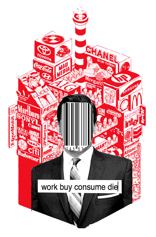
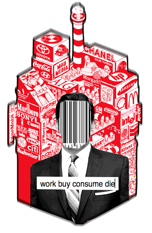
I thought it was quite poignant and liked the “work buy consume die” text in the middle, which was straightforward and a bit intense. However, I think the image was maybe a bit much and also too much of someone else’s work, especially the background, which isn’t mine. I then decided to change the idea and made a Buddha sticker:
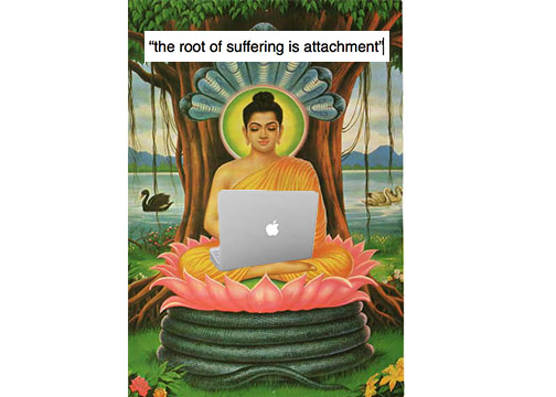
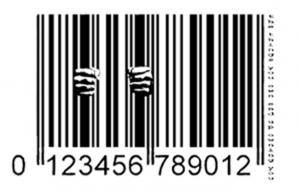
The sticker said “the root of suffering is attachment”. I thought it was fun, but not complex enough. I was looking for ideas online and whenever I typed in consumerism into google images, I found barcodes everywhere. The barcode was present in my first sticker but not predominantly. I think nothing says more consumerism than a barcode, and eventually the barcode becomes somewhat our “identity”, when consumerism takes over our lives and environments.
The barcode’s big black lines immediately made me think of bars, and made me think of “being locked in”, so I thought I would add big hands as if they were holding on to jail bars. I then added the text “the things you own end up owning you” in small font next to the barcode to slightly illustrate it.
The visual code of Heimbold played an important part in the making of my sticker. I was constantly thinking of where I would put it/why. The visual code of the building in my eye is quite hostile and simple in the sense that the only colors are white (the walls) and gray (silvery kind of). I thought my sticker should match the simplicity yet strength of the building. I think Heimbold is a great building in terms of creative thinking because it is all about vagueness. However, I think it sometimes lacks art and creations, aside from the Barbara Walters Gallery.
I was wondering where to put up my sticker in the building for it to have a significant meaning. It could be placed anywhere really but I thought it should be somewhere consumerism related in the building. I decided on the vending machines. I placed one on each: one on the glass part of one of the machines, and one on the bottom part of the other. The other place I am putting my stickers in on laptops. I have one on mine and started giving them to my friends to put on theirs.
Something pretty interesting happened though. I placed my stickers at night, and the next morning as I walked by the vending machine realized that the sticker that was on the glass was gone. It’s funny because it wasn’t completely removed, just moved to the black opaque part of the machine. I am not quite sure what to think of that/who could have done it but I think it’s interesting that it wasn’t completely removed!


