My conference project, The GIFer at the Gates of Dawn, started out as an assignment to make six gifs with at least fifteen frames each and take inspiration from psychedelic and counterculture art from the 1960s. When the project was finished, I ended up drifting off from the original theme, creating nine pop art-esque, campy, colorful works. For the most part, I’m glad at how the images turned out.
Most of my works dealt with the theme of iconography, something that has fascinated me for a long time in art (and something very prevalent in pop art). I tried experimenting with the different ways there are to revere a certain figure through their face and/or body.
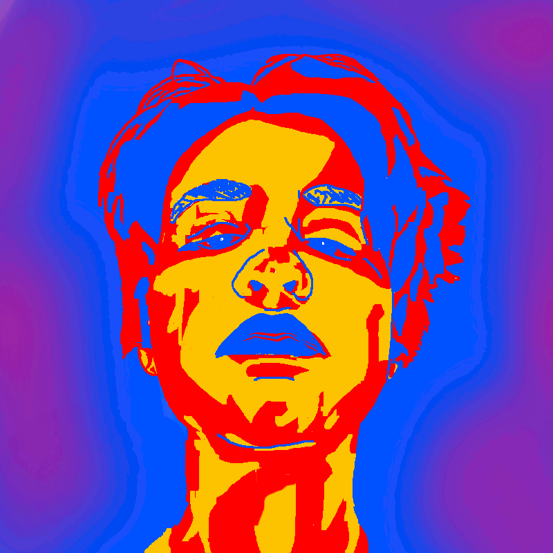 My first idea was to make something with my own face. I took a couple of selfies, chose the best one, and used it as a reference for a painting on GIMP. This was very strange for me to make, as my self confidence isn’t the best and I wasn’t very used to displaying myself so boldly. I do, however, love the idea of taking some seemingly perfect picture of someone and obscuring it a bit – whether it’s drawing a mustache on the George Washington of a dollar bill, doodling a crude interpretation of genitals on some celebrity’s face, or making your own eye fall out of its socket.
The GIF is 45 frames, so the falling of the eyes is very smooth. I also appreciate the pacing – a fast version of this would make you have to watch it a couple of times to see what’s going on.
This project is also, in a way, a journey of me understanding colors. I love the relationships between the bold primary colors (and the purple) here. They jump out at you, but they’re extremely relaxing and just fit. I feel as if my other GIFs get better with color overtime.

Like I said in my crit, I’m not the biggest fan of this. I feel like not much is going on and that it doesn’t fit everything else
I do like the shifts in color, however. Even if it’s a bit boring, it’s very fascinating to watch. I feel like I could have made some sort of never-ending loop with this as well (shifts from warm to cool and back to warm). This had potential, but might have been better saved for another project.
(This has nothing to do with iconography either.)
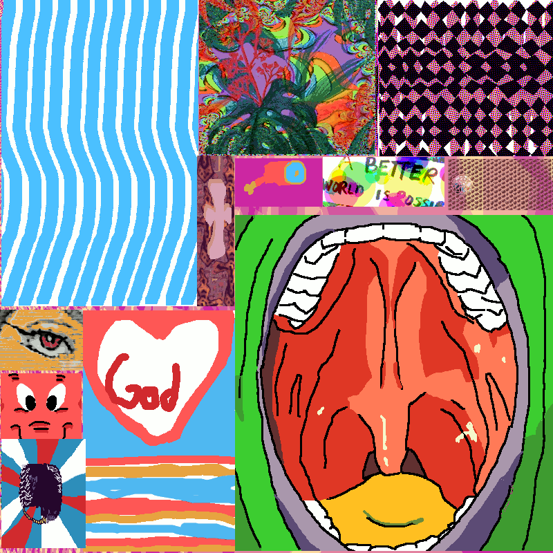
The sort of iconography here is a bit different. It’s the kind you see in advertising – bold colors, bold shapes, and clear messages. I wanted to do a collage to represent several different ideas cluttered together, giving you the “everything on TV is the same” sort of message. I’m quite proud of this one, though I wonder what it would have been like if I stuck to one theme.
This GIF was also inspired by the art of Slab City, an outsider colony in southern California, and most notably the incredible sculpture at its entrance, Salvation Mountain, created by the artist Leonard Knight:

I admire how Salvation Mountain is also a conglomeration of several different colors and patterns that form one message. Even though my GIF is more representational in its subject matter, I took inspiration from the strong presentation of the Mountain’s message.
I’m a big fan of how every smaller GIF, despite having a different color palette, eventually came together. The smaller ones on the top right don’t fit in as well to me, but everything comes together when you look at it for long enough.
I’m also a big fan of the looping – this is the only GIF of mine that loops (almost) perfectly.
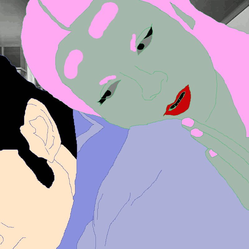
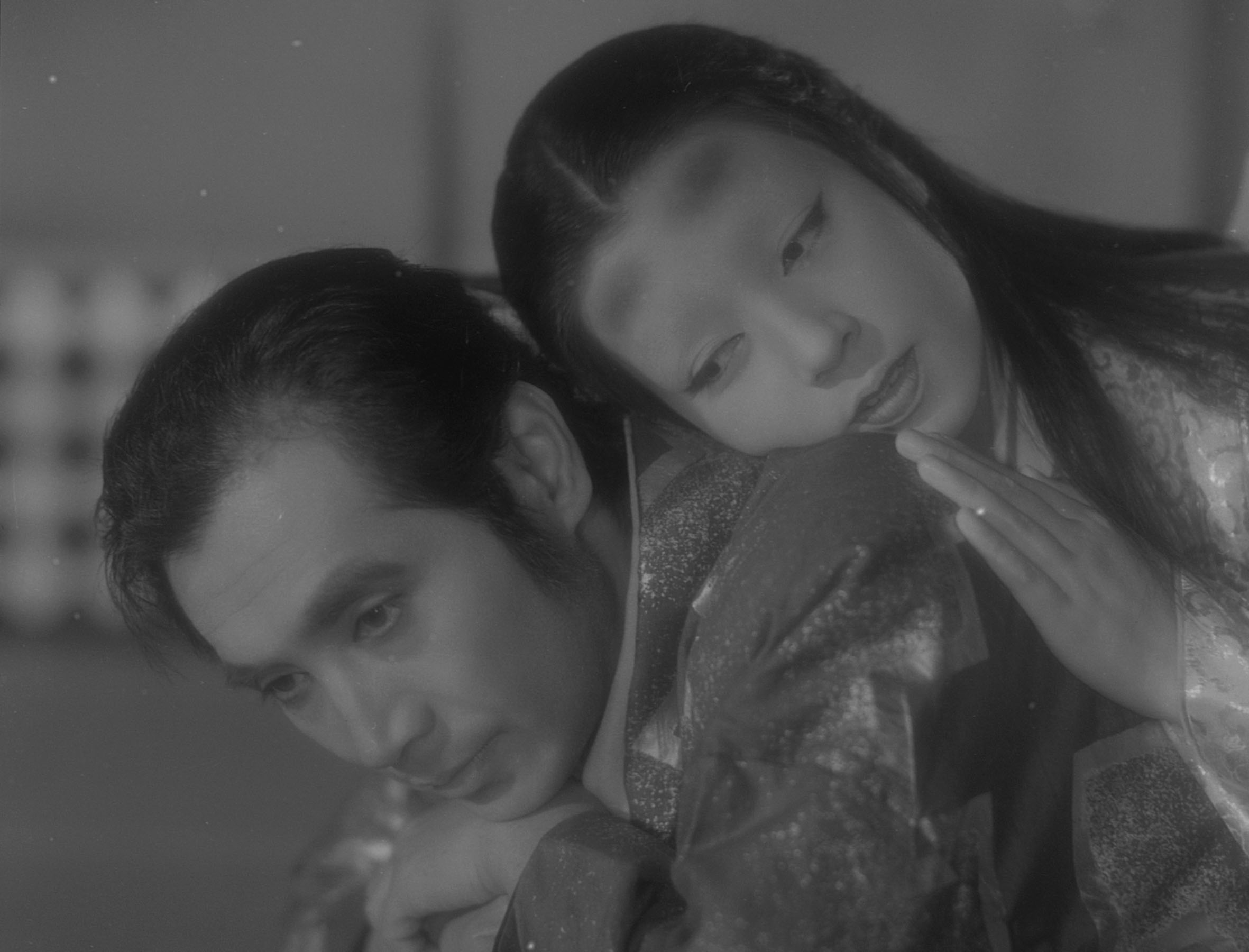
For this next GIF, I used a famous scene from the movie Ugetsu as a reference.
Ugetsu is a fairly famous, Criterion Collection-tier movie. Even if one has not actually watched it, they would probably recognize this scene. They may have a small idea of what it is, but they don’t actually know. This GIF was inspired by this ambiguity and vague familiarity about pop culture that most seem to have.
I’m a fairly sheltered person – I’ve never read Harry Potter, don’t know anything about the Kardashians, and spent most of my childhood collecting boxes rather than watching TV (my family didn’t even have cable until I was a sophomore in high school – how horrible!) Most of my friends, for some reason, haven’t been able to take it, so I’ve received a lot of “How can you not know about x?!” In that way, this was a theme that’s been pretty prevalent throughout my life.
It was also inspired by the short film Kachi Kachi Yama by Tadanori Yokoo, which parodied cheesy and exploitationist western films by using several (then-) popular actors to tell the story of a Japanese folktale in the most campy manner possible.

The content of the GIF has nothing to do with the movie itself – like in Kachi Kachi Yama, it’s just an abstraction that tells a different story.
This is my personal favorite GIF of the bunch. The smoothness of the animation, the bold, flashing colors, the abstraction of a normal-looking scene, and the ways the palettes work together make this extremely satisfying for me. I also like how the face is half abstracted and half realistic, but enough to make the drawing look convincing and resemble the actors. This was another way that Kachi Kachi Yama inspired me – it’s not the most flattering Brigette Bardot, but it’s her!
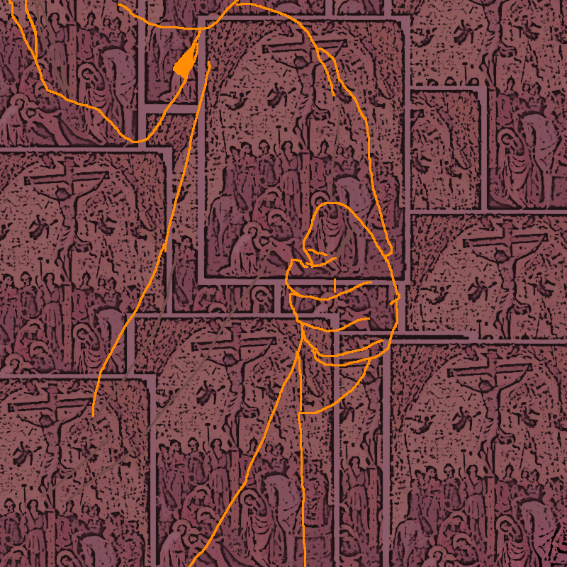
It’s been a lifelong dream of mine to do a rotoscope animation, and it’s finally been done! I took fifteen or sixteen pictures of myself on my phone, transferred them over to my laptop, and drew over them to put them all together.
The motion I tried to create was a that of a savior or healer reaching out to the viewer to lift them up or to save them. This goes hand to hand with the Christian religious art in the back. I’m not Christian and know next to nothing about Christianity, but there was always this concept of “saving” and “revering” that I associated with it (in the sense of Jesus and the many saints that are worth worshipping in their case). The motion and the changing background go hand in hand in this way. All in all, it’s about the huge effect of religion and religious iconography, even to those outside of its influence.
My favorite thing about this GIF is the collages in the background. I enjoy how all this art is muted down from its original glory and repeated to fit a common theme. I explore repetition and iconography more in the next GIF.
I wish that I could’ve worked on the animation itself a bit more – it’s uneven and choppy.
 This one is a bit more straightforward in theme. The obstruction of celebrity’s faces, turning what most people know and love into something of a monstrosity. The celebrities are, in order of appearance: British-American drag queen Charlie Hides, Singaporean-Malaysian singer and actress Saloma (Salmah Ismail), American musician Lana Del Rey (Elizabeth Grant), and Indian actress Asha Parekh. I felt like, to make the piece more effective, I should paint celebrities that I personally admire.
The collaging of the celebrity’s faces also plays into the aspect of popularity and obstruction – faces of famous people are similarly plastered all over media such as television and the Internet. When the colors become darker, it’s similar to a horde of demons or something equally horrific. It scared me the first time I played back the GIF.
I also love the use of color to create a very different image than what one might expect from a picture of a bunch of celebrities.
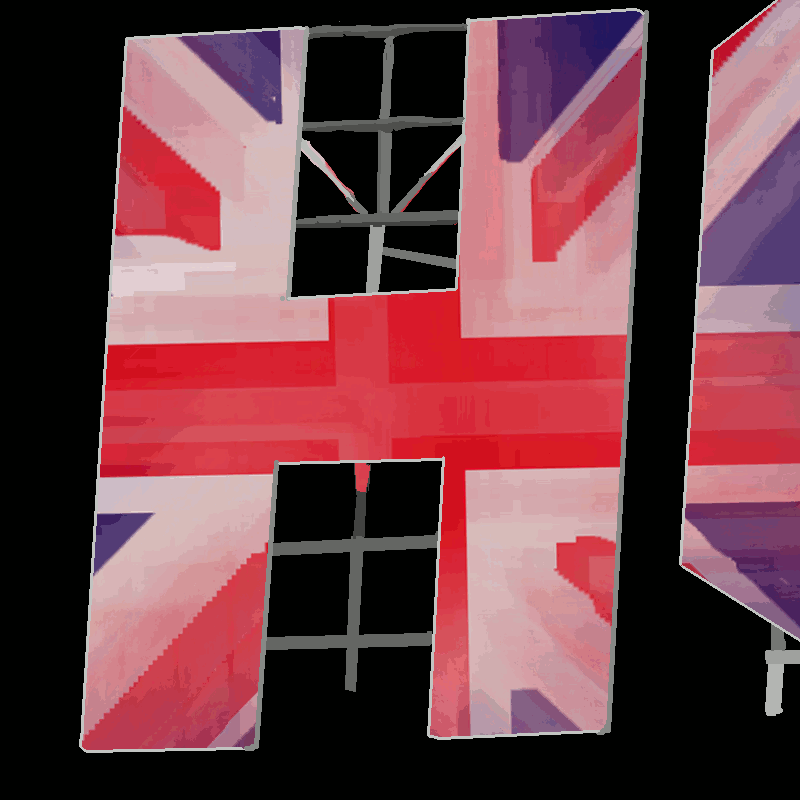
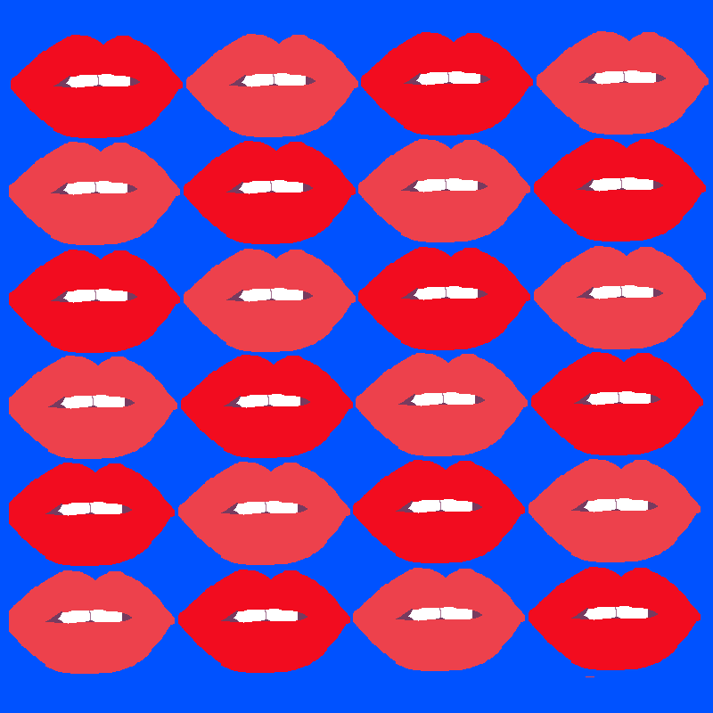
Projector Night gave me the idea of turning a structure into something its not. The idea to do this to the H of the Hollywood sign came from a song I love, Lust for Life by Lana Del Rey (“We climbed up the H / of the Hollywood sign…”) The images – Pills, lips, the Union Jack, and Amanda Lepore are all connected by color (red/blue/yellow/green) and by the fact that they’re representative of some popular cultural ideal. They’re icons on an icon – a true statement of the effect of iconography and how some unrelated things can look so related.
There’s not much to say about this one. I originally created this pattern for the GIF above it, but loved how the colors popped and made it change color. This feels like the most psychedelic of the GIFs, which is a strange and ironic tie in to the original theme of this project.
All in all, I feel like this project was a success. I portrayed what I wanted to portray, learned more about the medium of the GIF, learned about coordinating colors, and learned a little bit about myself along the way. I didn’t stick to my original idea, but life can take you in several different directions that you may not expect.
I feel like I could have made less flashing/changing color GIFs, but other than that, I’m pretty proud with how they all turned out. All that work on GIMP was ultimately worth it.
