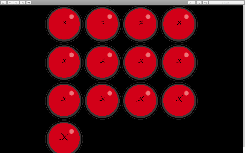
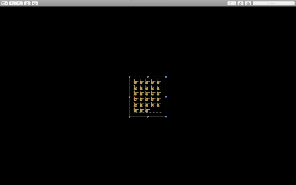
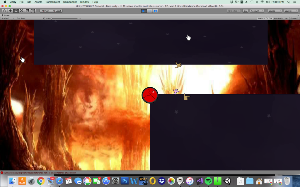
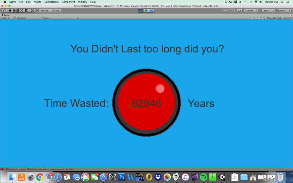
Undertale 2 doesn’t have a very specific world metaphor, but being 14 was the basis for a lot of the aesthetics of the game. The player controls a cross with an eye on it that is defending a large red button. The red button signifies the players health points, and as the player gets damaged the button gets more and more cracked. The enemies in the game are finger guns because the gun shape also looks like a hand trying to push a button. The finger guns also shoot bullets that are shaped like a mouse click sprite which drives the point home a bit more that they’re trying to press the button. The player shoots another style of mouse pointer which is mostly just for some visual cohesion between the enemy and the player.
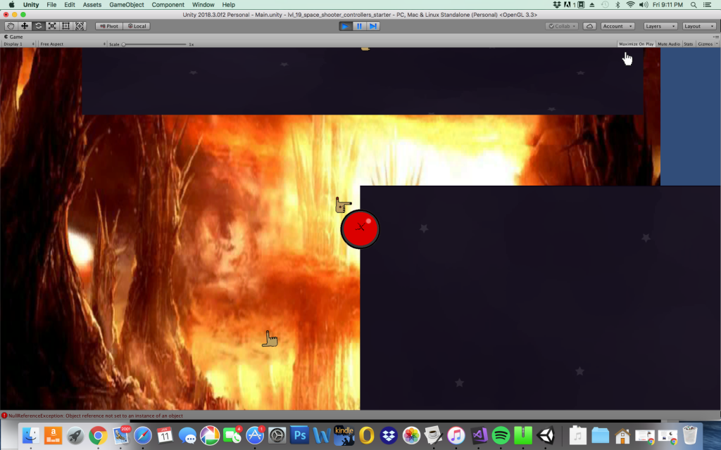
The background consists of three different images. The image of hell, and the image of stars each take up half the screen and both move in different ways which makes the motion interesting. Then, at points the images don’t fill up any of the space on the screen, and another image that’s just a light blue background reminiscent of an old windows computer background appears. This was meant to in a sense represent void or empty space instead of being thought of as another image moving on the screen, but I’m not sure if that came across properly. One final note is that the split screen with the two images is also somewhat of a reference to the supreme shirts that have two different band tees on the same shirt, and those shirts are something I associate with 14 year olds.

The original idea for the gameplay for the game was a sort of turret tower defense game where the player could score points and buy power ups. This was supposed to be the main form of progression with some sort of a final boss as a finale. Also, the points used to buy powerups were also required to get to the end of the game, so the player had to decide whether to buy upgrades or try to finish the game. This was somewhat outside of the scope of my current skill level and time constraints, so I went with a simpler game where the player rotates around a button and shoots.
The a.i. for this game is very simple. The enemies just move back and forth, spawn at random points, and shoot at random intervals. As the game goes on, the intervals for when an enemy can shoot get smaller and smaller. There was an additional a.i. that was supposed to shoot when it was aiming at the player, however it didn’t really work. To add some variety, I configured the spawn points in such a way that they were able to move in from the top, left, and right sides of the screen. The enemies are the only thing that pushed the player back. Conversely the only thing pushing the player forwards is shooting and time. Player path and a sense of progression of the game is definitely lacking in this version. Overall, I feel like this game doesn’t really play as well as I’d like it to. Instead of seeing that certain elements of the game didn’t work or feel like they should, I decided to keep working on it in hopes eventually it would. I think this overall limited what I could do with the game and caused it to end up playing somewhat poorly.
")

