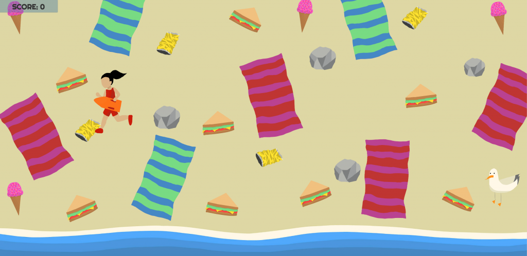
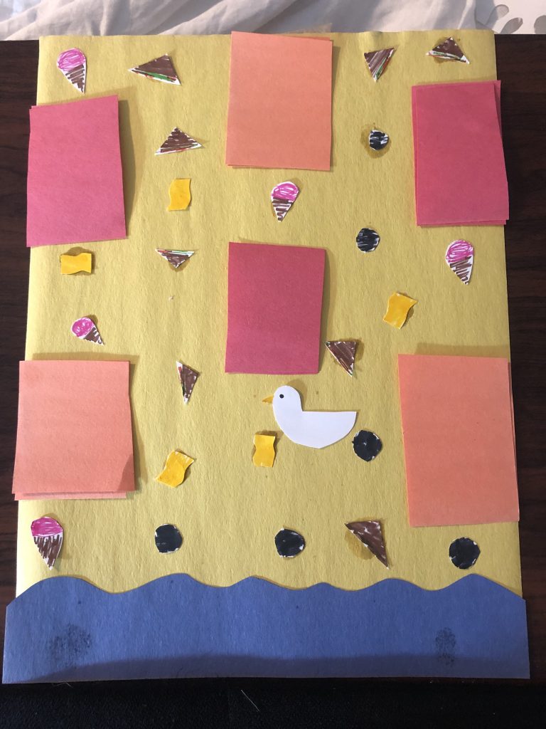
My game is Seagull’s Snack, a collection game in which a seagull moves along the beach eating food. As this was the first game I had ever built, I chose to stick with a simple theme as not to overcomplicate any part of the game. The idea of a seagull collecting food on a beach, while not the most inventive, felt like an idea that was clear and concise, and was still able to have an element of playfulness to it.
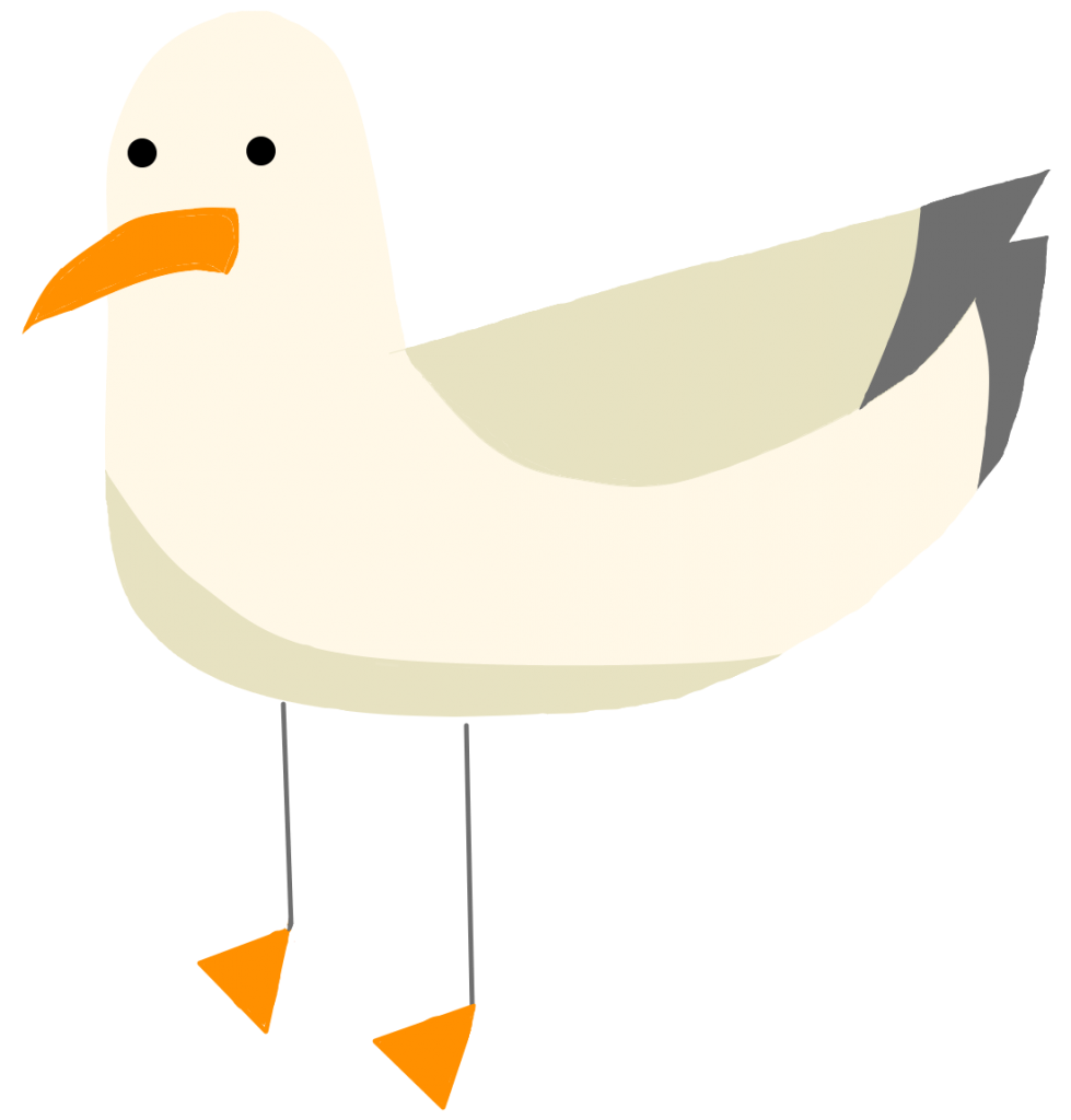
Going into this game, I was unsure how it would turn out, as I don’t have much prior experience with art or game development. As I was worried I would be limited by this, I focused on Costikyan’s idea of creating endogenous meaning within a game. Creating a consistent tone within the game helped give me direction while making the game, as well as unifying the game, so it felt more cohesive, rather than just a sum of its parts. Once I had settled on a world metaphor, the design elements of the game started to fall into place. I knew I wanted the game to look bright and graphic, as I thought it would add to the tone of the game. The more simplistic the art, the more playful the game felt. I chose a color palette that reminded me of vintage postcards of the beach. I didn’t want the colors of the game to be overwhelming, but I still wanted the game to have a nice, beachy vibe.
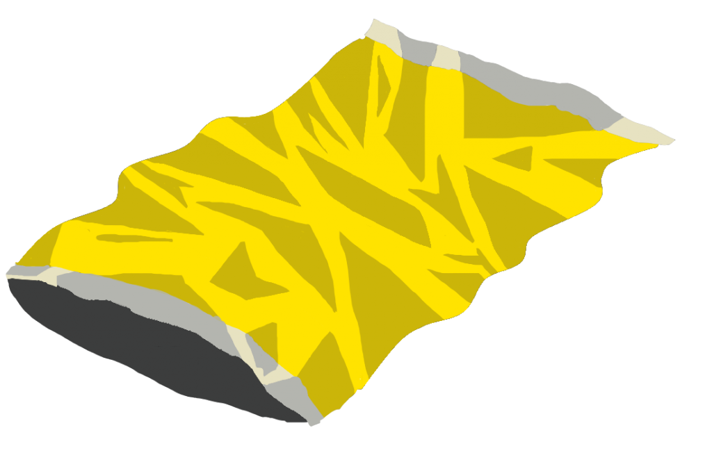
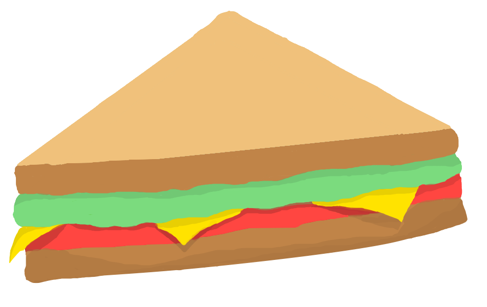

The choice in designing collectibles felt obvious, having ice cream and sandwiches as positive collectibles, and trash as a negative collectible. These items are all quite easily recognizable and had clear connotations, which helped enforce the world metaphor. I also played around with the sizing of the game objects. All of the collectibles are roughly the same size as each other, as well as the seagull. While a sandwich the size of a seagull might look ridiculous in another context, through the idea of creating endogenous meaning within the game, these choices felt natural and added to the tone of the game.
The map of the game varied greatly over the design process. I was worried about making the map feel too congested, or the elements too small. I settled on a horizontal map as it felt the most beach-like, and I used towels as barriers. I chose to place the towels at an angle, to add some dynamics to the game and keep it from being too uniform. Originally, I had been planning on making the game with a vertical map as that was the format of the tutorial, but after making my paper games, I realized that it wouldn’t be the best use of space. In a future version of this game, I might add zones, creating diversity within the map. I didn’t make zones in the game as I had a hard time visualizing how it would affect the map, but if I were to expand on the game, or make different levels, I think adding variability would help create depth within the world.
One of the parts I enjoy most within the game is the sound. After a long time digging through a website of free sounds, I settled on an upbeat, cheerful song to play as background music. I also added the sound of waves as background noise, to reinforce the world metaphor. Each collectible makes a different sound when picked up; the sandwiches make a munching sound, the chip bags make a crunching sound, and the ice cream makes a slurping sound. I thought that these sound effects would add a fun element to the game, as well as emphasize to the player that they had picked up a collectible.
While the game is simplistic in nature, I focused on creating an easily comprehendible and unified world metaphor based on this concept. I wanted to create a game that was clear to the player what to do, as well as being fun and having a clear aesthetic.