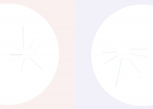
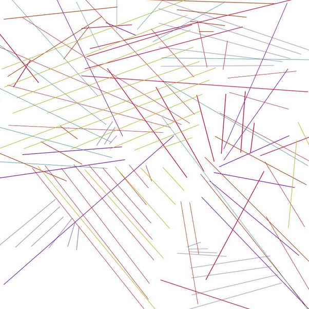
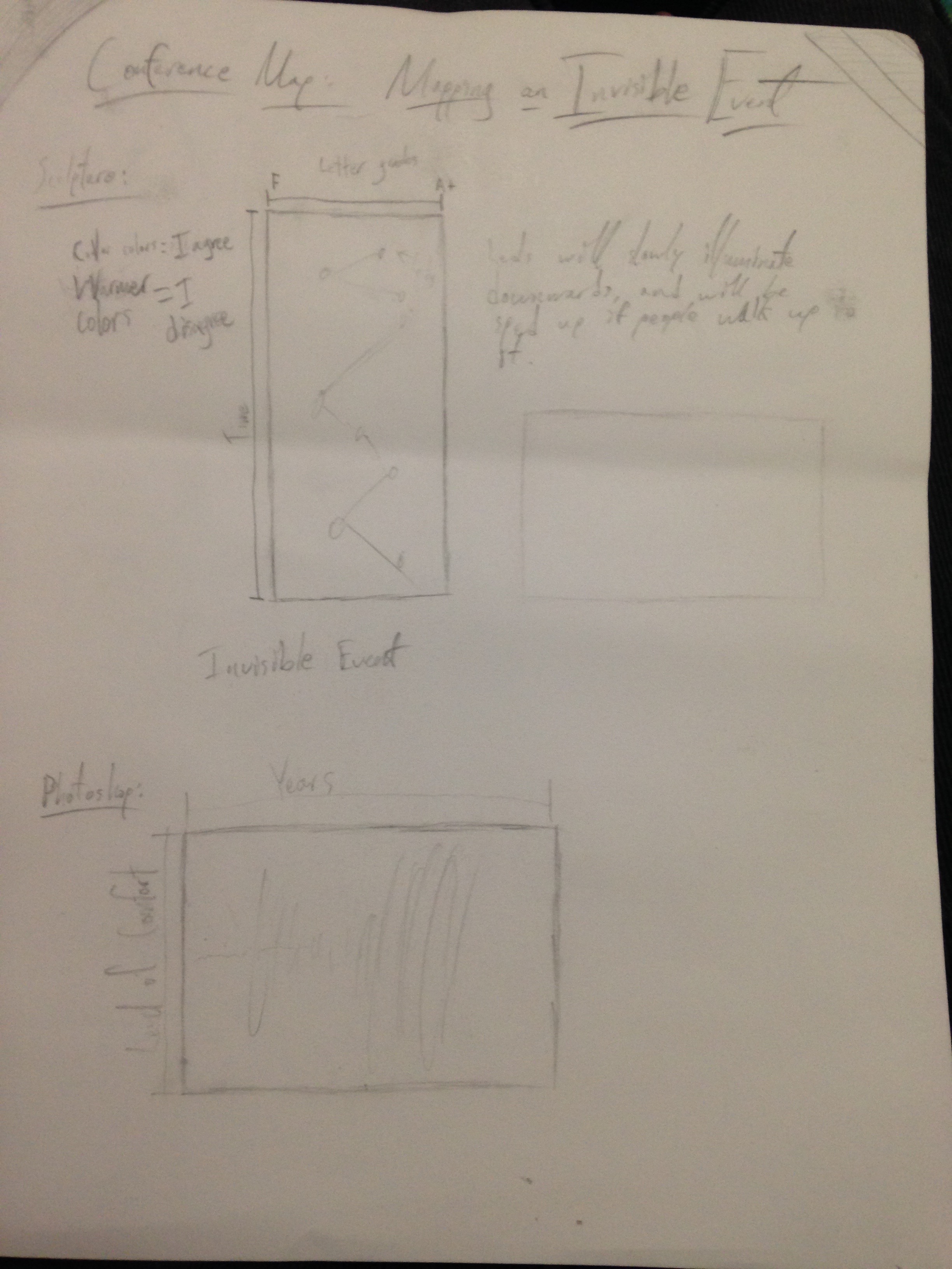
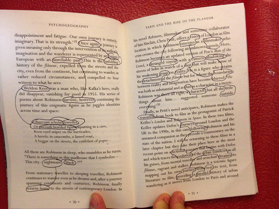
One of the main criticisms of my last draft was that because both locations were represented with the same line pattern, there didn’t seem to be any discernible difference between the quality of one place over the other. Therefore, my map has undergone a subtle shift in design that is meant to better reflect the qualitative differences between both places.
First, I got rid of all of the days in which I didn’t go to the location, which I had previously represented with a black line. I also added the variable of line length to represent the time spent at each place for that day. In addition, I further split up both patterns with colored sections, red being WARM (good) and blue being COLD (bad). I arranged both patterns in a circle, with the Pub (right) cutting off at the top and facing downwards, which emphasizes both the length of the lines and the negativity that is tied to it. In contrast, the Andrews Backyard (left) has more lines and is more vibrant with more red lines than blue.
I believe, overall, the project did achieve the goal of mapping an invisible event, that being the evolution of my time spent in locations I desire to go to versus locations I don’t want to see as often. I do question the impartiality of the data, given the fact that so much of my mood is dependent on external forces such as the weather and the knowledge that I’m recording my behavior, however I don’t think the intervention of those two factors necessarily negates the results, it merely frames them. Indeed, the project could be described as a motivational intervention of my free time, with purely visual records of how my actions changed thusly.


