My conference work derives from the wave clock code. For my project I am working on putting together a collection of wave clock sketches that vary in color scheme and presentation. My ambition is for each sketch to capture the elements of its name in color and feel. Currently I have five different sketches titled Pineapple, Saltwater, Greyscale, Moth, and Sarah.
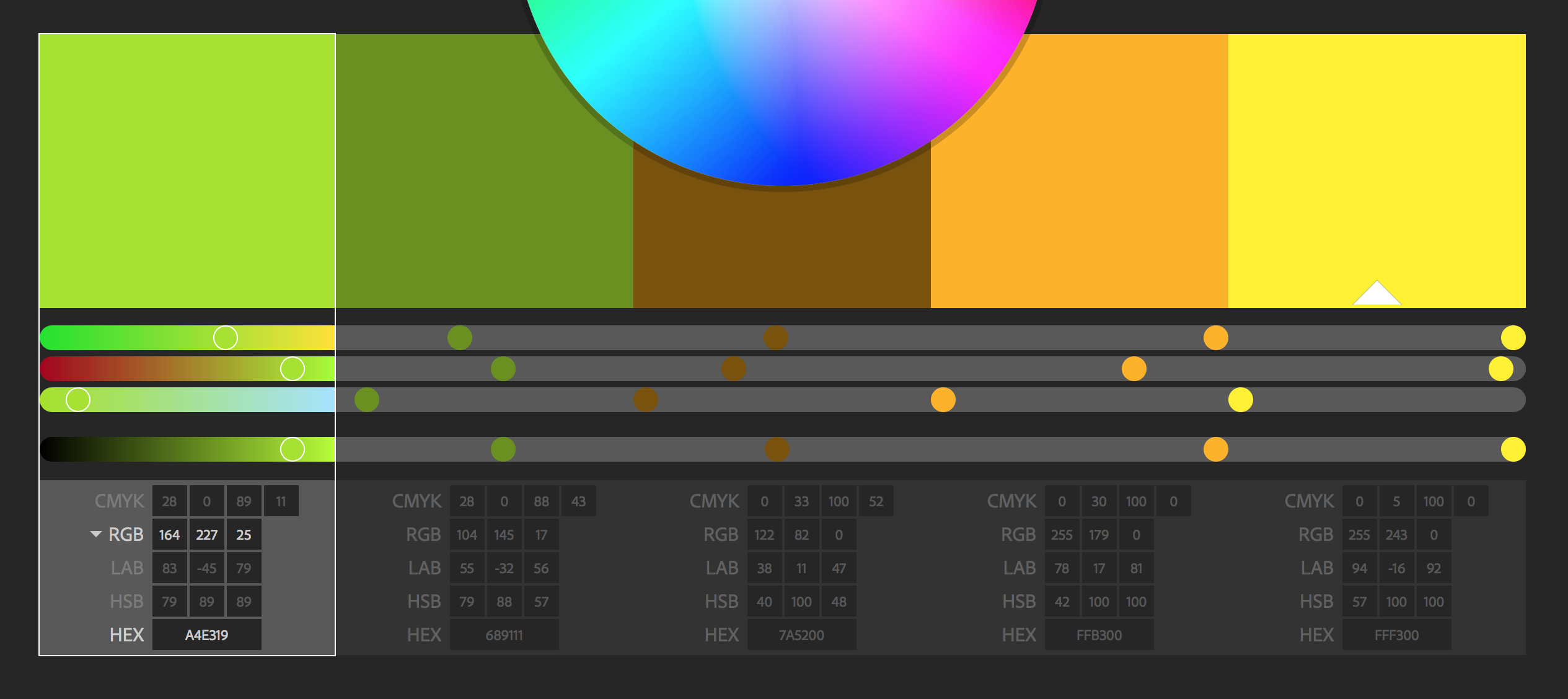
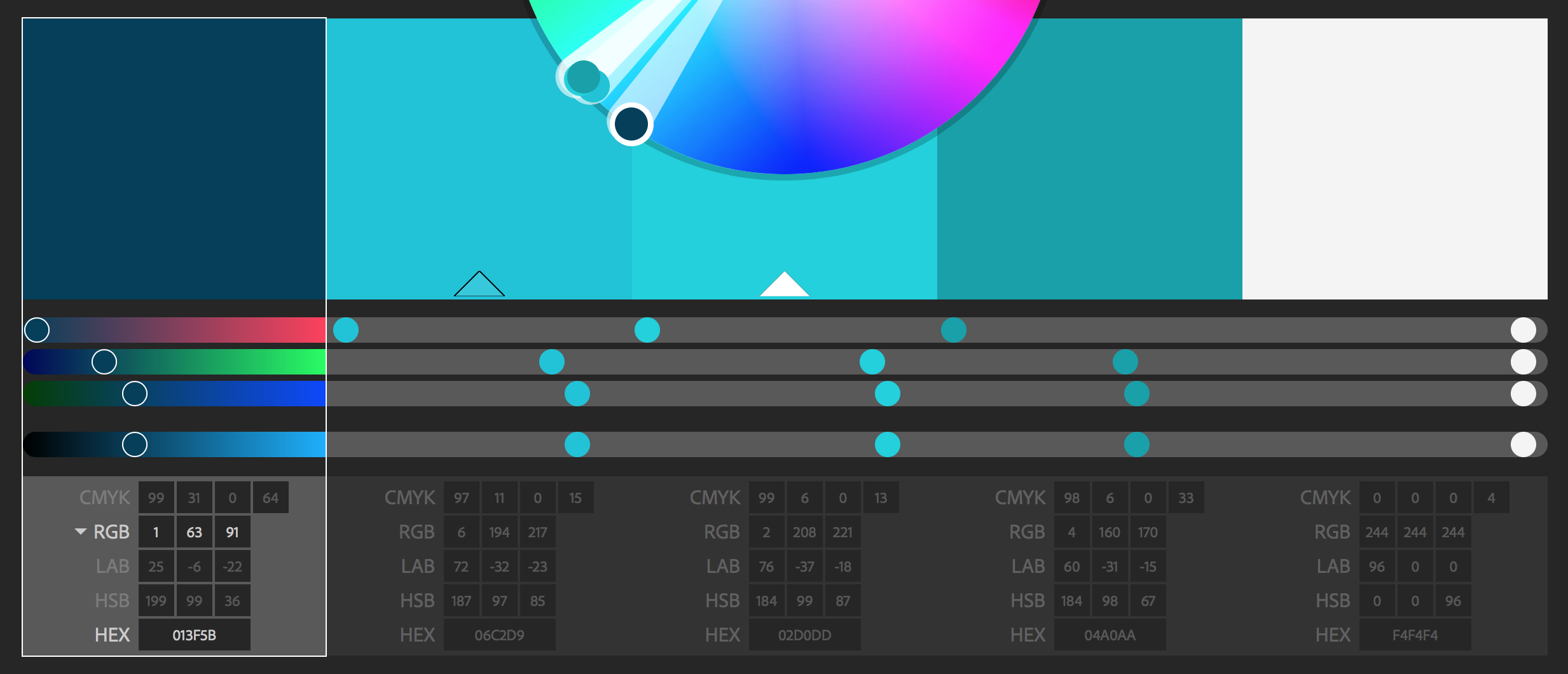
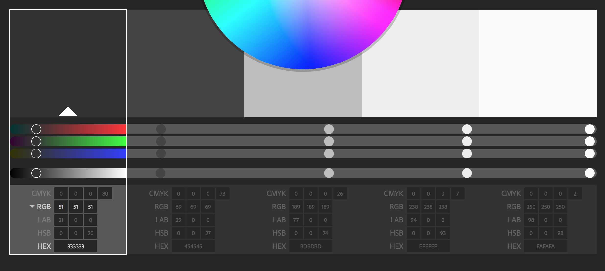
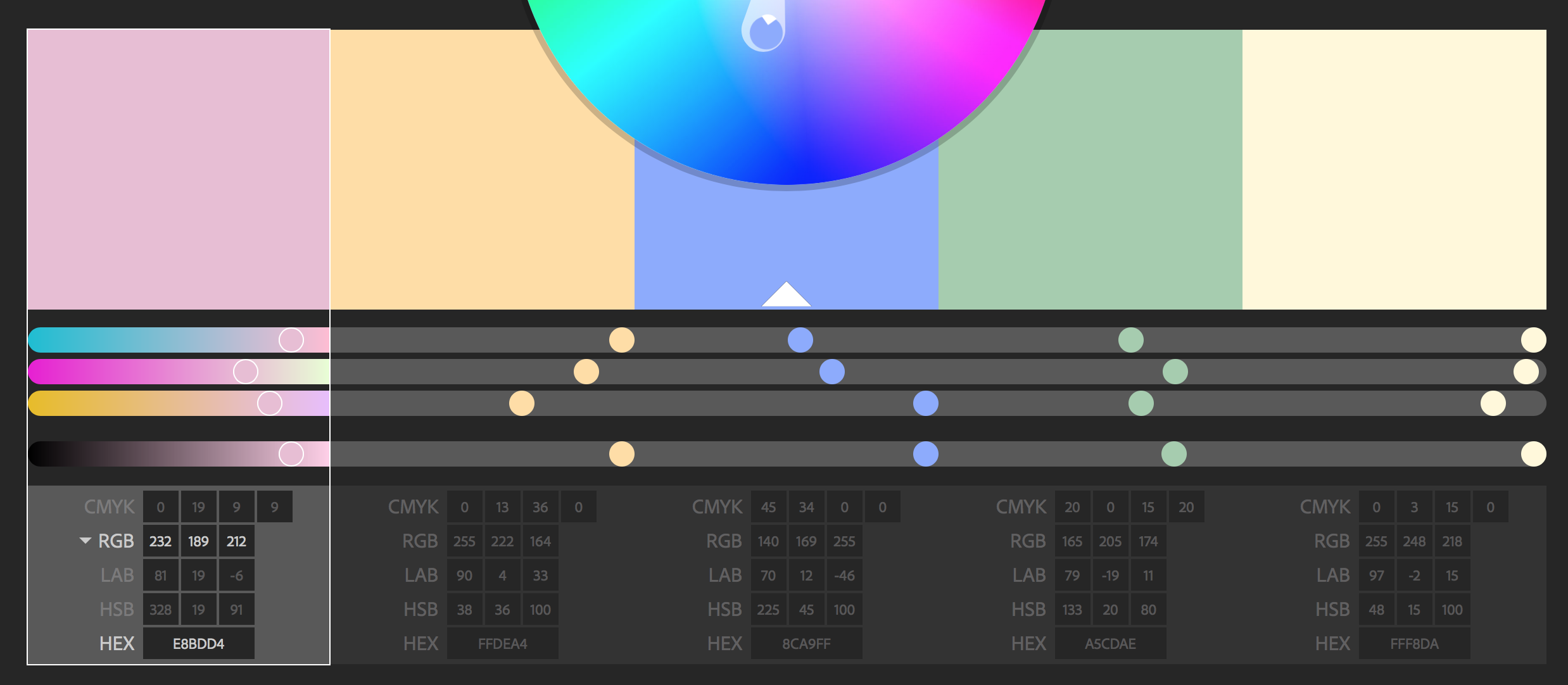
For the color pallette of each sketch I used Adobe Kuler, an online library of color schemes of five, to find color combinations that suited the aforementioned keywords. Choosing the correct color combination was an essential part of the sketch since color helps control the emotion and life of the presentation. In order to get a real feeling of pineapples or saltwater, the best color combination needed to be coherent, relevant, and telling.
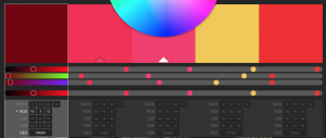
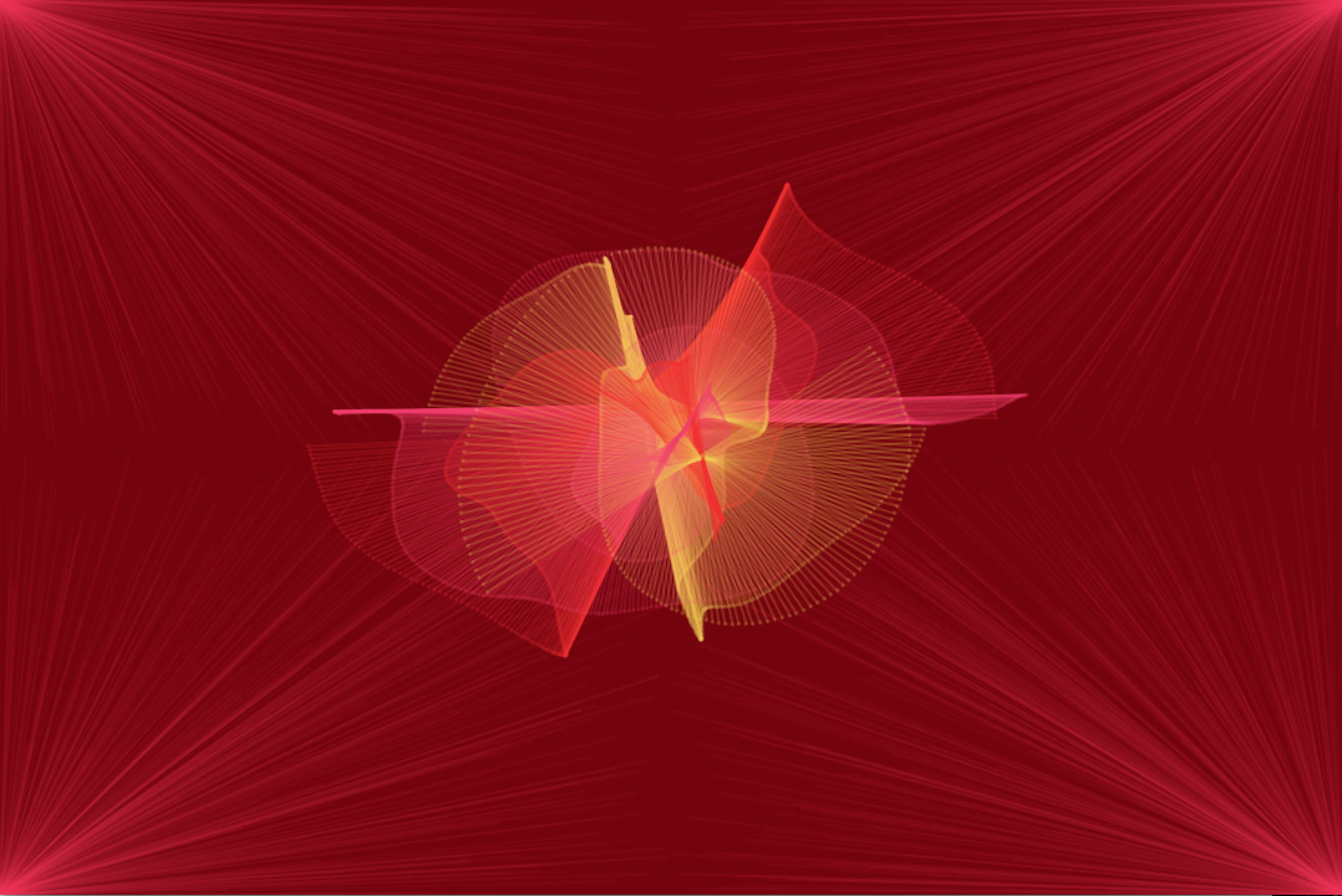
Each sketch, with the exception of Moth, is essentially presented in the same format. Several wave clocks are in the center of the screen while the background has different elements that add to the name of the piece, either as animated or stationary shapes. The background is one of the few variables in these pieces that changes from each sketch, and so it relevance to the overarching theme of the piece is crucial. For example, in its early stages, Saltwater’s background consists of ebbing arcs which are reminiscent of waves. For Sarah, dynamic red lines reach for the waveclock in the center of the screen, complementing the vibrant red color scheme of the sketch.

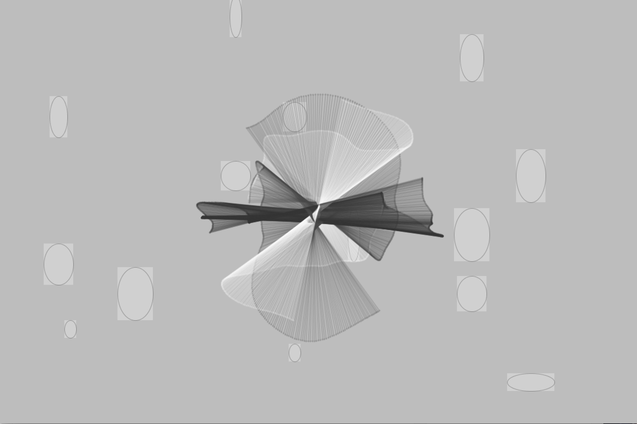
What is important to also keep in mind is that the background parts must also complement the wave clock, which is the dynamic centerpiece and so naturally is the center of attention. If the background components and the wave clock do not mix well, then the piece will feel contradictory or imbalanced, contrary to the ambition of coherent themed wave clocks. With Greyscale one can already note that the background elements, which are blocky and static, do not go well with the fluid diaphanous qualities of the waveclock in the center. These will be tweaked to create a better overall feel. As with most generative art projects I have worked on this semester I am always open for the unexpected and expect some interesting qualities to occur randomly.


