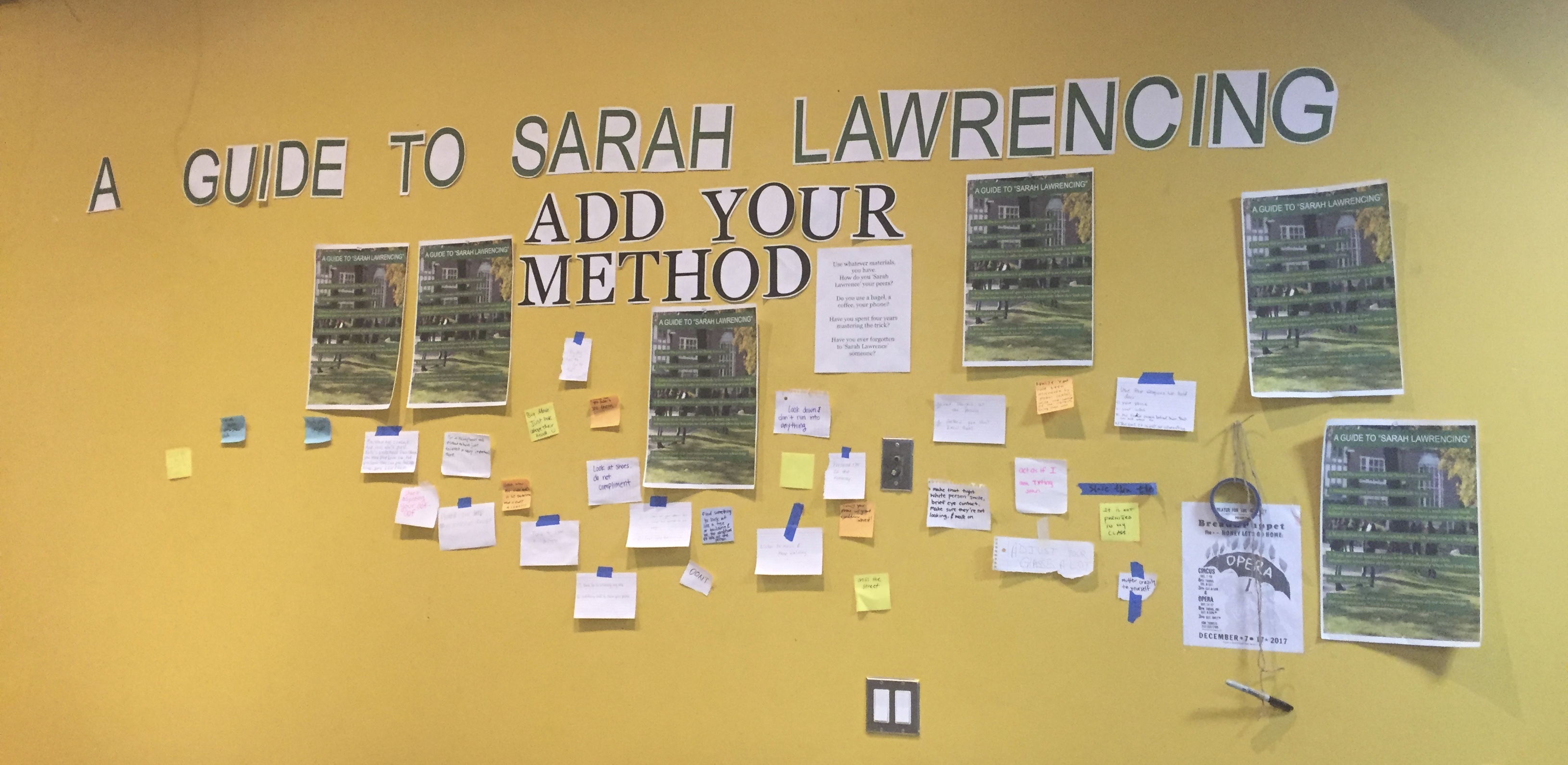
 My aim in revising this project was to receive a significantly increased amount of participation from viewers. I wanted this second version to be physically bigger in terms of font and poster size and in a space that would receive more traffic. I wrote ‘A Guide to Sarah Lawrencing’ in font size 600, and ‘Add Your Method’ in 500. I chose the yellow wall, a sort of hub in Heimbold because of its location next to the café. I hung up six copies of my poster, which I used in the first version, scattered throughout a section of the yellow wall. I put a piece of paper that gave further instructions right under ‘Add Your Method’. I hoped that placement would be natural for a viewer’s eye to read the titles and then look below to see the instructions. The cut-out letters originally were just because I did not have paper large enough to fit the whole title and I didn’t like the look of a bunch of 8.5 X 11 pieces of paper next to each other. However, I later realized that it added to the DIY nature of the project, made it arts & craft-like, and potentially convinced more viewers to participate because it was hand-made and not perfect.

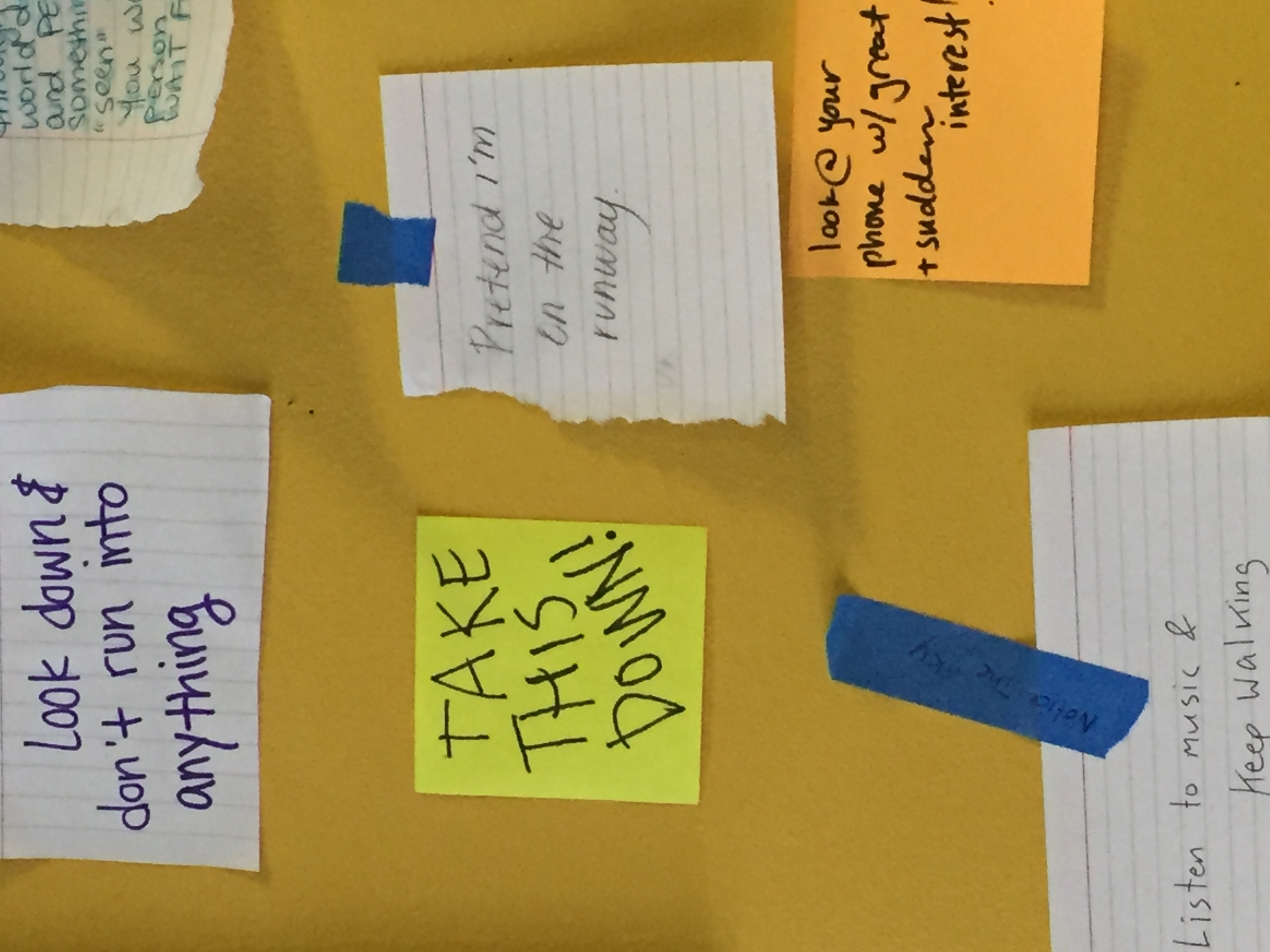
At first, I didn’t provide tape, sticky notes, or a sharpie due to the disappearing materials in the first version of the project. After a suggestion from the class, I put a sharpie and a roll of tape onto the string that I then hung up on a thumbtack. These materials never disappeared because they were much more clearly a part of the project. My peers have used everything from scraps of notebook paper, index cards, sticky notes, and even the tape I provided to write their methods. The texture of all these different materials is something else that adds to the DIY nature of the art and makes the project accessible. My peers were able to use whatever materials they had on them.
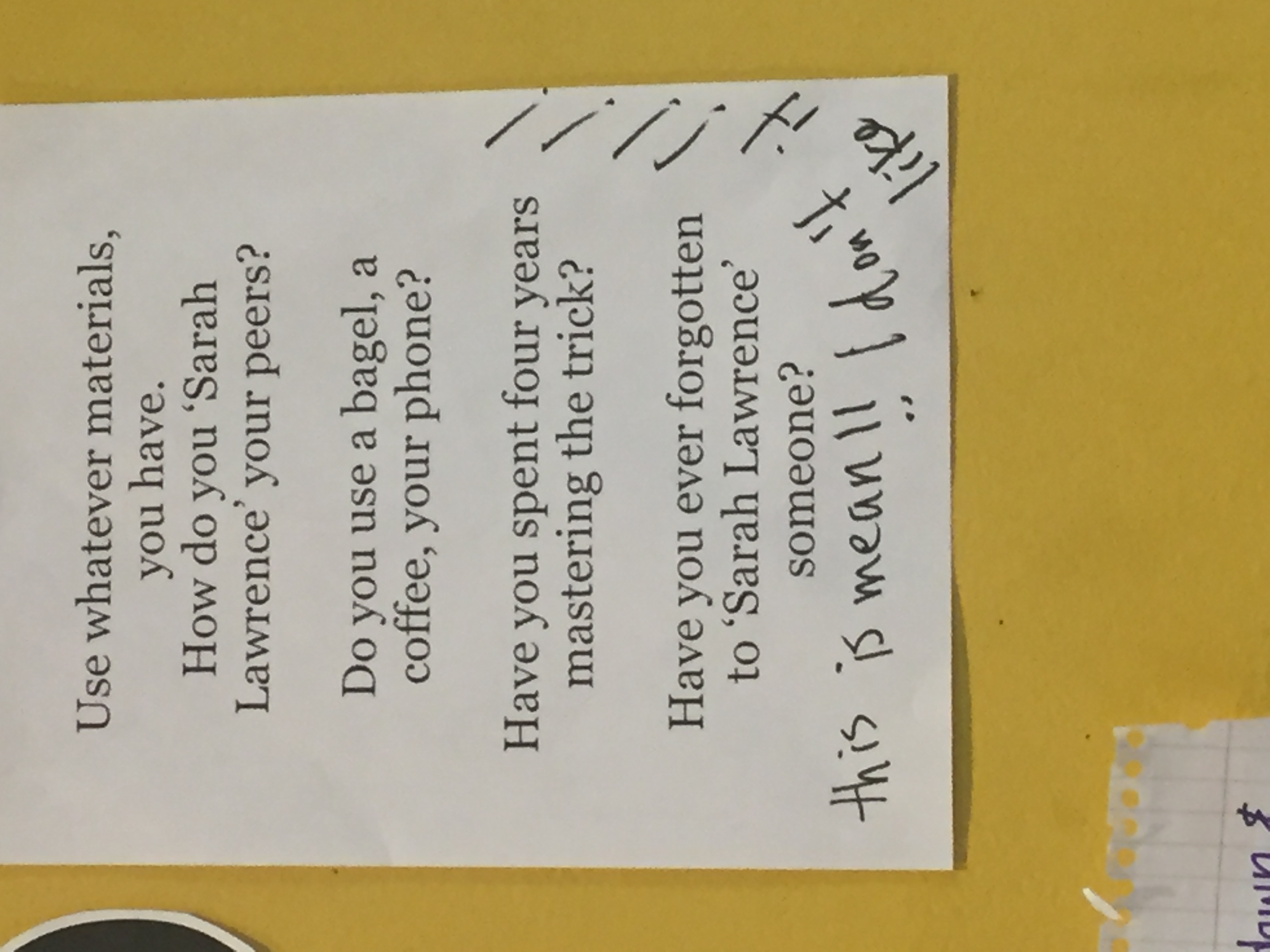
We’ve talked a lot in class and in conferences about ensuring that one’s art does not hurt the feelings of viewers. I was doing pretty well, until this version of ‘Sarah Lawrencing’. During the last couple days that my art was installed, I found comments such as “Take this down” and “This is mean! I don’t like it!” on the yellow wall. These comments do not feel directed at ‘Sarah Lawrencing’, but at my art. I panicked when I first saw them, severely worried that my vision wasn’t coming through in the installation. At the same time, my art is not original and does not come from me, in the sense that everything that I wrote on the poster, came from actions that I watched peers take. It came from a social culture at SLC. Maybe these comments were a defensive response to a reality that my peers do not want to face. Even if I had removed my installation earlier than I had planned (It was only up for a week anyway), ‘Sarah Lawrencing’ would still occur constantly on this campus. However, I also do not want viewers to see my art as mean or cruel, when in fact I see ‘Sarah Lawrencing’ as rude and mean, and therefore am attempting to combat it. There are clearly peers who do not understand my aim with this art, yet the majority of the sticky notes are positive, funny, and understand what I am asking and what my goal is. If the majority of viewers understand the art is that enough? I realize I cannot please everyone. However, there is a difference between someone not liking my art because it doesn’t suit their personal style versus someone finding my art offensive or rude. It was mentioned in class that in order to get someone to care about a serious issue, you must first make them laugh. I see this project as doing just that. Comments such as ‘Take this down’ seem to want me to speak about ‘Sarah Lawrencing’ in a serious manner, but I see that as the next step, not the first.
One viewer went so far as to post an 8.5 X 11 piece of paper on top of one of my posters. They wrote, “Can we love and appreciate and enjoy this community of awesome people rather than be petty and endorse negativity <3 for this SLC community”. The placement of their commentary intentionally on top of my poster, signifying that they see my poster as “endorsing negativity”. What this viewer is asking cannot happen until SLC combats ‘Sarah Lawrencing’. It’s interesting to see that these comments are less of an attack on ‘Sarah Lawrencing’ and more of an attack on my art. Do these viewers respond just as strongly when they witness ‘Sarah Lawrencing’? I highly doubt it. My posters were very clearly sarcastic and humorous. This commentary is all part of working in public space. Since, I am asking viewers to engage, it is at their discretion what to put up.
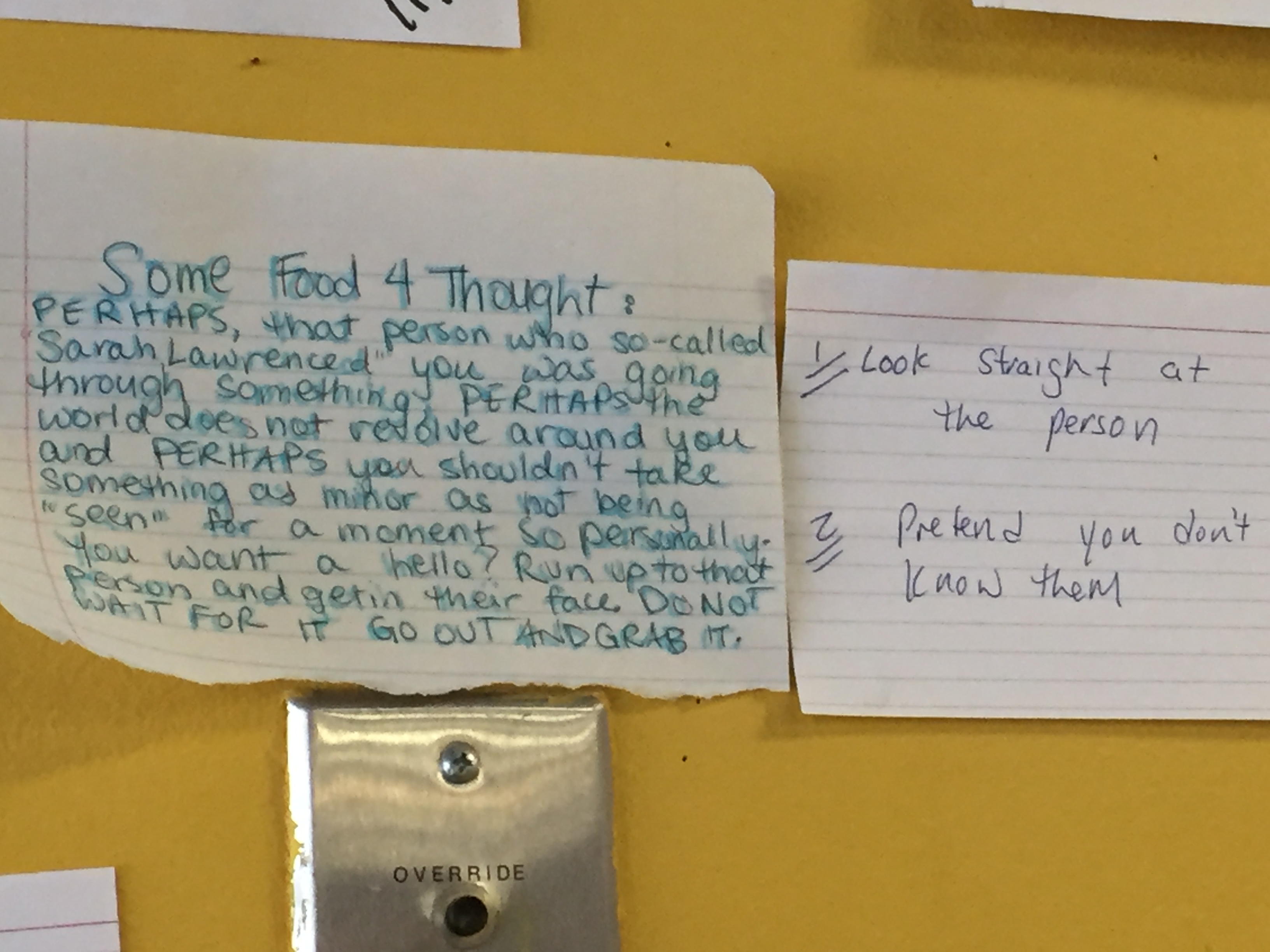
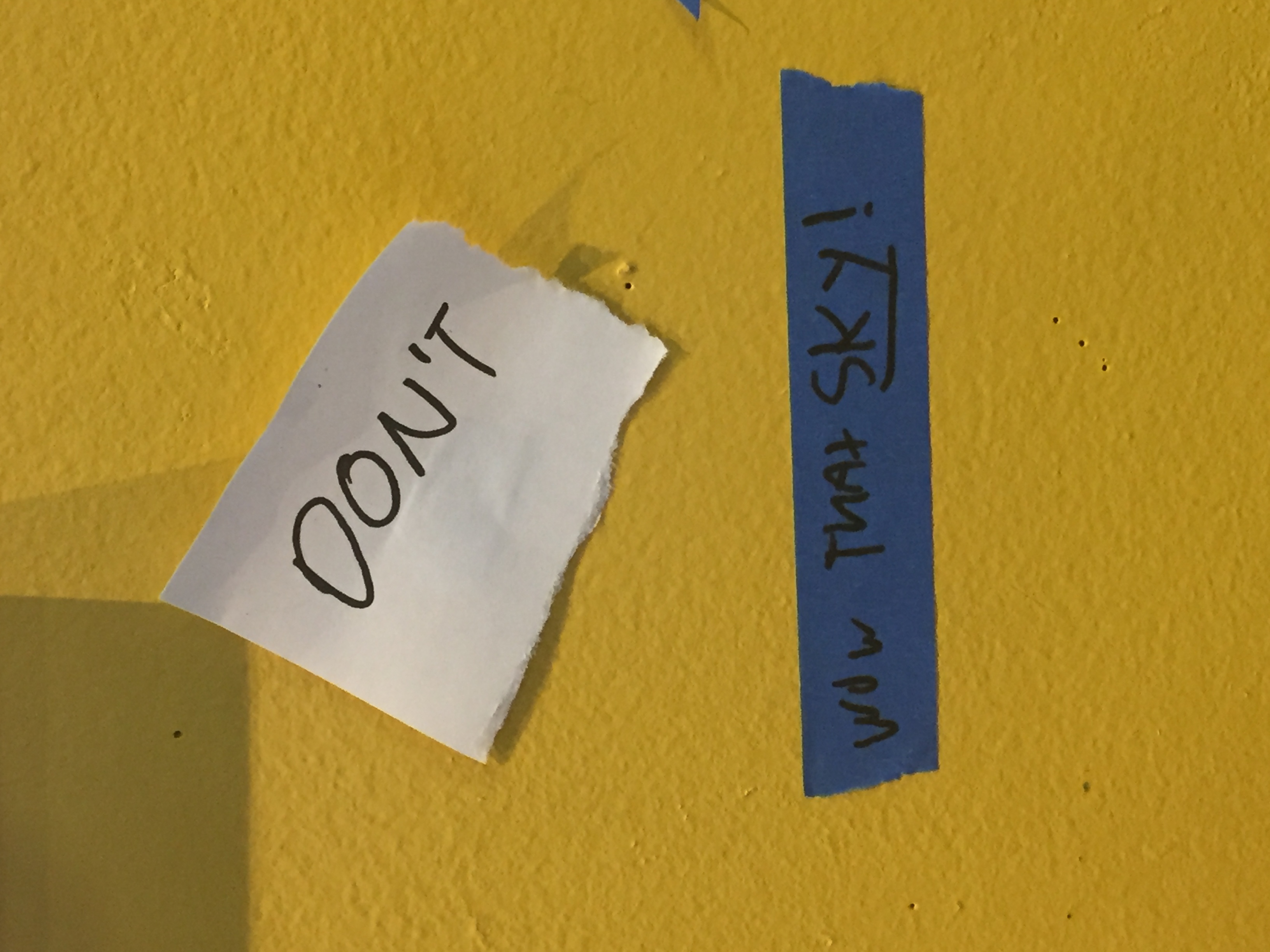
There are still other viewers who put up messages on the polar opposite side of the spectrum. They wrote comments, such as ‘Pretend like I don’t care about y’all, cuz I don’t’ or ‘perhaps you shouldn’t take something as minor as not being “seen” so personally’. However, being seen is imperative to fostering community. My art was part of a much larger conversation on campus climate and social life.