For conference, I was most inspired by Bret Victor’s call to stop drawing “dead fishes” –– a metaphor to suggest that computer art should not seek to replicate older mediums but rather take advantage of what is only possible in making art with the machine. Essentially, I was interested in interactive art. I have also always been interested in incorporating live video feeds in installations and performance, so I thought it would be fitting to use the webcam function as a way to explore interactivity and, more specifically, the interplay between the artmaker and the computer. Because these use built-in webcams, it was decided the best framework for this project was the self-portrait. These pieces utilize what is called a software mirror: instead of rendering what the camera sees, the pixels in the camera-feed are loaded and then processing gets the colors of those pixels at each specific location and repurposes it into the color call for whatever is drawn in processing. What is worth noting, then, is that it is not the literal camera reflecting back at us –– no, it is actually a sequence of pixels that are similar to where things are in our world.
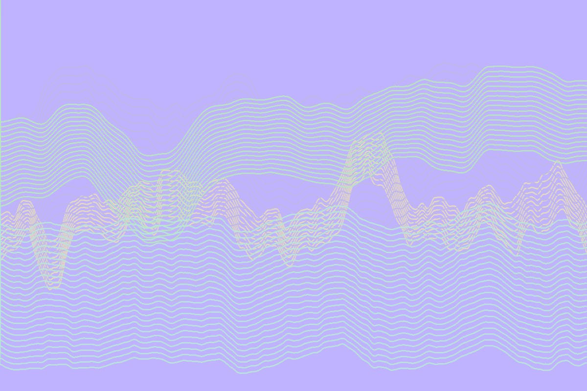
Where I end (in these three pieces) came about in a very Molnárian manner, as it started from a simple Image call to something else through small incremental changes; very often did I go back because I was displeased with what I added. Since we were not learning pixel manipulation in class, it was important I took small steps as it was simultaneously a process of learning the processing library for video. The first piece (“me: at arm’s length“) features a random walker within a counted loop; its color depends on its coordinate, based on the color within the camera’s pixel array. The result is a very impressionist-esque software mirror which is continuously redrawing itself, so it is always seeking to catch up to you –– and especially so if you are moving fast.
To me, it looks very Hertleinian in that it is quite noisy; even if one were to stay still before the camera, there would be tiny random movements as the random walker continues to redraw itself. As a result, it looks very organic, almost painted. Because you are always ahead of the drawing, time is a recurring presence as you are constantly looking at what just happened, while things continue happening. I think this is more representative of reality than a simple live camera, as life is a continuous sequence of becoming. With the motif of time, I decided to create a class which renders the Chinese character for “time” which moves randomly and bounces across the screen. The main reason for the use of Chinese text specifically is that it is much more compact than words that rely on alphabets. To further increase the sensory of interactivity, The fill for text color was inputted based on the pixel color value in the center of the drawing.


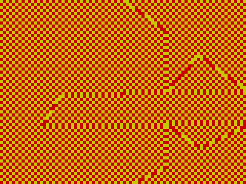
Honestly, I was somewhat uninterested with “me: at arm’s length” because it seemed too representative of what was in front of the camera –– it still felt too literal. Thus I attempted to spruce things up by abstracting given camera values. This is how my second piece (“me: dissolved“) came about. I first created a software mirror from a double-looped grid instead of a random walker; the ordered grid definitely gave the piece a more clear-cut structure than the prior. In this case, I only extracted color from the first row of pixels and those colors were then what colored all of the squares in its column. Every 200 frames, it saved and copied the current video pixel array and plugged it into a color array variable. After the first array copy, the square colors were then based on the saved pixel array subtracted from the current pixel array. Any slight movement would be rendered through inverted color. First and foremost, I noticed that this process was extremely light sensitive, as any deviation from the background would be registered and even minor shade differences would be displayed. Consequently, it seems that the machine was in conversation with itself as changes seem to subsequently send the machine into a spaz of tangential change. Each 200 frame checkpoint would cause further disarray as there was always a diversion from the saved pixel array –– overlaid amongst the gridded order was a certain chaos.
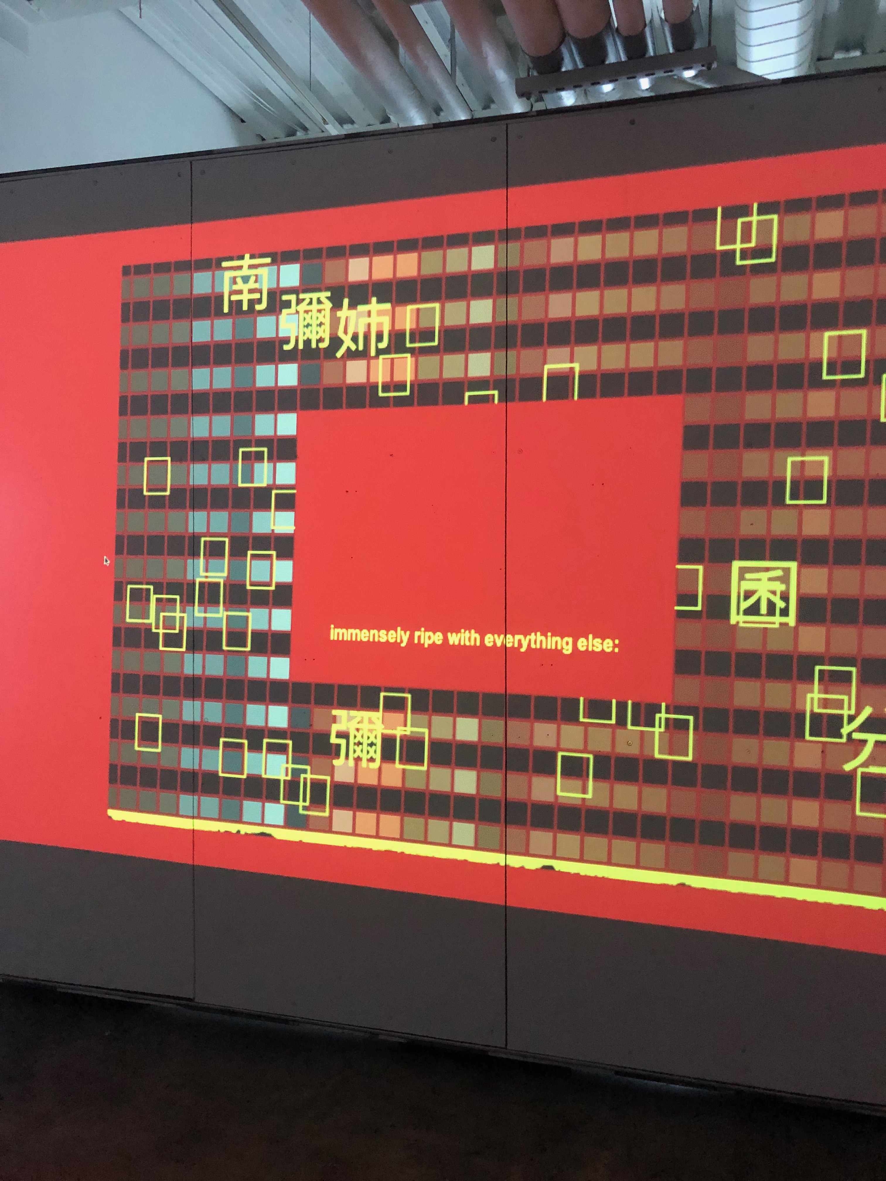
I utilized the same text class, however this time it read a string sequence of characters instead of a singular character multiple times. I used the first six lines of Vietnam’s most significant literary epic, The Tale of Kiều, in Chữ Nôm, which is the Vietnamese equivalent of Chinese characters (like Japanese Kanji). The empty blocks are also characters from the poem, in place of characters nonexistent in modern day Chinese –– i.e. uniquely Vietnamese. Chữ Nôm is basically a defunct written language, replaced by a romanized alphabet. By serendipity I really liked that these texts did not fully render despite my attempts to correct it; the corpses of Vietnamese history are actually put to the fore and underlined. Though the blocks are universal unicode signifying nonexistent symbols, in context it is ripe with Vietnamese traces. This was probably my favorite version because it also reminded me of the aesthetics of 90s Hong Kong cinema: futurism and neon signs –– combining both an electric and swampy palette visible in Wong Kar Wai’s films. In a way, this piece focuses more on the texts of history, that which is more generational and cultural.


It seemed “me: at arm’s length” was more successful (or rather well-liked) at the class show. I am not surprised for it was much more digestible than “me: dissolved” –– you could tell what you are looking at and that it was yourself. I feel like the latter piece was ambiguous in what was deciding the color for the grids. If you were moving, you could maybe trace that you had an effect on the camera because it would change accordingly. However it becomes less apparent after a few array shifts, in which then the machine is more likely affecting itself. If I were to go further, I would attempt to include a reset in order to allow a bit of calm after the storm (and before the next one). That being said, “me: dissolved” is in fact my favorite. Perhaps because I was able to align it more closely with a sort of sino-aesthetic… Or perhaps because it is so ambiguous what decides the colors… It could be you; it could be the machine; it could be both. I feel like it better disrupts a sort of self, just becoming pure color value.
Returning to the idea of the self-portrait, I wanted to try one more approach at portraying my self, the operative word being “my” –– which is where my third piece (“me: up close, intimate, and most of all personal“) comes in. This one is a combination of the first two iterations. It is an identifiable software mirror extracted onto an orderly grid. In this case, the scale of the camera’s input is imploded; in other words, it is zoomed in. I aimed at bringing it out a bit more concisely the 90s Hong Kong cinema look. Therefore, I increased the stroke weight of the grids, made them a golden yellow; I also removed the variable that filled the text class based on the center pixel and made it a a sort of mandarin red. These are the colors of the Vietnamese flag, as well as the Chinese flag. Additionally, I took out most of the characters that rendered properly (leaving behind the un-rendered blocks) and replaced them with the characters for the practice of Nianfo –– or rather niệm Phật: “Nam mô A Di Đà Phật.” Nianfo is a Buddhist practice in which one repeats the name of Amitābha to facilitate meditation.
I would describe “me: up close, intimate, and most of all personal” as the most accurate (for what the word’s worth) self-portrait. First and foremost, because it is so uniquely proportioned in its zoom, it wouldn’t work in a gallery setting; the positioning is too awkward to be anything but personal. This piece is also much more calm –– a practice in Nianfo –– whereas the previous two had a more lawless energy. Only two things move here: the characters, and you –– and you only move if you want to; you may also stay very, very still. The meanings of the characters in “me: at arm’s length” and “me: dissolved” were arbitrary, while here I specifically chose to incorporate the Nianfo. If the audience knows Chinese, it might be clear they are Buddhist text; I will always know that. This is all to say, the first two pieces I would definitely install, but this one is truly for me, perhaps as a self-portrait should be. After all, does it matter if art needs to be ready for the public? Does a piece’s value get deteriorated knowing it wasn’t made for you?


