I have a talent for spinning yarns so believable even I forget what’s real, so when I engage in introspection I like to have tools, guidelines, a map. It’s safer; I’m less likely to commit self-idolatry or self-flagellation if I have a prescribed method or path to follow. For this reason I have always been very attached to tools like tarot and systems like astrology. (Just a warning: this is all going to seem rather ‘Dark Ages’ if you’re a science-minded type.)
I also enjoy exploring different philosophical perspectives on our experience of the universe. One of my favourites is the idea that ‘I’ am the way I experience the universe and the universe is the experiences ‘I’ have. This effectively puts me right at the centre of the universe as experienced by me (which is, after all, all the universe I will ever experience). Not only is this a lovely little ego trip, it also has interesting implications for the organisation of a map.
Hence my initial sketch; attempting map my world as if it were ringed around me. However, as I mentioned previously, I am not good at introspection without direction. I would never have found focus and I probably would have ended up panicking. Tarot spreads are too transient to map. They are true in the instant of your response to them and then they are outdated. It would have to be astrology.
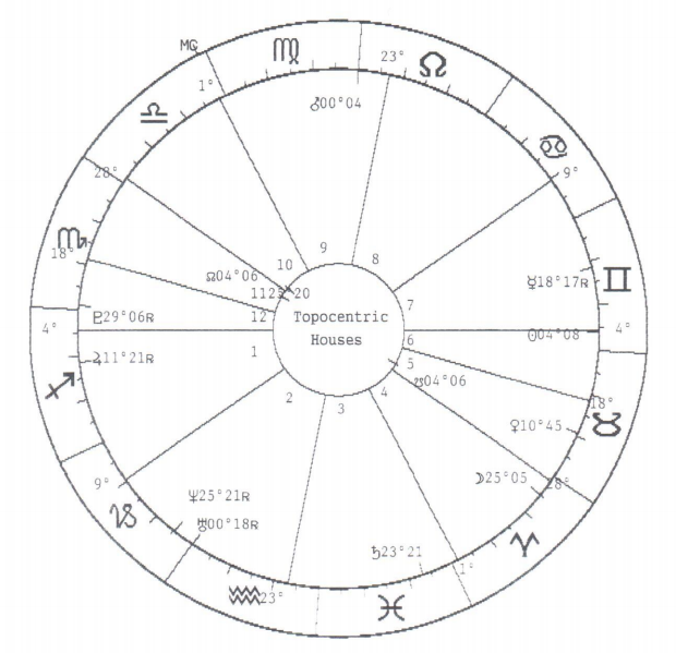
I thought this would be a good idea for multiple reasons. An astrology chart is basically a map of the heavens; if you stood on the exact spot I was born at the exact time I was born (see title) and looked up (and were somehow miraculously able to see all the stars clearly), then drew a map of the position of the constellations you would have made my horoscope (see Fig.2). In a horoscope, the universe revolves around you.
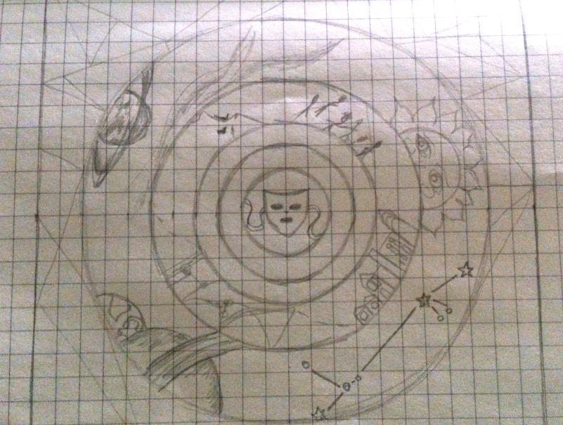
Secondly, I have barely any previous experience with Photoshop et al. Having a basic shape and some visual prompts to speed up the creation of a map might be a little lazy but I believed it would help.
In hindsight I was wrong.
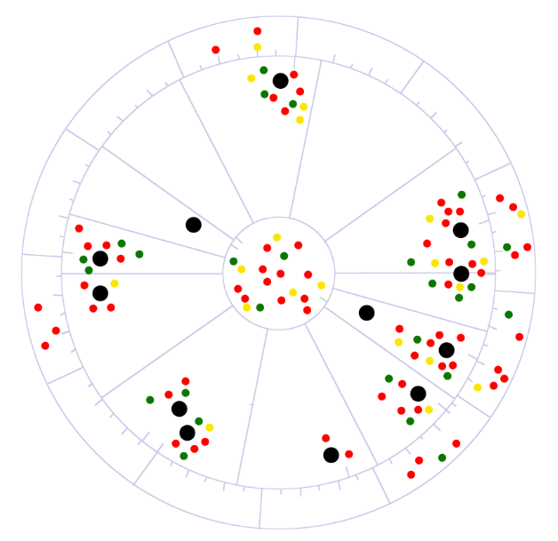
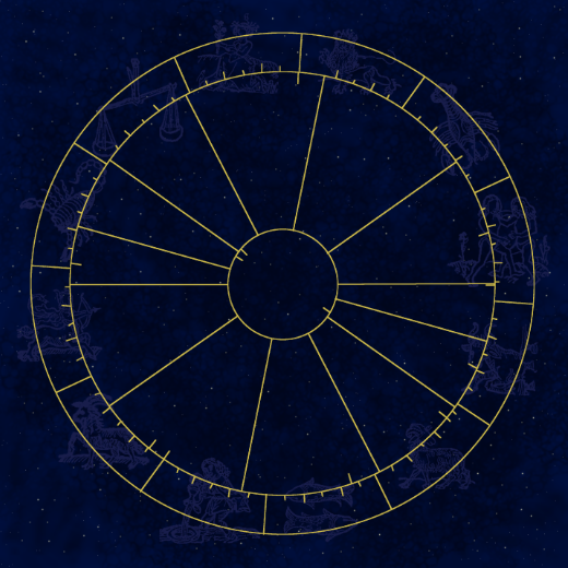
The nature of an astrology chart as a map-chart hybrid means that it is rather difficult to re-interpret without A) simply re-drawing the astrology chart with a pretty background and pictures (see Fig.3), or B) ending up with something rather more diagram-y than one would like (see, unfortunately, Fig. 1).
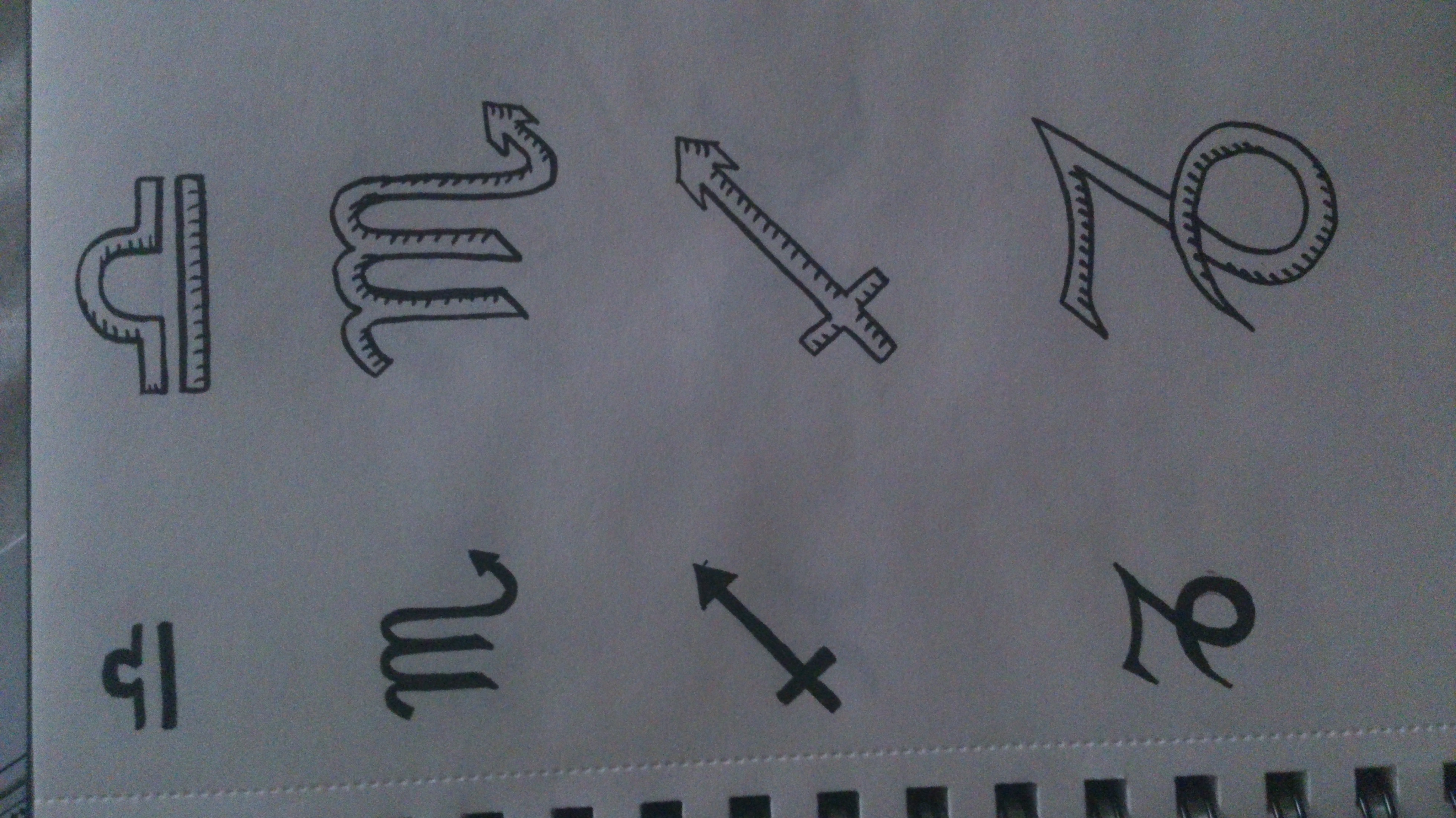
Fig.3 was attempt no.1. It did teach me plenty of new software tricks but failed to turn into a respectable map. I include it to show what I wasted most of my week on. After that failure I tried going right back to what it was I wanted to map. Trouble was, everything I could think of was either impossible or diagram-like. For example, using the astrological symbols as my sign system (see Fig.4 for potential designs) involves no creative effort and would achieve nothing.
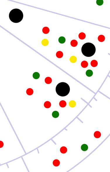
Eventually I decided to asses the relative verity of the claims about me and my life made by the horoscope. Red is ‘true’, green is ‘possibly/maybe/unknown’, yellow is ‘false’. I did not choose these colours with any concious associations in mind (hence red not being ‘false’), but I did want bright colours that I liked, because it is a self portrait. I realise this does make it look as if it had been executed in Microsoft Paint, but I quite like it, aesthetically.
The black dots are the positions of the planets in the astrological houses. Should I choose to continue with this map I will ink in the appropriate symbols (post printing) with gold ink. Similarly I will ink in as many of the details on the original chart as I feel aesthetically necessary.
Despite many setbacks and much panic and confusion I feel that at least I have learnt something from this exercise. The reading and the class discussion helped me not fret about my map not being comprehensible and my map being ultimately false. It was also helpful to have the definitions to go back to, even though I fear I have not met them in every instance.
For one, I am not entirely sure my map meets the criteria for a map; it is so sparse and there isn’t exactly a space in which the points exist. I would say that it is map-like in that it shows concentrations of truth in relative proximity to implied statements, and that the statements are only comprehensible in the context of the surface (the chart skeleton).
My map therefore proposes that the implications of the positions of various planets in various sectors of the sky at the moment of my birth is a valid representation of me as a person, due to the concentration of truth related to those implications. It does this by making visible my self knowledge (which enabled me to assign relative verity), and placing it within the framework of a series of suppositions about my personality.
This is all very thin, of course, and I would like to see if I can come up with some sort of system of connection to maybe add another layer of meaning (and make it more map like). I also think it will be much improved when I have inked on the details. I would do them digitally but they’re far too important to be left to the computer. I believe the gold ink will also add a pleasing depth and texture to the digital work, which is currently rather flat.
I was much inspired by Janet Caswell’s ‘Alternate Realities’ (Harmon, 128) and Kanarinka’s ‘Mostly Sunny, chance of showers late.’ (Harmon, 122) for their use of colour and the circular form. I particularly liked the instinctive randomness of Caswell’s, as well as her openness about the flaws of her system. It was very encouraging.
Oh, and for anyone who’s wondering – my parents had my horoscope made up when I was born and they only gave it to me on my 18th birthday. I hadn’t paid that much attention to astrology previously, but it’s really remarkably accurate.

