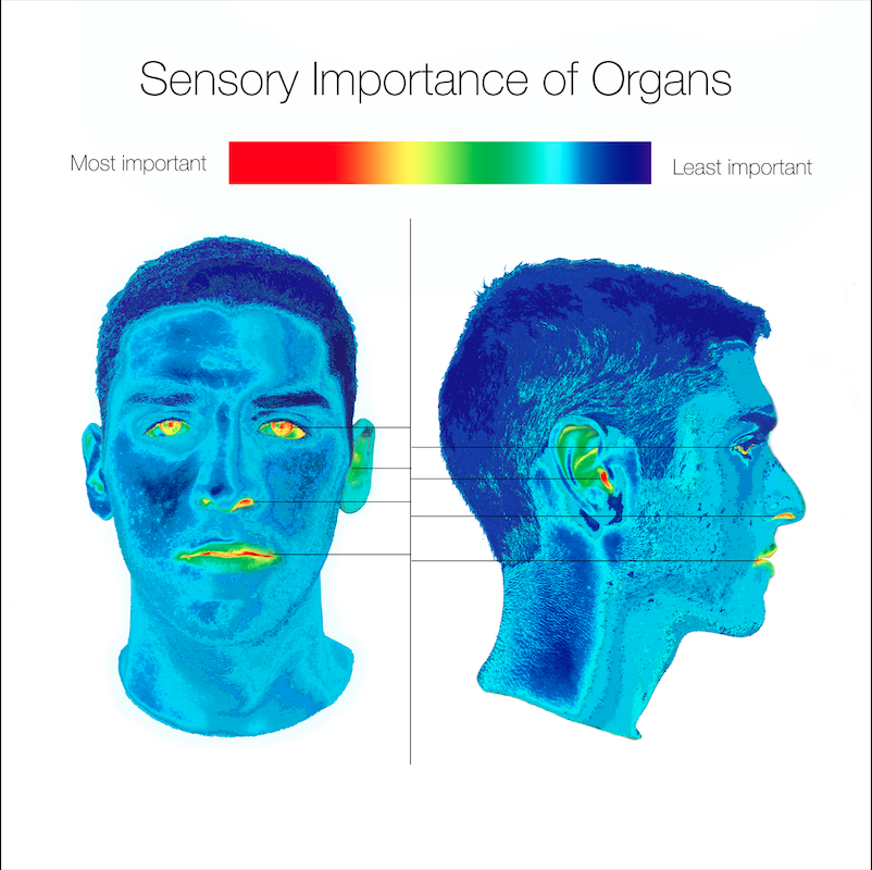
Before conceptualizing my map, I found myself visualizing it in a very abstract way. I was seeing colors and shapes way before I could actually make sense of them. Rather than a traditional birds-eye, navigational map, I wanted to map something more immaterial, like motion or feeling. I knew that I wanted to utilize color as a sign system, and to do it in a way that was as expressive as a pictographic sign system. By choosing something less literal, I also figured I could make an image that was subversive, in a way. My first sketches are all toying with the idea of thermographic imaging. This concept drew me in because I thought it was an unexpectedly beautiful way to express a very hard quantitatively-measurable thing. Heat isn’t necessarily invisible, but thermographic photography visualizes it in a way that is both intuitive and expressive. It’s a fascinating method to reimagine perception as both visual and sensory. You can feel heat, but thermographic photography allows you to match the sensory experience with an image, and all with the help of color.
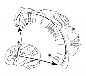
I felt that my own head was a simple enough choice for my map’s base. Since I had already interpreted the concept of a “map” very loosely, I thought I would stick to something more characteristic of a self-portrait. I was also partly inspired by the Cortical Homunculus, a distorted representation of the human body which sizes our appendages based on the nerve structures within them, not their actual physical size. I wanted to play with this concept of the visible and invisible, or the externally and internally perceived body.
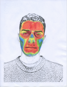
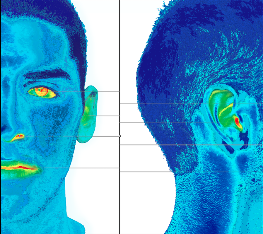
I think that a heat spot is a simple and effective way to communicate importance of a certain region. It could be more active, louder, tastier, anything. Also, because of the gradation effect that thermography creates, it automatically strikes a relationship between two points on the spectrum, rather than separating them.
My self-portrait is map because it locates a phenomenon spatially (across the plane of a human head) and relates different points based on a key. Color is such an important part of how we identify the world around us, and I knew that by redefining color based on a new set of rules, I could create an alternative visual representation of a phenomenon, or what Wood calls, a “reality that exceeds our reach”. His reading was particularly influential during my creative process. I thought a lot about his comments regarding equivalence between postings and locations. By correlating sensory importance with bodily organs, I acknowledge the link between senses such as taste, sight and hearing, and the organs themselves. Though senses can be externally identified (I can confirm that you are hearing me because you don’t have headphones in, and vice-versa), it is impossible for me to qualify your sensitivity just by looking at you. Also, I wanted to play on Wood’s statement, “the posting equivalently asserts that ‘there’ exists, that it is the unique locale of ‘this’ “. I interpreted this as Wood claiming that a map can take a certain correlation (for example, eyes, mouth, nose, and ears are the most important sensory organs of our head) and create the illusion that this is objectively true for everyone. My map suggests that senses are not produced by our core sensory organs alone, but by a combination of organs.
Adolf Wolf’s maps were probably the main artistic influence on my own map. His work is very abstract and relies heavily on the selective use of color and shape to convey meaning. I liked that his images have a sort of time-lapse effect when you view them. The immediacy of his color choices sets the tone for the image, while the complex and meticulous placement of shapes allows for an entire narrative to unfold.


