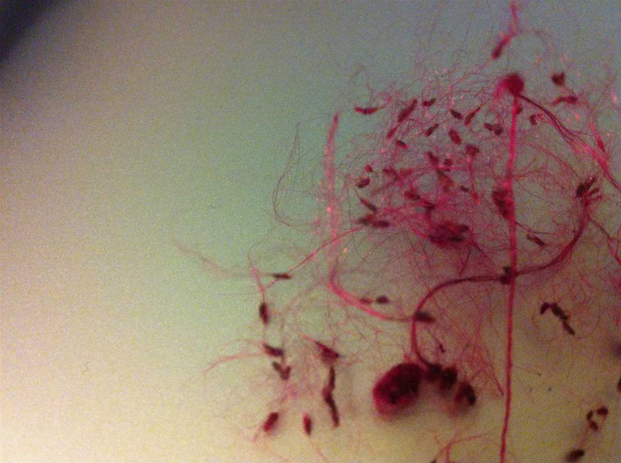
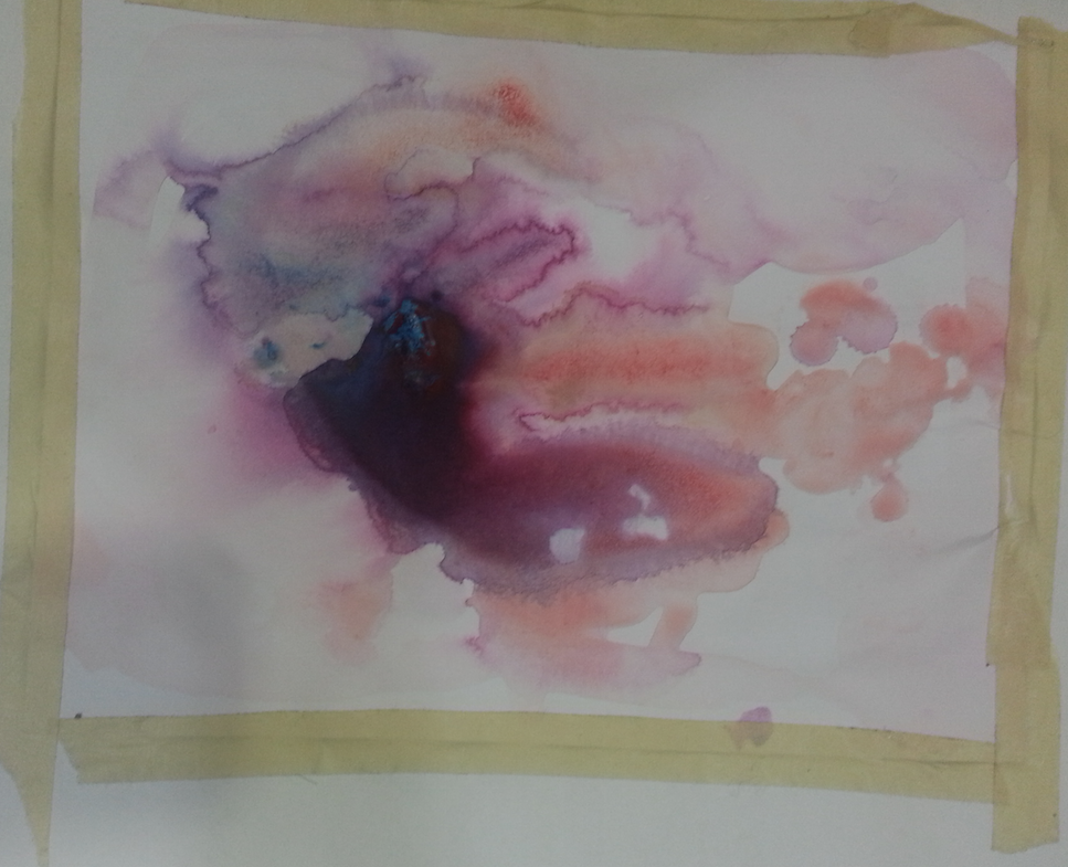
Preliminary photo and painting (sketches):
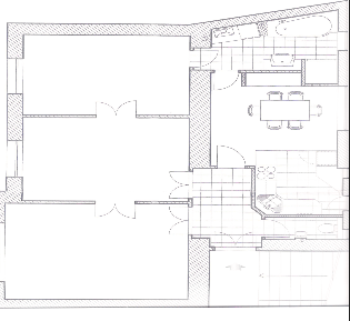
Sign system:
Connection system:
surface:
The artists and works that influenced me the most were: Josh Dorman’s 2008 piece, “Four Fleurs”, Liza Phillips works “Inlet” and “Flood plain”, both from 2003 and, Mariele Neudeckers’s 1998 installation “Unrecallable Now”. Also, though I did not go into the project thinking about Tamara Kostianovsky it seems that perhaps I drew from her as well. She made a map of the United States using her hair that I remember being very impressed by.
AFTER PRINTING THOUGHTS:
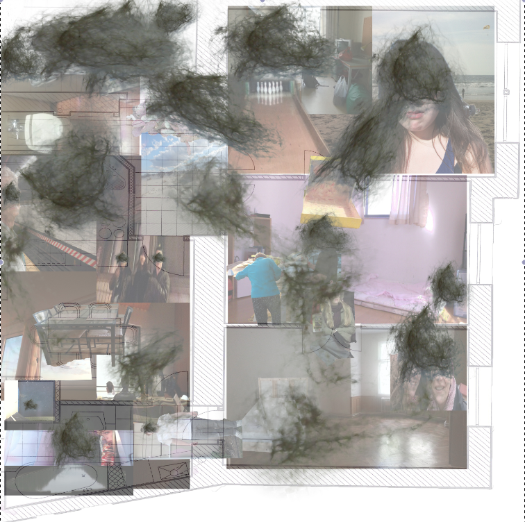
I did not repost as I did not make many changes to my map. Here is a photo of what it looked like prior to critique:
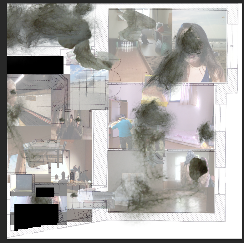
I removed the black boxes because they took away from the translucent free flowing quality that I had created with the rest of the map. I like that though the map has a narrative it dose not have one central point and I realized after critique that the boxes were demanding to much attention. Initially I included them to block out the bathrooms in the apartment. However in my final map I found a way to work around the space by not being quite so literal. In the map I printed I replaced the black rectangles with a photo of a lake (overlaying the bathtub) I spent a good deal time in, and a showroom toilet (over the real toilet) that I was obsessed with when I briefly worked at the Poop Museum in Tokyo.
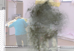
Over all I feel satisfied with the final product. I am so thrilled that we were able to print our maps out this big! It was amazing to see everyones all together. I was nervous about how mine would look without the weird depth and glassy screen of the computer but I do not feel that, in this regard, printing it add or took much away. What did change drastically in printing was the size of the hair, I had not given much thought to scale when working on my map. After seeing the 40×40 print I wondered if maybe I should have layered more small images of hair rather than stretching and bending several large images. As the large clumps might not immediately read has hair, given their size. I was worried they would appear to be burns or scratch marks, I put a little note next to my map with the title in the hope that it would help to point the viewer in my intended direction.

