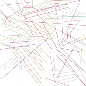
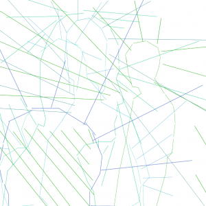

For the second draft of my self portrait, I primarily focused on the visual aesthetics of the map that needed to be better fleshed out. To start, I wanted to see what it would look like if I included outlines of my body, as a way of clearing up the fact that these are in fact profile pictures. However, for reasons that I will explain in a bit, I decided after the fact that this was not true to the overall concept of the portrait. In addition, I used the colors as an indicator as to the age of the picture, blue being the newest and green being the oldest. This was a good start, however because those colors are so close together on the spectrum, a few of the pictures in the middle ended up being hard to differentiate. Thus, for the final draft I’ll be extending the spectrum over one color to make that clearer.
I was also debating whether or not to include a legend, which points to a larger conceptual decision that, in hindsight, I didn’t consider as much as I should have, that being the amount of information that I choose to reveal to the viewer. I can boil this debate down into two camps: 1, I reveal the system via a legend, thus making the methodology incredibly clear, or 2, I don’t provide any information, and just let the signs I’ve created imply accumulation. Both, in my opinion, are valid. In fact, I have to disagree with Angela’s comment that the portrait doesn’t include a sign system at all. There are variables to the piece (age of the photo, composition of negative space), and I have a consistent way of expressing them (color, lines). Furthermore, there are numerous examples in The Map as Art in which the sign system is not readily obvious, or when the purpose of the map is not to navigate but to demonstrate concepts such as change or abstraction in a consistent manner. Examples include Bryony Graham’s Rockaway Felix, You Are Here: Felixstowe, in which a pile of rock candy was left on a beach for people to take with them as they please, or Julian Schnabel’s South Coast Prickly Point, which is “not to be used for navigation,” but instead meant to show “how images and objects can be stripped of purpose through abstract manipulation” (177). The latter piece became an inspiration for my project, because in a way I believe that is what my portrait attempts to do, namely subtract the content from images that are supposed to represent me, leaving only the abstract similarities between them.
All that being said, I do understand why that would be Angela’s first reaction, and I don’t think this draft was successful at all. Indeed, I’ve provided no evidence that there is any rhyme or reason to the lines I’ve drawn, and when people look at the piece as is, they would absolutely be lost as to how it should be read. For this reason, I will be including a legend in the final draft, which will indicate that the color is connected to the age of the photos. I will also be adding more photographs, and within those photographs I will be adding more lines, so that they are closer to the actual shape of the spaces between me and the environments. When I do this, I am hoping that clusters of lines will reveal themselves within certain pockets of the frame, thus clarifying the overall theme of accumulation. If this is successful, then I would also like to get rid of the outlines of my head, because they are contrary to the subtraction and abstraction of content that I’m trying to achieve.


