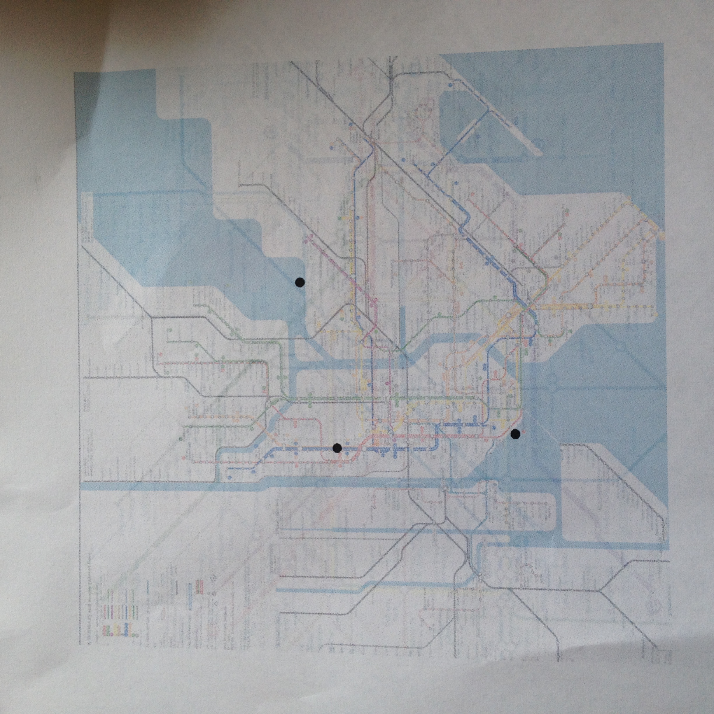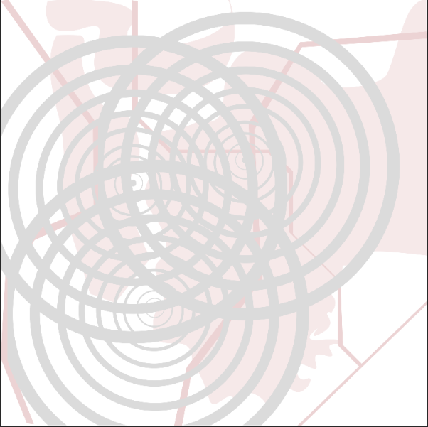
I started with the three points that are geographically located: London, Buenos Aires, and New York. The placement is where these three cities actually fall on the map. I planned to use concentric circles to show the impact these cities have had on my personal development, the thicker lines showing a heavier influence in recent years. This would be my sign system. My surface consists of an abstract interpretation of Manhattan in 1998. This was a pivotal year in my family’s history. My connections are the darker purple lines that actually follow the tracks of London’s subway system. The lines are the Bakerloo line which is the track we would take home. I chose these colors because they remind me of my mother and her favorite scent (lavender). I chose grey because I wanted a subtle but powerful color to attract the eye but not distract from the map. Unfortunately, the website would not upload one of my photos of my sketchbook, but I had originally planned to use stripes to color my surface as opposed to solid color. I changed my mind because I wanted a color of significance. My map wasn’t really influenced by the readings and more by my family’s history and the significance of place in and presence in our family. I will also be adding hand drawn images and painting more of the blank space with water color.