The evolution of my sticker project was sort of wild.
When I first decided to do a nespresso campaign i really hadn’t worked anything else out, except I knew I wanted to utilize humor because I am no artist, and the thought of producing something without an ironic undertone felt odd and frightening.
So my first draft looked something like this:
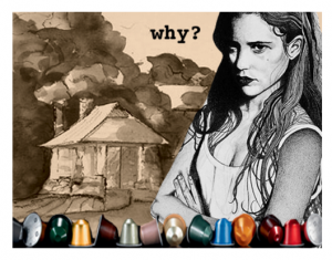
And I really didn’t like the way it looked.
Moreover, I no one understood the point. Way too vague.
Granted, the making of this piece did teach me how to use photoshop. Before this I had never even opened the program on my desktop.
Other than that, the making of this piece didn’t sate me. I really just couldn’t figure out what else to do, so I mentally abandoned the campaign (which is typical of my personality.)
I started messing around with Plan Bs, and became sort of interested in creating a campaign about the path after liberal arts school – it would have been an anxiety inducing campaign about moving to one of the 5 boroughs after college.
I created a few lackluster stickers about gentrification – mostly inspired by Spike Lee’s speech about gentrification: “We been here”
http://nymag.com/daily/intelligencer/2014/02/spike-lee-amazing-rant-against-gentrification.html
but the message was also alluding to the story I followed this summer while living in Brooklyn about gentrification in Brooklyn.
http://www.nytimes.com/roomfordebate/2014/04/13/the-pros-and-cons-of-gentrification
one looked like this:
What I liked about this campaign was that it didn’t isolate me. It wouldn’t have highlighted something that I was doing right / that others were doing wrong. I too will probably end up in Brooklyn.
Simply put, I like thinking critically and there was something appealing about posting a thought provoking sticker that leaves room for debate.
The Nespresso campaign wasn’t thought provoking nor did it allow me to think critically. All that I could draw from it was a sense of irony, and I could not figure out how to portray that.
—-
So I met with Angela shortly after I began exploring other options, and she encouraged me to go forth with the Nespresso campaign. I just needed to rethink the situation, rather than abandoning it altogether.
She helped me harness a certain sense of irony that had been in front of me the whole time.
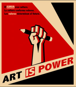
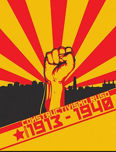
I “curated” a series of images that inspired me to go down a new path: Russian Constructivist artwork.
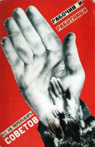
So i rediscovered the lab from the second day of class.
I took a photo of my friend Brian’s hand clutching a water bottle cap with my iPhone
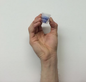
And then my first draft ended up looking like this:
During Critique, I was told to complete a series of things.
I tried all of them, and stuck with most of them.
1) I was told to change the color of the hand. I tried, but I swear it looked awful and so i made the decision to change it back.
2) I was told to use a picture of the Tea Haus rather than Westlands.
——–I totally respected this idea, and tried to oblige, it’s just that Westland’s shape was particularly perfect for this frame and the Tea Haus didn’t measure up, even when I tried to include the trees in the background.
3) I was encouraged to change the color of the words, because they detracted from the drama of the pod, and I was told to change the Russian Constructivist words to a more relevant tag-line.
So I tried:
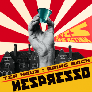
And I got a little bit stuck here, which is why printing/distributing took so damn long for me.
I couldn’t get the yellow in “Say yes take action” to match the bottom layer perfectly.
And I felt like the whole piece looked sort of flat, and I needed to add a third dimension.
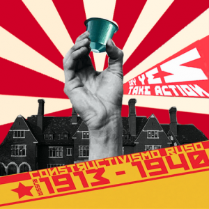
So thats when i settled on my final piece:
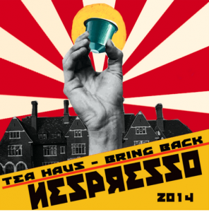
I added a glow behind the pod, alluding to an altar painting which is really funny to me, but also I feel like it adds dimension. I took the sun from a Van Gogh painting because it was sort of 3D and I liked the way it looked as an altar-style halo.
Additionally, I deleted “Say yes take action,” which wasn’t the easiest decision but I feel comfortable with it.
I changed the text slightly, but I actually think it improved the image dramatically.
—-
So now I am done and installed and surprisingly satisfied.


