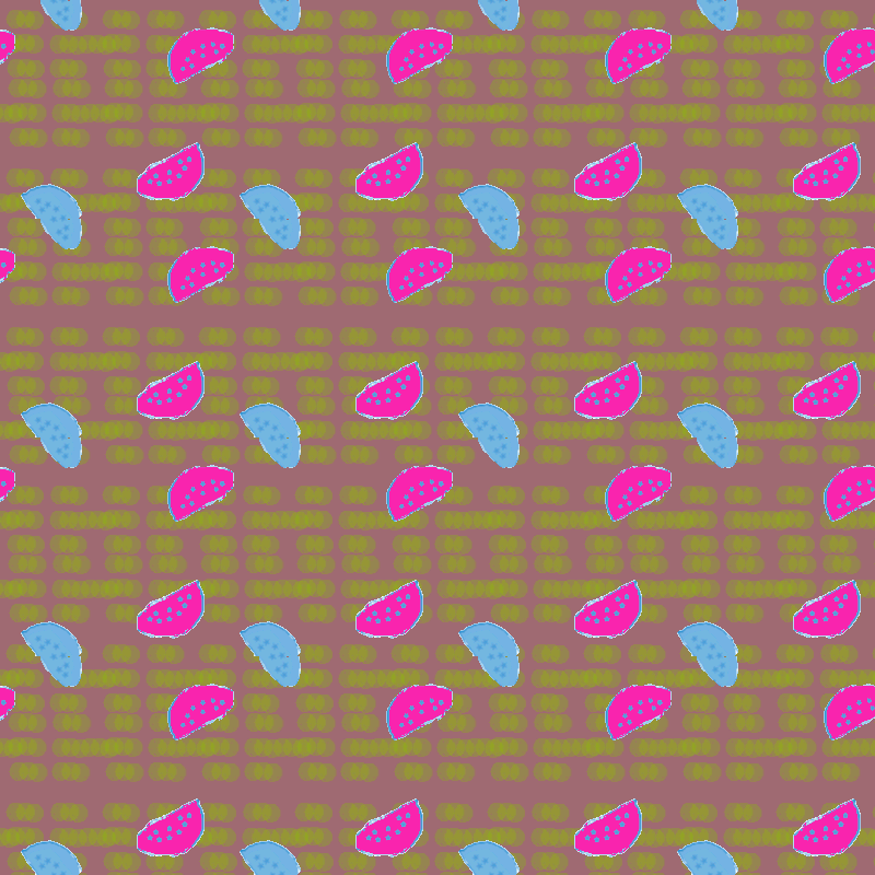
This is one of my earlier tries to create gifs. This gif is designed to have a foreground layer and a background layer, just like my other gifs. I create a kind of flickering light effect to the background. The texture of the background layer is contrasted to the foreground layer. I also like my organic drawing of the watermelon because my purpose is to change the usual look of the one of my favorite fruits to a more artificial look. We can still tell that they are watermelons, but they are more fun and playful with their colors.
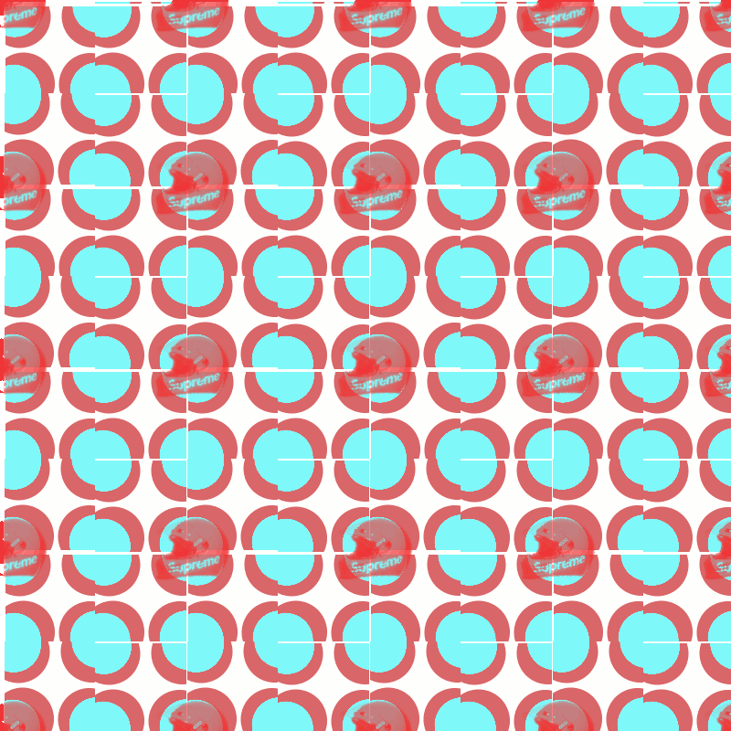
In this gif I incorporate a picture of the helmet from the brand supreme that I found on the website. I tried to use bold colors not from the actual color themes from the brand but from my impression of pop culture in general. The used of red in the background tile was also a subconscious choice because of their distinctive red box logo. When I look at this gif now, I am less satisfied with it because the movement of the background does get disturbing as one look closely.
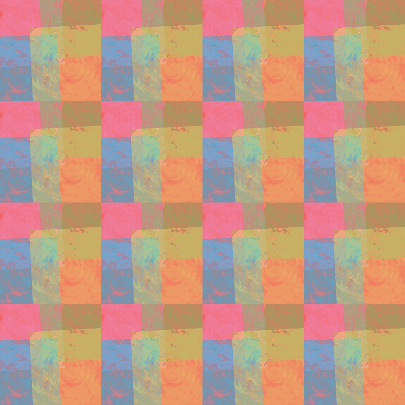
This is probably my favorite gif: not because of the complexity of making it but because of the conscious color choices I made. This is a little experiment of color consistency to me. First I created a grey texture of spiral waves and I transformed grey texture into pink, blue, green, and yellow segments. I overlaid the four different segments to create my tile. Then I simply applied color filters with almost same colors that I used for pattern. As a result, my tiles change as the I put on different color filters. Therefore, depend on the color interaction, the spiral wave tenure of the segment of different colors become more or less ambiguous.
