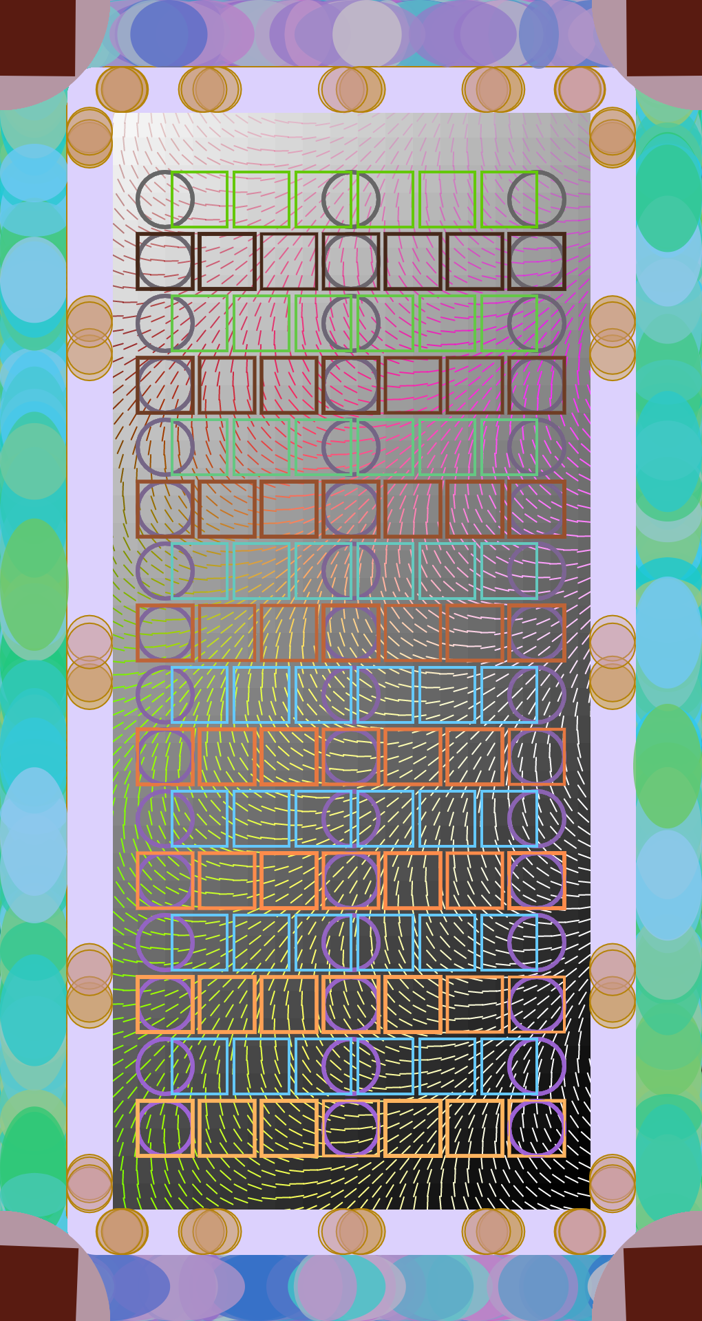
For this assignment, I spent most of my time just experimenting. I went in with no real idea of what I was going to do, but I just wanted to explore. I really didn’t sketch much because I jumped right into the code. One of the most intriguing things we’ve worked on in the last few weeks was the pattern of small lines. I was fascinated by them and knew that I wanted to use them as the background for my wallpaper. They create visual interest without distracting from the other elements. Later in the design, I realized that the colors of the lines were being lost on an entirely black background, so I coded a loop that creates a gradient through the multiplication of the coordinates. This change came late in the design, but it let me entirely redesign my color palette into something more interesting.
The next part that I experimented with was the Riley Circles we did in class. The ability to create overlapping patterns made them ideal for the aesthetic I was going for in this piece. I decided to use different colors on the top/bottom and the sides because the shape of the canvas is already irregular. With a canvas shaped this way, I thought it would be advantageous to draw attention to the oddity instead of trying to hide it. I liked the color results of the green/blue generator more than the red/blue generator so I put that one on the area with the larger area. I eventually decided to make them slightly translucent in order to create an effect like a mosaic or a stained glass window.

This border, while pretty, presented somewhat of a problem. In order for it to have clean edges, it would have either required me to let the corners overlap or to find a way to cover it up. This lead an idea about rotating squares. The problem with rotating squares is that the edges don’t travel consistently. So in order to have a consistent edge, I filled those corners with a stationary circle. It created movement of a different kind and, while I still think it looks strange, I enjoy it for that.
In my initial plans, I didn’t have the small lines in the draw section. They were part of the set up, which made it more difficult to put moving objects on top of them. This created the idea for what I have been calling the “runners” and the “track”: the yellow circles moving along the purple shape. Putting the runners on top of the track would have allowed me to have moving objects without leaving a trail behind. Eventually, I decided to just put the lines in the draw section, but I still liked the visual of the track.
The grid was all experimentation. I went in with no plan other than I wanted the center to be a grid. I probably spent more time on the color of the shapes than on coloring any other part of this. When I changed from a black background to a gradient, it allowed me to have more fun and to put a wider variety of color without being afraid that it would get entirely lost. Additionally, one of my favorite effects is a shape whose stroke randomly changes widths. I had originally included this effect on every part of the grid, but it got very busy so I restricted it to the orange circles.
By the end of this wild exploration, I was surprised to find a clearer image than I expected. While spending hours staring at wallpaper, I managed to make a door. I think it started, again, with the shape of the canvas. As soon as I drew a shape that mirrored the canvas, I started thinking about doors. And that influence made its way into the design: the heavy frame, the squares to mimic panelling. Even the circle-square decorations at the corners of the canvas are reminiscent of the metal plates put on the corners of doors. The door theme may have been an accident. But I still think it fits.