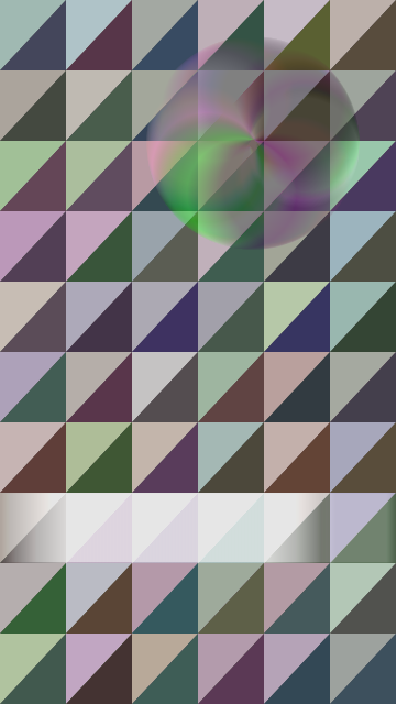
My main inspiration for this project was Bridget Riley’s work. Specifically, I looked at Shadow Play and Natraja. These works have a lot more artistic depth than I could hope to replicate with my amateur abilities, but I really like the way she displays and compares color. To begin, I spent a couple hours creating different patterns that allowed me to contrast color in a similar way. I settled on a grid of right triangles, because the combination of the grid and diagonals resembled Bridget’s work.
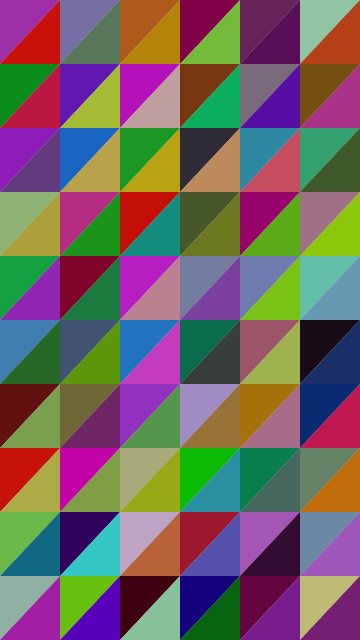
From there, I wanted to create more color mixing. I added a circular rotating ellipse that was transparent enough to see the base pattern behind it. The ellipse is constantly shifting color as well, ensuring even more combinations. The sliding rectangle serves a similar purpose, lightening the triangles it passes over so that they can be seen from both perspectives every time the background updates.

Finally, I realized that all the bright colors made my wallpaper look rather childish, and subtracted from the overall experience. To alleviate that, I made the differences in color for each set much less vivid (either dark or light). In the final product, you get contrasts in each square, between the triangles in a set, and against the mobile objects.