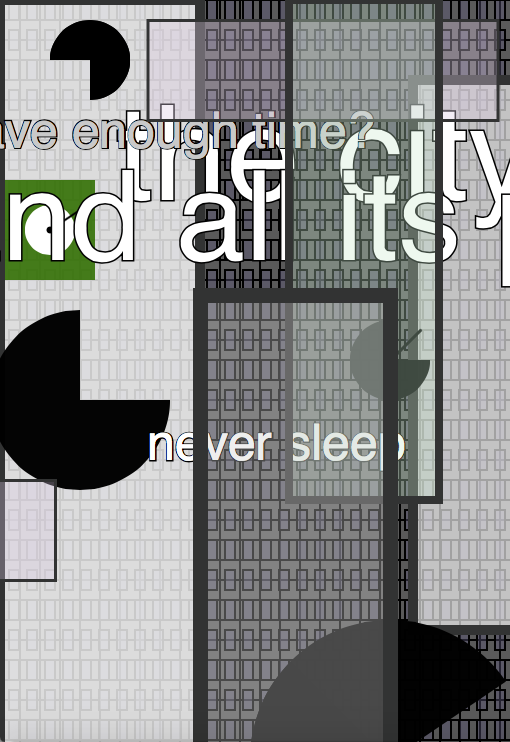
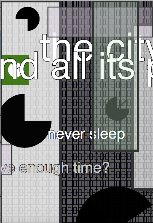
This wallpaper did not go through as many phases as my last project. Here I dabbled with the movement more than the official look. It is meant to capture some of the movement of a city. I struggled with the colors because most new york buildings’ are shades that do not translate well to code. Color-wise I ended up doing something very different from what I traditionally think of as “city colors”. Maybe some of Times Square made it into the project. (Which would be very upsetting for me because I am a native New Yorker and you must know how we feel about Times Square.)
At first, I wanted to work with solids to get a feel of a crowded cityscape. I thought having it move strictly where the eye could see it might also encourage a feeling of closeness or stacked-ness. However, the disappearance of the moving rectangles (I called them the “buildings” in my notes) added another characteristic of the city: passing things by.
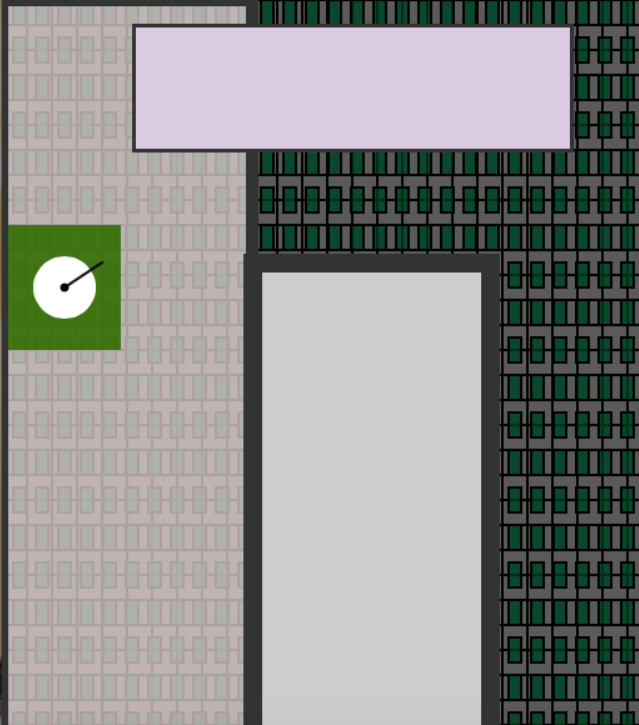
The piece hit a turn when I added more of what I noted as “clocks”. Unlike the green one they ended up being very stationary arcs but I felt that it got some of the idea of change across. I decided not the make the clocks move (perhaps I will in the future). After all, the city houses a very stressful look at time as well as the unexpected.
I added the text simply because I like being a bit literal. I also knew the shapes, clocks, and grid might not get across everything going on in my head as I worked on the piece. The text consists of the phrases:
“the city”
“and all its people”
“always moving”
“do I have enough time?”
I wanted the words to capture the idea of walking through the city rather than stand as complete thoughts or phrases. So I took thoughts I had and cut them to a point I was comfortable with. I may not have gone as far as I could have with cutting the phrases. But in the end I liked where they ended up in the piece and felt they captured the idea even if they were a bit on the nose.
In the end I messed with transparency; completely going back on my old idea. I cannot immediately explain why but one reason I came up with–that made sense to me—was: the city is too complicated to be solid and wordless. The dark colors are a choice that I fall in love with and fall out of love with frequently. However, they work well to emphasize the shadow that sometimes falls over the city.