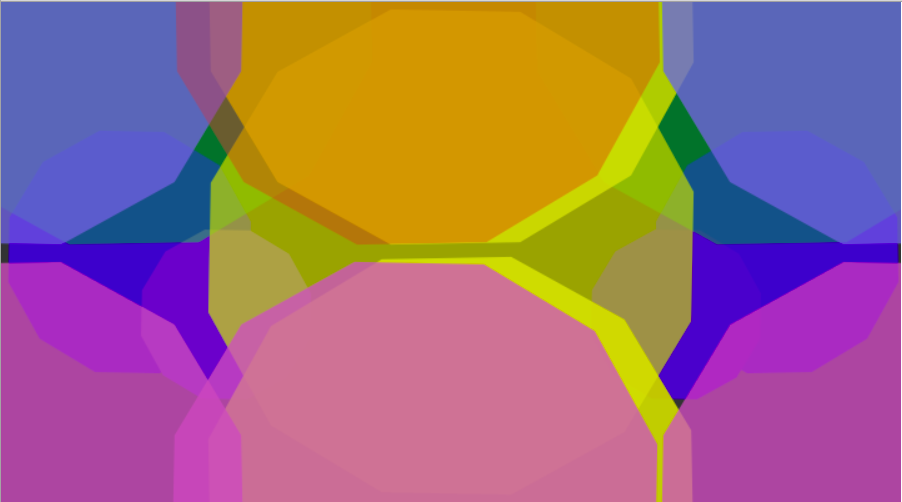
For this project, I did something very new—maybe not at this point because it feels like I have been repeating that statement a lot in this course… but at the time it still felt new! I began working on the polygon starter file with no real linear ideas attached to it. The most stable ideas I had included two goals: make something that could resemble deep space, and experiment with color. I also wanted to work with the snowflake sketch.js, but I left that out because I thought the piece was going in another direction and I could not find a way to fit in that felt right.

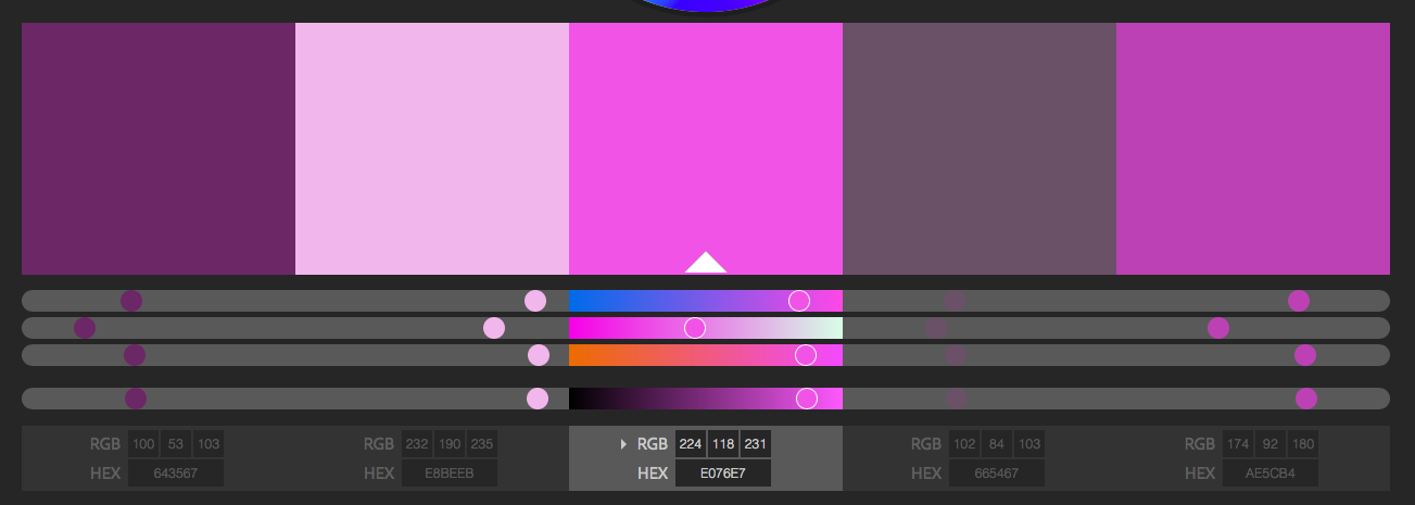
Before starting with the code, I found the starter colors. I call them starter colors because I did not end up using any of them and knew very well that I would not toward the end. A majority of the code works around what colored polygons I wanted to emphasize over the others. In a sense, I tricked myself into thinking I had found my colors and worked from there. The colors I used were very similar to the abstract clock assignment’s colors in their saturation, which, looking at them both now, is surprising. Over this semester, coding has helped me play with color theory. Just like with coding as I explored it, I learned it. But before then I did not like bright and saturated colors. They can easily over-stimulate me due to my sensory integration disorder. But in my system piece, I think I found brightness levels I am comfortable with.
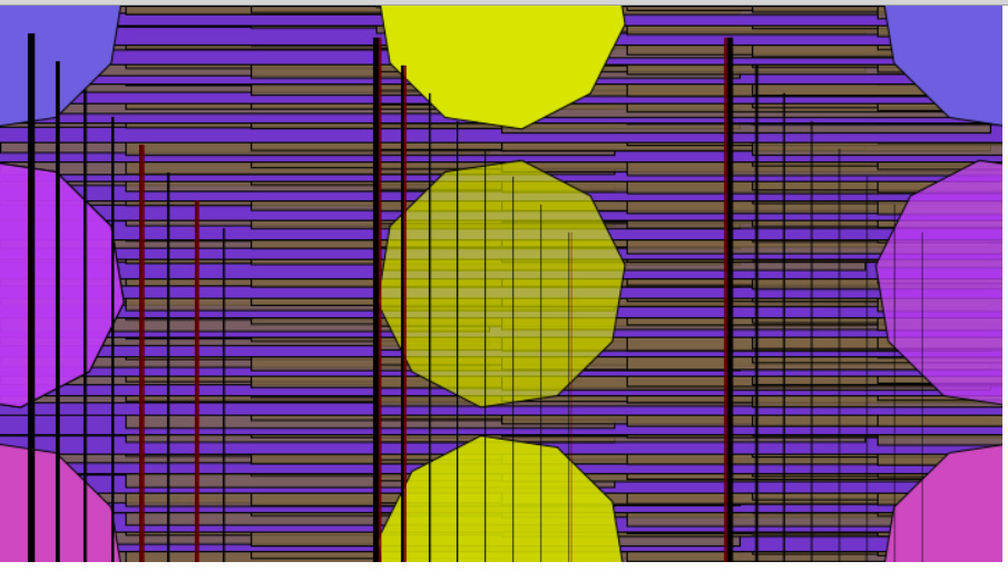
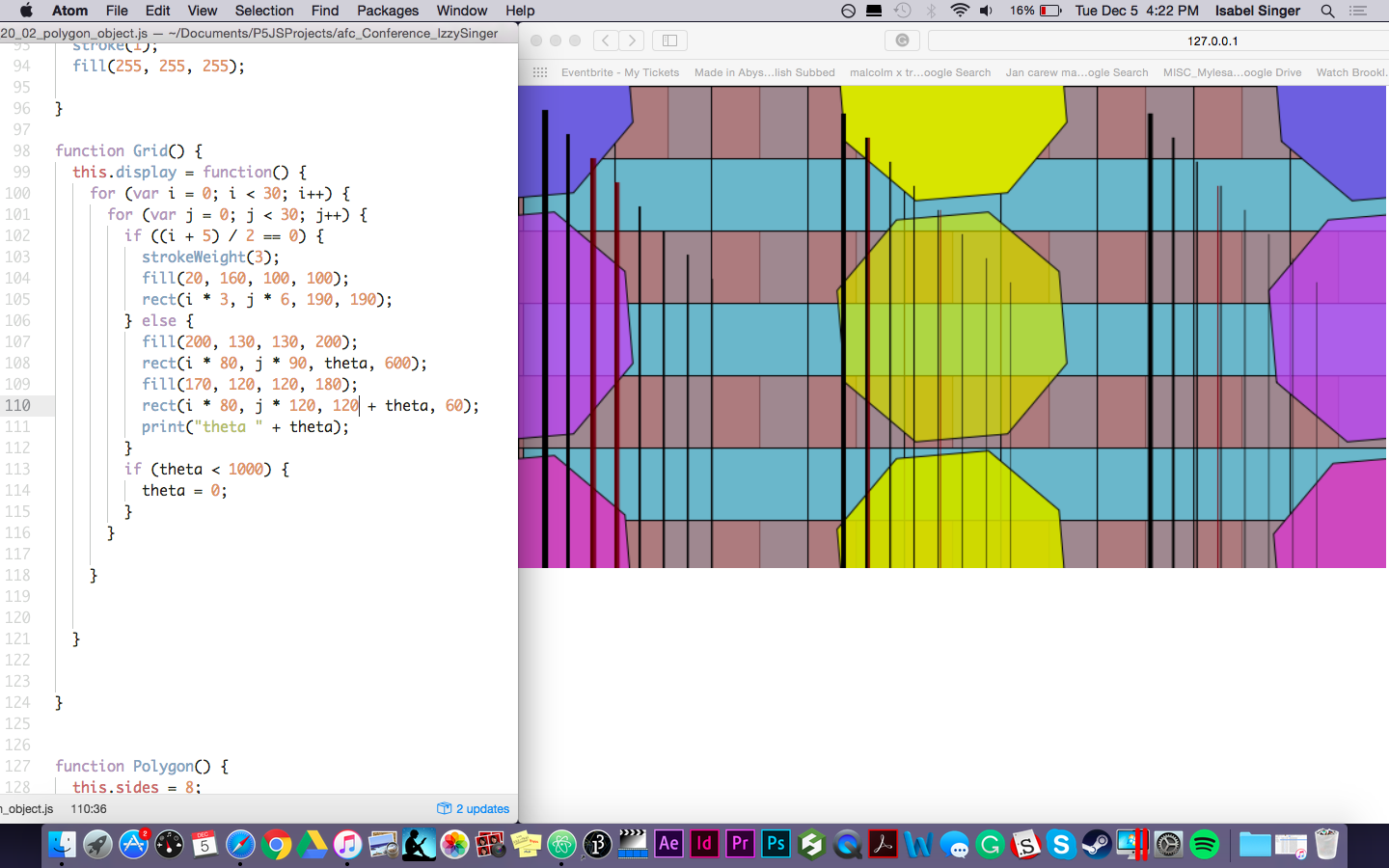
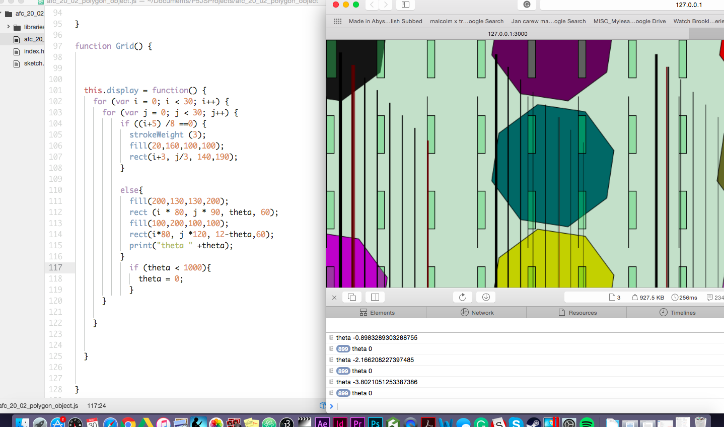

When I started out, I played with semi-randomized lines in the front to add more of the dimension that I originally sought. I also played with a turquoise grid and kept the polygons small. But it was so separate that I felt it was missing the point of the assignment and thought I had coded myself into a corner. As I worked with them, the lines, grid, and circles grew apart into their singular characterizations. The randomized lines in the front never connected to the polygons in the back or added enough depth and, to my frustration, became more out of place after each session and seemed to be the only ones that were evolving. The code itself was also set up as very separate, and toward the end of the project, I felt I had coded and colored myself into a corner. How would I get them to work together as a functioning system?
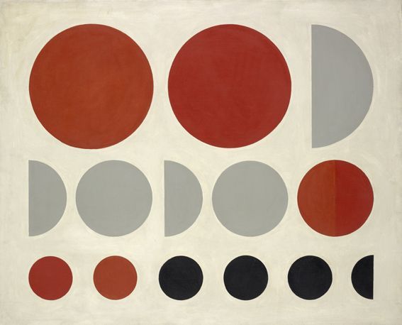
At first, staring at Molnar’s Une retrospective for inspiration felt counter-productive. It was still separate! Looking at it now, I know that the more I worked, the more the colors began to expand and almost blend until it arrived at the final result. And I know now that Molnar’s painting isn’t actually that divided. Or, one doesn’t have to look at it that way. In each work, she uses the implication of movement. From Lettres da ma mere (Letters from my Mother) to the one I showed above her lines and shapes always suggest that a change is occurring. I already had the polygons spinning and wanted to keep that but then I began experimenting with making them move in another way as well. The spinning along felt monotonous. Adding a loop, I made two of the cut-off and off-center polygons rotate across the screen in a recurring wrap to make it a little less expected and languid. I also changed the direction of some of the polygons, the opacity and, of course, the size. I think the turning point was when I got rid of the lines. Once I did the subtle changes were highlighted more and made room for adding smaller and less translucent polygons in the back.
To conclude, I think I accomplished a lot with this piece. The process felt natural and I think the spinning sequences and imperfect interactions help to make it more entertaining to a curious audience. The colors are vibrant (for me) but do not overpower it (or myself). And the movement remained odd yet weirdly calming.
Thank you for the opportunity.
Izzy Singer


