Space Oddity by Izzy Singer
If I thought harder on the project, did some research, or found some good art depicting space I probably could have found a song to animate an exploding star too…or something. I didn’t do that. I went back to my basic interests. Though exclusive, and perhaps lost on some who do not know the Star Wars franchise I justified making this piece of art by making it for myself. And I did. I had fun, I got to listen to a track that brings up a flood of emotions and visualize an abstract to pay homage to a character (and the lady who played her–you can’t really have one without the other, as Ms. Fisher put it herself: “I am Princess Leia and Princess Leia is me. It’s like a Möbius striptease.”).
Okay, I’ll stop now. On to the project.
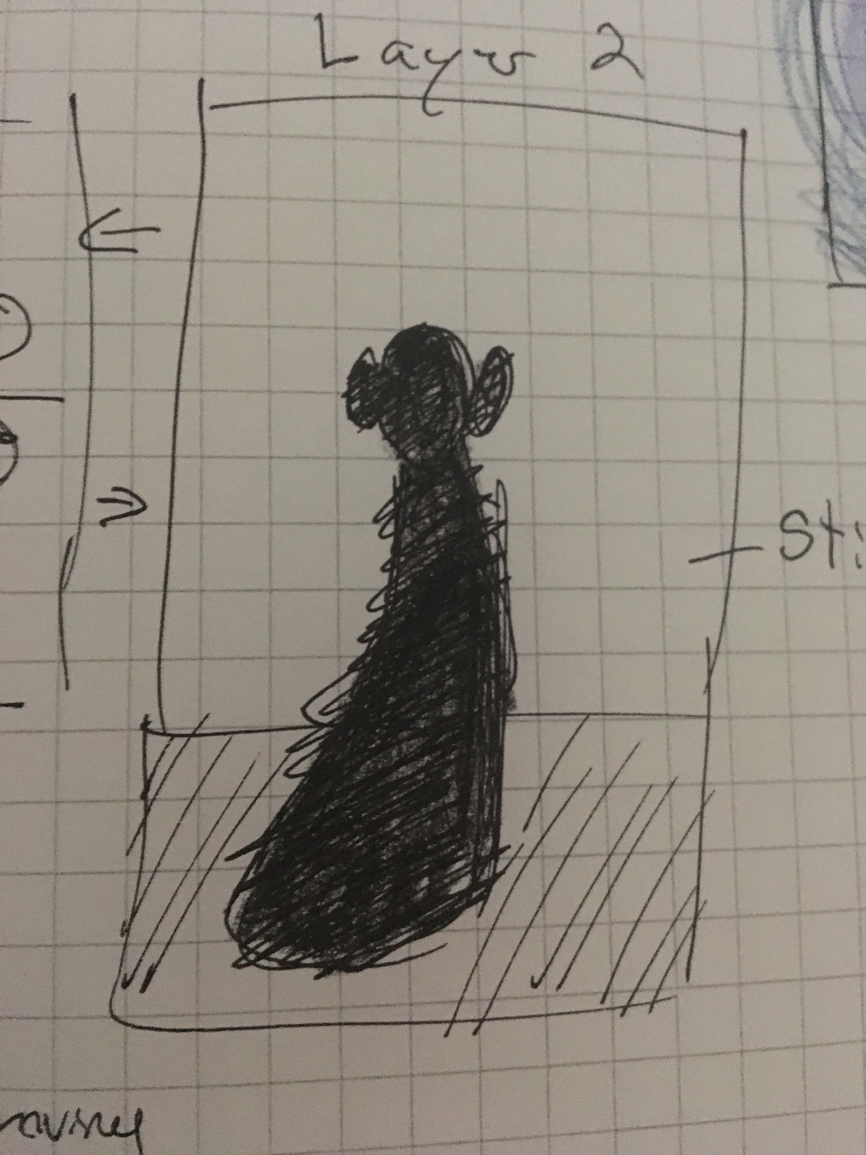
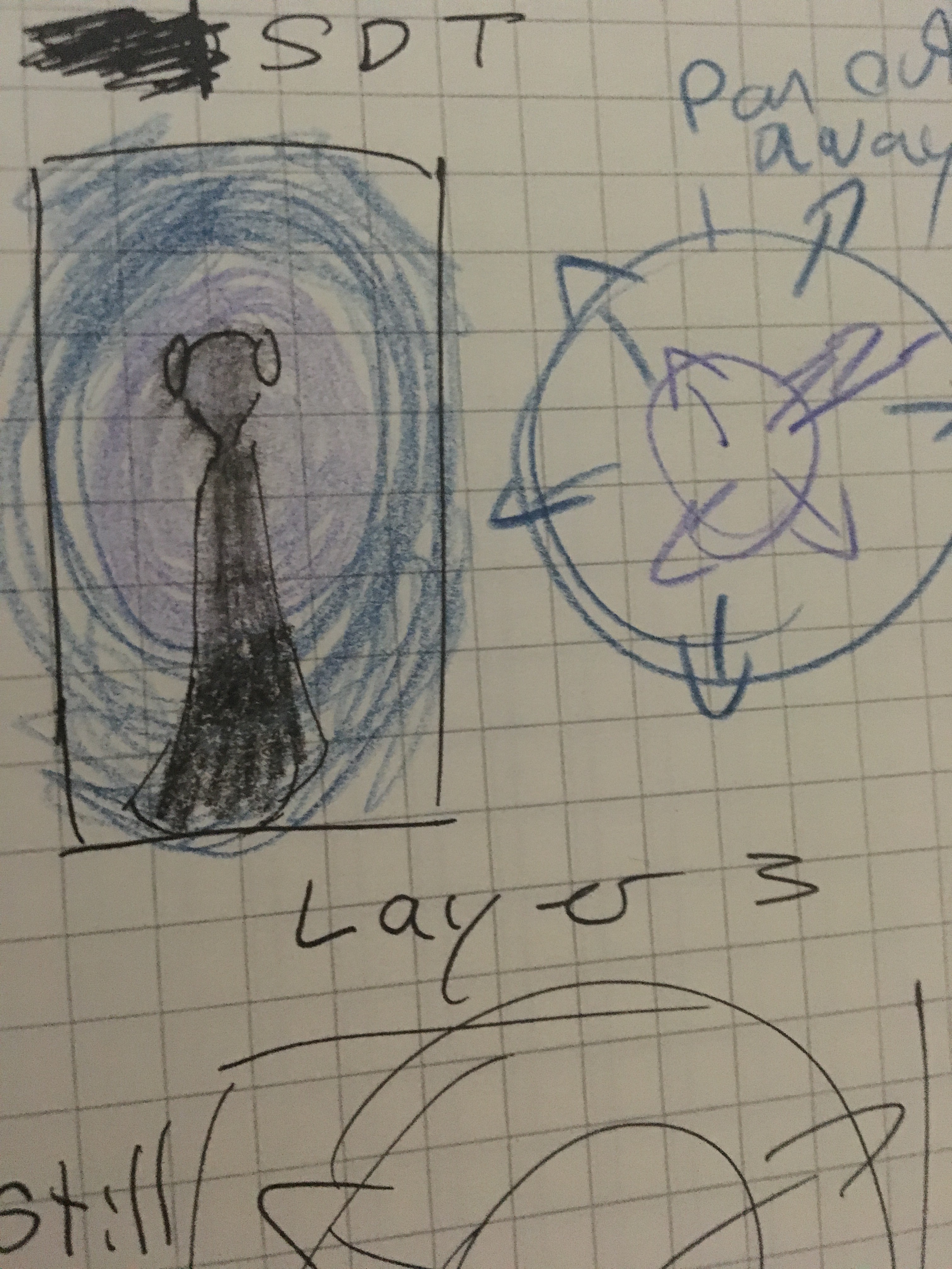
When made the first sketches I imagined something with far less structure. My initial idea included the use of colors–royal blues and purples for the most part. I was going to play with the size and opacity of the shapes against a black background whilst the colors within turned different shades in a cycle. Then adding lasers once the horns in the track swell to gather our attention. I knew I wanted a silhouette from the beginning and wanted it to capture movement.
Once I was introduced to “Kaleida” however, my “simple color” ideas all got sucked into the nearest black hole. I began to bank on the 2-Dimensional movement by making it as flat as possible so the Kaleida effect would keep our attention. I used a pattern I found online by Eloise Renouf:
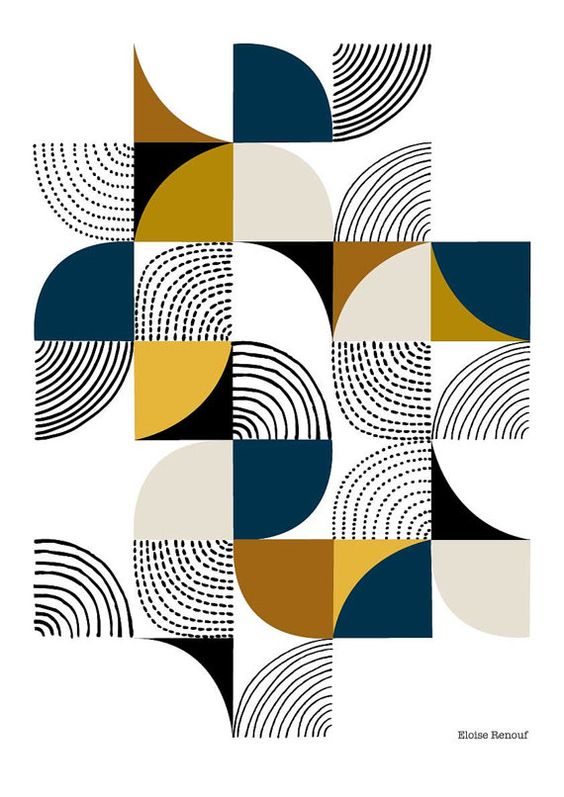
I played with the color with the “Color Offset” effect. Initially, I chose the pattern to play with the possibilities of Kaleida, however, once I got hold of the beautiful gold, blue, white and turquoise version I decided to keep it. I felt that gold and bright blues were more accurate to the character anyhow. Sorry purple.
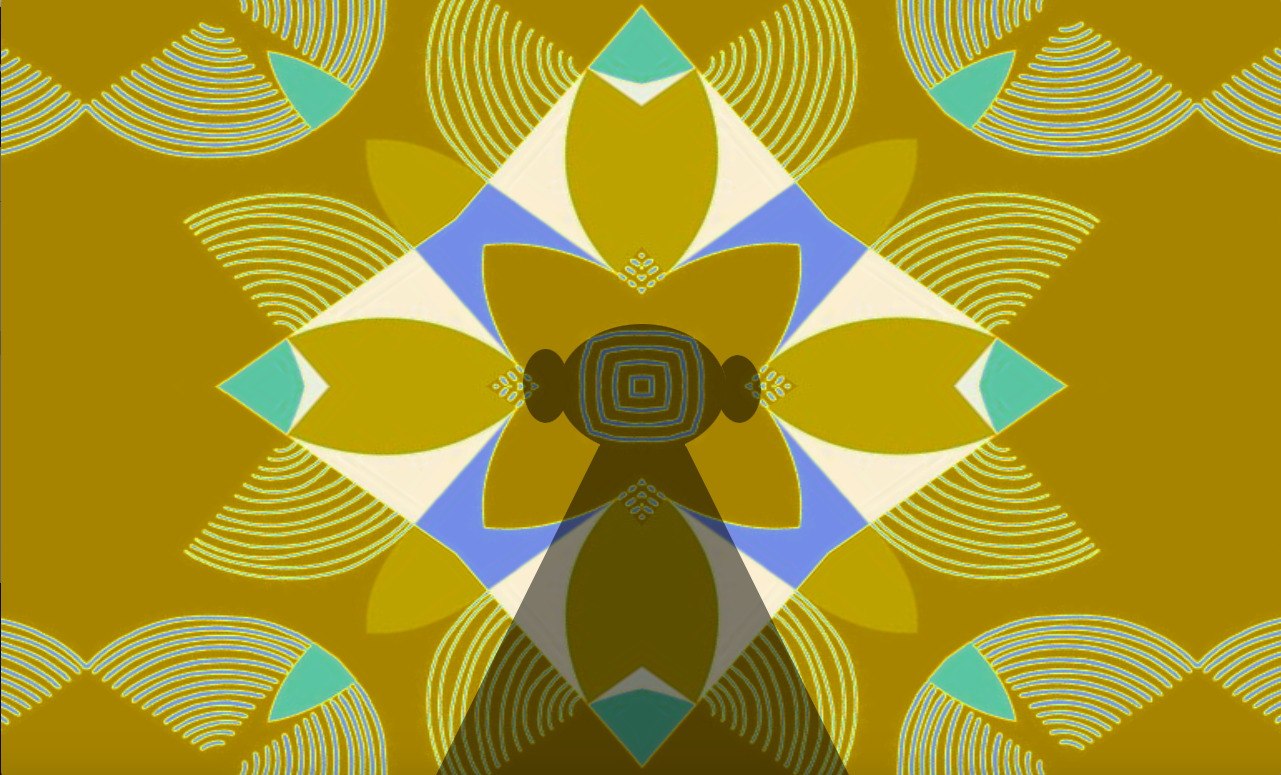
It would also help with the yellow echo and lines later but I’ll get back to that. A too-realistic silhouette would have hurt the project alongside the Kaleida. It would be too adverse, maybe a little too creepy. I do not know if I avoided creepiness, but if the silhouette stands still without any implication of motion I thought it would help to avoid making that part of the piece distracting. Or, less distracting. A figure that did not look as though she were about to walk around.


