Going into this conference project, I really had no idea what I wanted to create. At the beginning of the semester, Angela and I had discussed where my interests laid both inside and outside of the class. In class, I thoroughly enjoyed the assignments that allowed for my personal style to shine through: that essentially meant projects that were open to saturated hues and whimsical images. My artwork outside of class has been described as “cutesy” with pop-art influences, therefore, I attempted to inject those styles into my Processing sketches to see what would happen.
Over the course of the semester, I worked on a grid of squares that slowly changed color over time–I loved that I was able to randomly access the color channels to create such a cute graphic! After I finished this assignment, Angela and I discussed my interest in typography, and we decided that it would be a good idea to explore this interest a little more in my free time. Truthfully, I really struggled creatively to come up with sketches that explored typography to my liking, so I decided to trash the idea (for now) and went back to the drawing board.
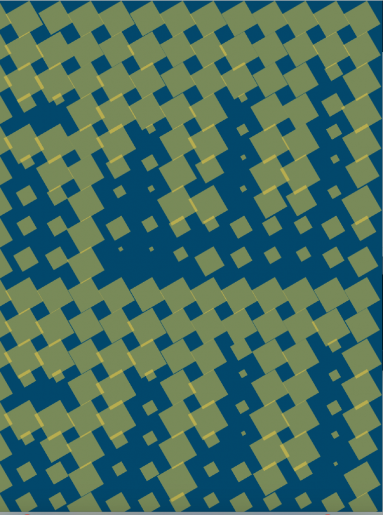
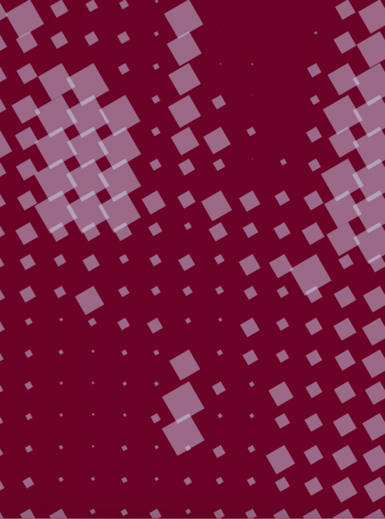
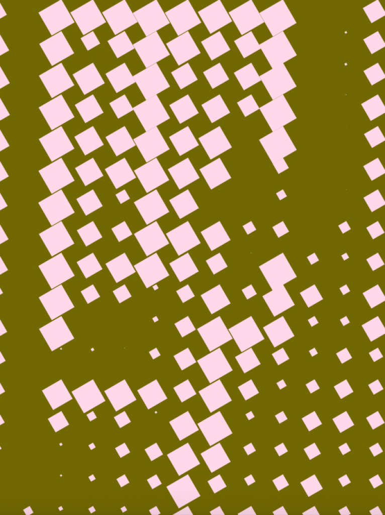
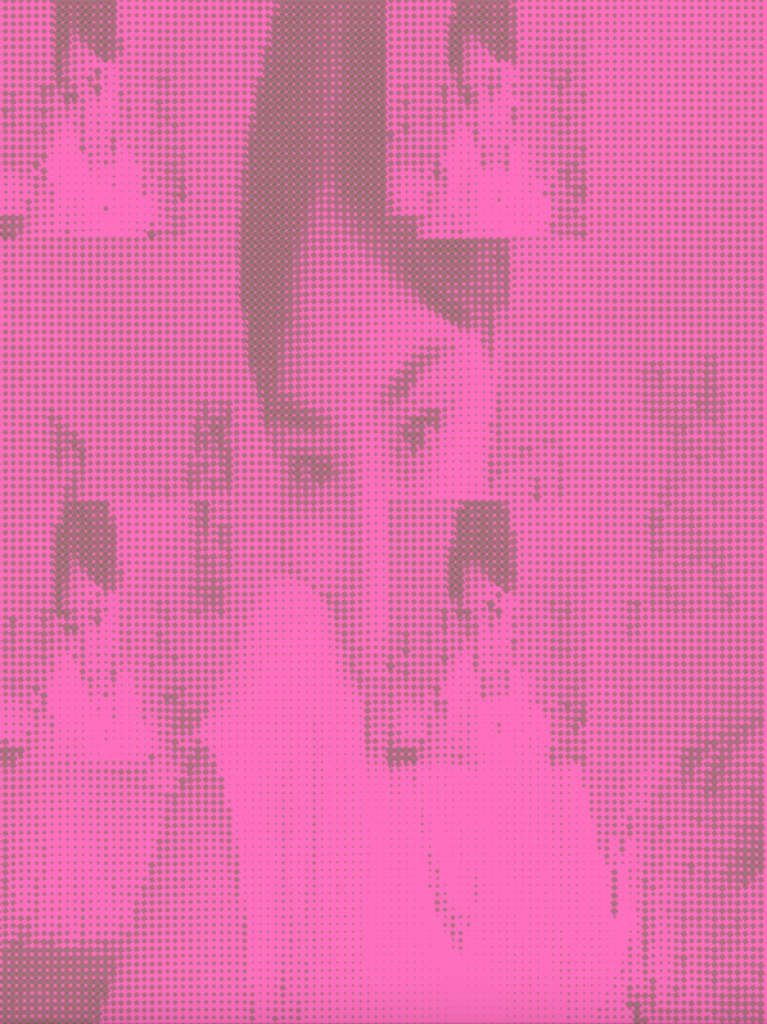
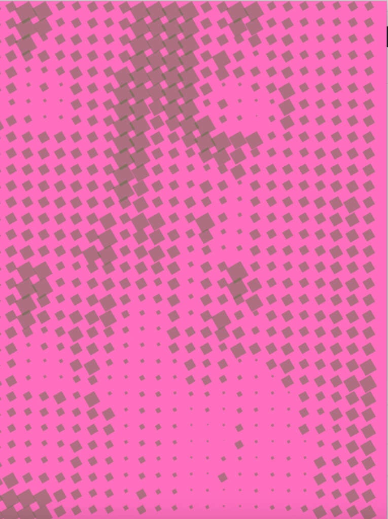
One of my favorite assignments this semester was the webcam check-in. My generation grew up with PhotoBooth, amongst other webcam-based programs, and I feel like the class was collectively excited to create our own effects. I had a really wonderful time creating my own effects, and, truthfully, I wish PhotoBooth currently offered them! I took my inspiration from this assignment and decided I wanted to create another, large-scale, webcam effect. After doing some research, I found Tim Rodenbroeker’s tutorial on rasterizing images in Processing. Basically, Rodenbroeker assigned the fill and background to separate colors and created a grid of tiles that, depending on where your mouse was on the screen, either obscured or revealed a selected image. I decided to change a few things and test out his code on a random image and loved how the piece turned out.
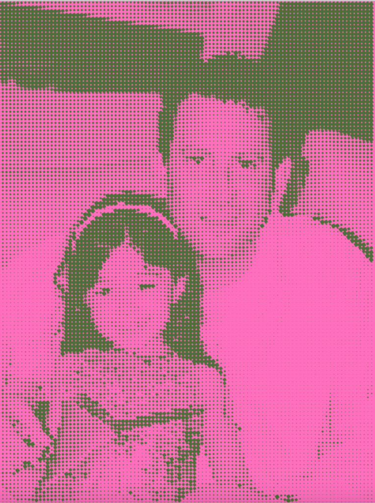
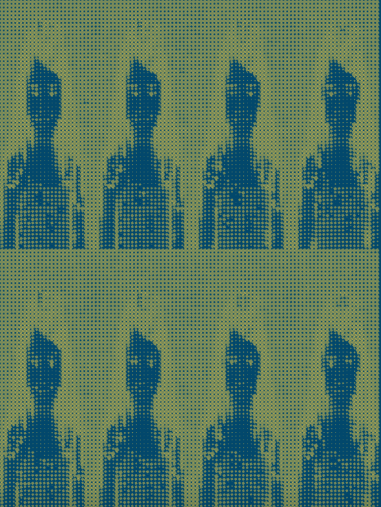
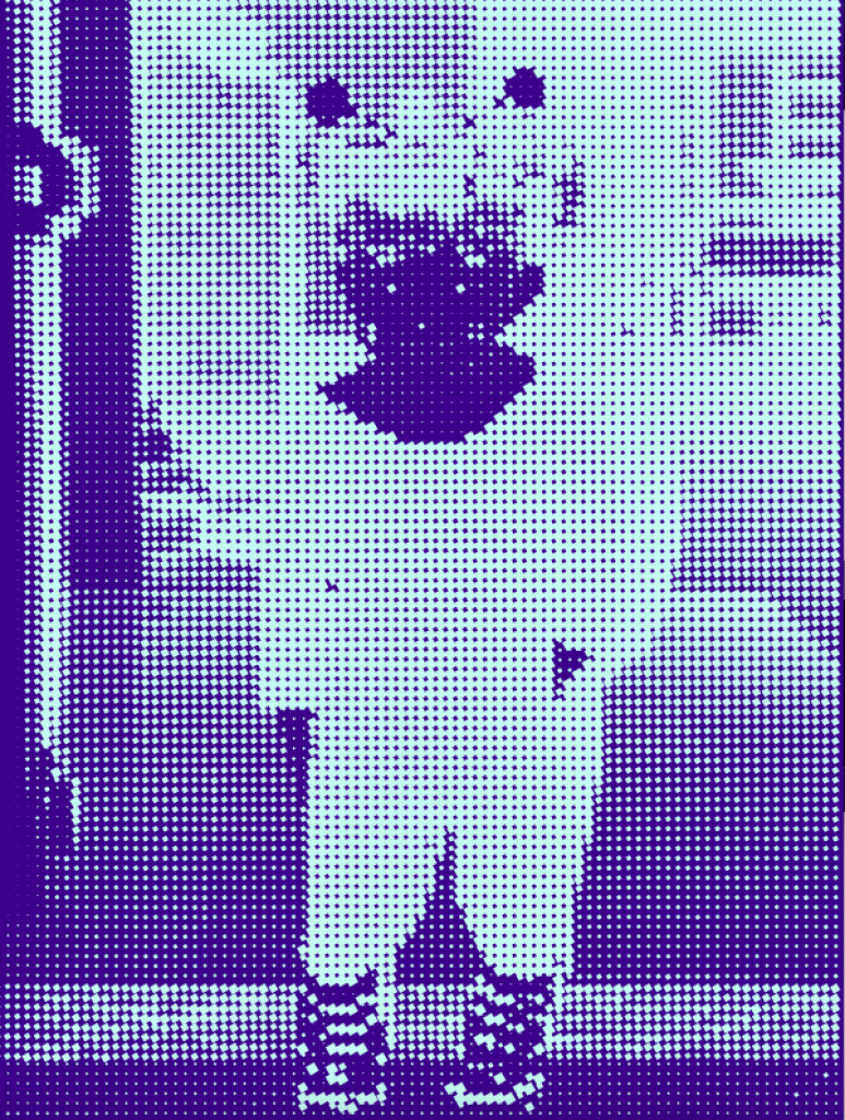
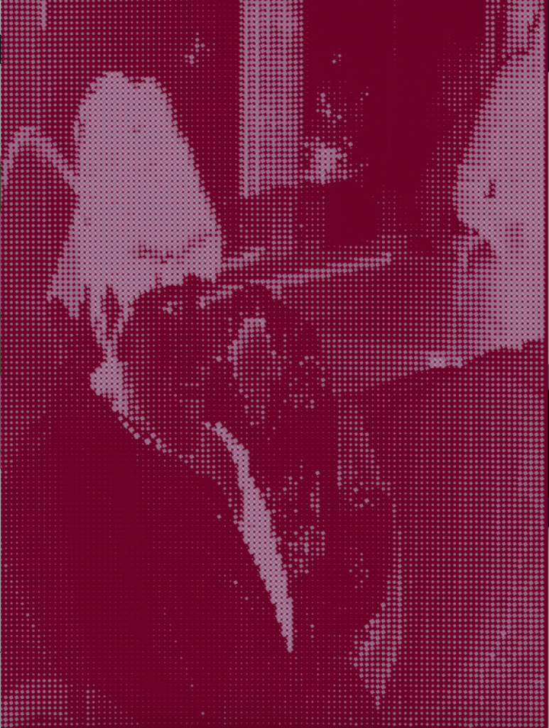
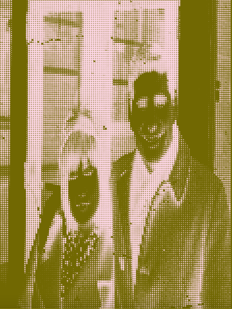
After bringing this sketch to conference, Angela showed me how to get the code to run on its own–meaning that one wouldn’t have to use a mouse to obscure/reveal the image underneath it. This way, the tiles start off really zoomed in, obscuring the picture, and slowly branch out to form the image underneath. Once we got this code to run successfully, I took it and ran with it. I was sure that I wanted to tweak the colors every time the image shifted, so I began looking into different color combinations that wouldn’t overwhelm the viewer. After this, I started sifting through the pictures I have on my computer and stumbled upon a folder filled with scanned family photographs. Until now, I hadn’t looked at any of these images since I scanned them myself over two years ago, so it was really fulfilling to see years worth of family memories in front of my eyes. In the past I have explored the connection between the digital and physical family photo archive—how the two overlap and challenge one another—-however, I had never explored this in my artwork. I thought that this would be the perfect opportunity to bring in these photographs, as the sheer rapidness of the movement in the sketch highlights the temporary nature the photos now retain.
My selection process was relatively simple, I started with a photograph of myself in the present, that had been taken using a webcam filter I created for class. I then sifted through my family’s photographs and randomly selected some images that have some deeper meanings within them. I settled on a picture of my Dad and I, a set of school portraits from second grade, a picture of myself as an infant dressed up for Halloween, a picture of my mom holding me in the hospital, and a picture of my grandparents when they were younger. Once I solidified that I wanted to use these images, I arranged them chronologically in the sketch; we move from the picture of me in the present and slowly work our way to an image of my grandparents in the past.
Overall, I’m really proud of how this project turned out. I know that this was not what I initially had in mind, however, I think that the sketch is able to encapsulate the fleeting quality of my family’s memories through my personal stylistic lense within a modern technology. The only part of this project that I am not satisfied with is how harsh the transition is sometimes. I spent hours looking over my sketch and tweaking different elements of it, but I just couldn’t get to the bottom of what makes these transitions so awkward. I was able to fix it slightly in some instances, however, it’s not fixed in the entirety of the sketch, and that is still bothering me. In spite of this, I am truly proud of this project and am overjoyed that I was able to meld my memories with my newfound love for this medium! I hope to continue this project on a larger scale in the future.