Crit was really useful for me because I had no confidence in my map before I presented it to the class. I had actually planned on starting from scratch. So I’m thankful that the feedback I received was so encouraging.
My map still revolves around the same idea: mapping my communication via power plays, presentness/alertness, thoughtfulness and receptiveness.
But I had to abandon the surface of the original map upon developing a more in-depth sign system.
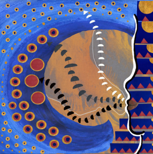
In crit, I was told that the figure representing “me” was too distant/closed off. I decided to incorporate myself into the actual map.
My new map makes better use of colors and shapes.
My face is represented on the right side of the map, and the people/platforms I communicate with are represented by the wave on the right side of the map.
On the right side of the map, the blue bars represent control, the red triangles represent consciousness, and the gold circle represents curiousness. As the blue bars grow in length, I lose control. Simultaneously, the red triangles increase in number (representing my increasing level of consciousness/self awareness once I begin to lose control), and the gold circle in the corner decreases in size (representing my loss of curiosity, which occurs when I realize I am no longer in control and therefore undergo an energy transferral, wherein I feel less interested in whomever I am communicating with, and I focus more on protecting myself.)
My “communication waves” are depicted via the white, gray, and black hemispheres on the thin lines drawn between my lips and the wave on the left.
The white leads to the most inessential conversation type I partake in. This type of conversation happens most frequently, but tends to be the least momentous. This is represented by the small size, and large number of the medallions in the lightest shade of blue on the wave. These conversations are depicted by the colors gold and blue. Gold consistently represents curiousness and blue consistently represents control. Red is left out here, because these conversations require little to no consciousness/self awareness on my part.
The gray leads to the most essential conversation type on my map, the conversations I have with my support system/people I care for deeply/people who serve a real purpose in my life. All three colors are depicted here. Gold for curiousness, blue for control, and red for consciousness.
The black leads to the most confusing conversation type on my map, the conversations I have with those who withhold their support of me. These conversations are seldom but very momentous. I am sort of curious, very self aware, and completely out of control. Therefore, the colors depicted are gold, for curiousness, and red for consciousness.


