For this project, I collected the dedication pages of books in the library, wrappers of granola and nut bars, and various kinds of black markers.
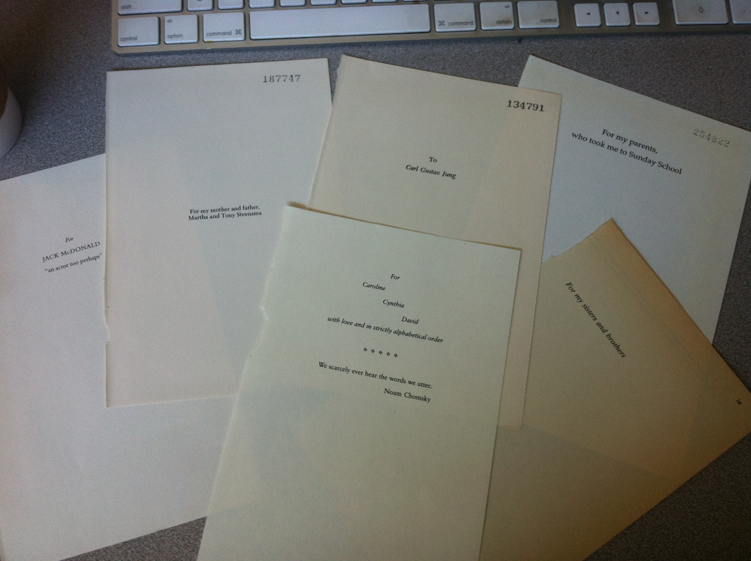
For the dedication pages, I noticed slight variation in the formatting of the pages but they all had a very similar look and layout – typically just a few lines (no more that five, generally), sometimes italicized, spaced out towards the top and centered. It looked like a poem set up. I think the lack of variety in terms of layout and design made this a weak candidate for the collection. Conceptually, I enjoyed reading the various dedications, some humorous, some vague, some relatable (like parents, or teachers, etc). I did find it interesting to remove them from their context. It’s kind of humanizing.
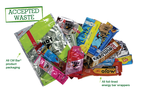
(Image courtesy of Terracycle)
For the wrappers, I thought about Chip Kidd’s break down of what attracts the eye. I noticed a lot of them used muted, earthy tones. I think this is to differentiate themselves from candy bars, since they are about the same size. I think it’s symbolic of their intended audience of mature, health-conscious, on-the-go individuals.
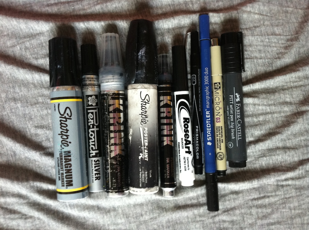
For the markers, I paid particular attention to the use of font. Again, Chip Kidd comes to mind as he lays out the subconscious connotations that typography can have. For example, Krink markers have a very industrial look to them, connoting a very masculine, permanent, durable product, while Faber Castell (the brush marker) has an elegant but practical (legible) look to it. Crayola has something that looks a little comic sans-y, which is appropriate for its child-audience.


