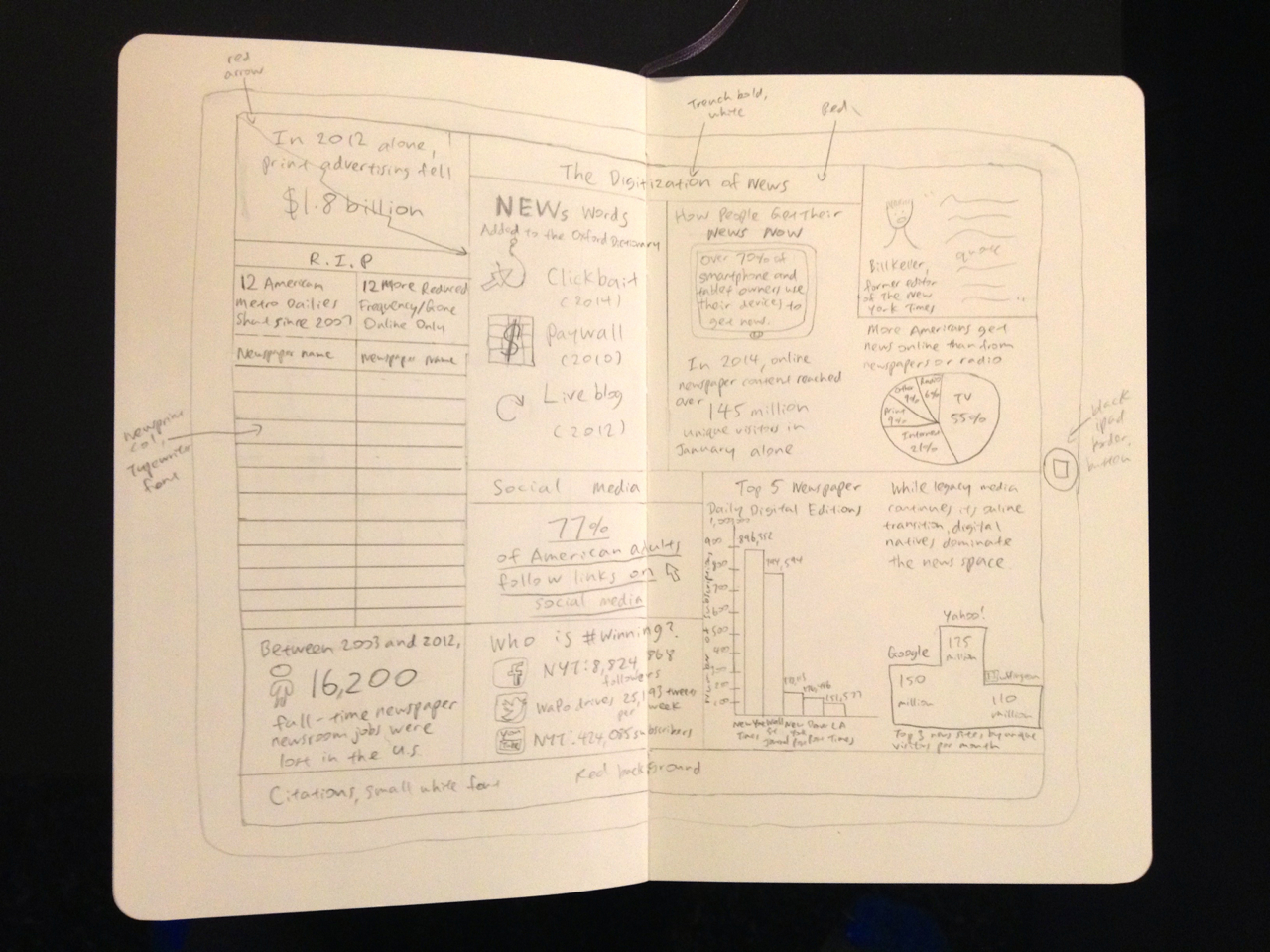
This is a sketch for my infographic – I chose the information that seemed most interesting from the data I’d gathered, and drafted a few rough layouts. Then I made sure that each segment, or chunk of information, had a visual representation. After that, I played around with fonts and colors, and decided on a red/black/white color scheme. For the left column, which is dedicated to newspapers, I’m going to use a newsprint colored-background and Typewriter font. For the rest of the infographic, which focuses on digital, I’m using a modern Sans Serif font called Trench, in three different weights.
I’m worried that it still looks a little text heavy, but I’m hoping that it’ll come together with the charts and logos and different colors and fonts. Chip Kidd’s book has been really helpful to me in the design process.
The next step is replicating my sketch on Illustrator. After that, I’ll test out the printing on transparency and regular paper.


