
My Relationships to My Relationships (In final draft stages of Part 2)
In my second draft, I changed many aspects of my original “self-portrait”; after my meeting with Angela, I came to terms with the fact that my original map, while accurate insofar of its truth as a self-portrait, lacked the presence of a map. I found that in first choosing the base for my self portrait (a face), I had chosen an image that controlled me, rather than my controlling it- I had to alter certain aspects of the placements in the portrait and sign system in a way which diluted the “map”-iness, and I wanted to change that in my second draft.
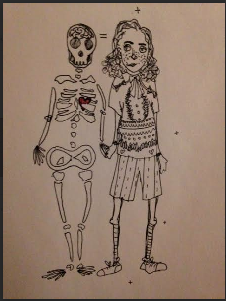
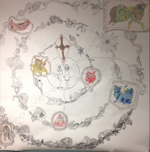
So I chose to discard that surface, and instead replaced it with concentric circles. Not only did the circles provide me with more freedom in the size and placement of my symbols, but they also allowed for a less distracting background. I still wanted to retain my original statement, that the separation between myself and the basic human is my relationships, but instead of doing that by showing a skull and my face, I drew myself in the center of my map, holding hands with a skeleton version of me.
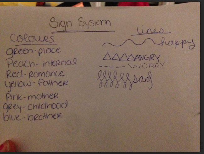
I also figured out exactly what it was that my map was depicting- My Relationship to My Relationships. In this, I drew lines connecting me with the symbols I used to depict important relationships in my life- however, this was a self portrait, rather than a portrait of relationships, and so I chose to only show my emotions regarding the relationship, rather than depicting both sides’ emotions. I wanted to capture the complexity of my relationships- in that each relationship ties together different concepts that I hold as being important, so I used color as one of my sign systems, creating a multifaceted dimension to the symbolic depictions of my relationships.
Different types of lines point from me to the symbols, showing the different emotional connections I have to those relationships, while the concentric circles show the frequency with which I think of those things and emote towards them.
I drew arrows pointing from the exact spot on my map to the symbols for them, showing that it is my relationship towards that particular relationship that is being represented, as opposed to a more multifaceted option.
ALTHOUGH IN THIS DRAFT THAT I’M UPLOADING, THE IMAGES IN THE CONCENTRIC CIRCLES ARE CUT OUTS FROM PHOTOS OF THE ORIGINAL SKETCHES, THIS WILL NOT BE THE CASE IN THE FULL SIZED EDITION! (Because I found it hard to capture the original vibrancy of the colours- an essential component of the map- I will be using the original sketches rather than photographs of them in my finished draft.)
My finished draft, contained of course, slightly different lines, as they were all drawn by hand. The sign system remained the same, but I chose different lines to define the circles that surrounded me, after speaking with Angela. She correctly pointed out that the previous lines were generic circles, and that I could create a circle from something other than a black line. I made my new circles by drawing wreath-like pictures, featuring flowers and small animals; the concept being a garden tea-party to which I invited my closest relationships. Because the circle closest to me is the most prominent, I wanted to give it more power than the one furthest from me, so I added to it small animals.
However, I didn’t want my lines to be rigid, to exclude relationships from prevalence, rather I wanted to show a certain mobility and fluidity to my relationships; I did this by allowing an occasional overlap from wreath to wreath, such as the butterfly on the outermost
wreath. The wreaths are askew upon the page, to show that no factor can be precisely measured.
I was inspired in my circles by the imaginative and detailed work by children’s illustrators, suck as Quentin Blake (Patrick’s violin contains many beautiful images of trees and nature coming to life) and of Korky Paul.
I attached my images to the paper by layering them into frames which I cut out from poster-board, to create a factor reminiscent of a family portrait gallery.


