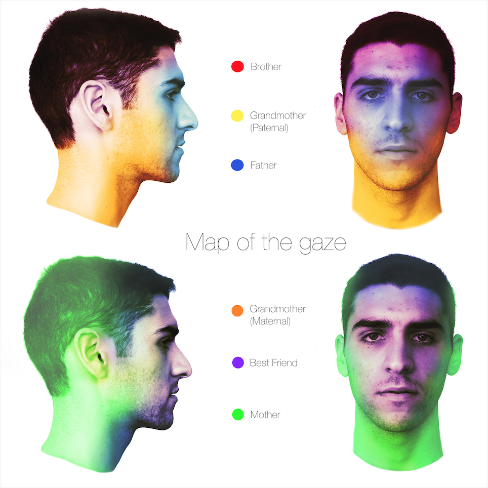
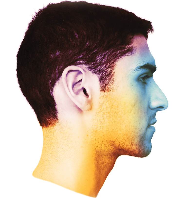
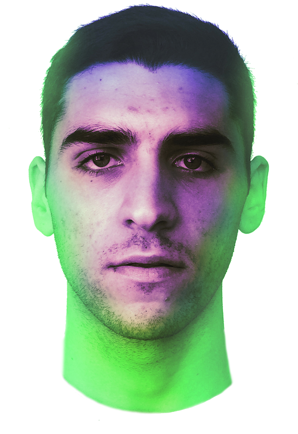
The first draft I made of this map played on a different concept with a similar execution. I was still trying to express an invisible phenomenon through the use of thermograph-esque color spots, each shade in a spectrum representing a certain level of sensory importance. After finishing this earlier draft, I knew that I needed to propose something that was less universal and more unique to my personal experience. While sense is a highly individual experience, I knew that I could express something else using the same system I had conceived of. I chose to map the gaze of six important people in my life, five immediate family members and my best friend. In doing so, I could make a visual representation of where I feel their eyes anchor when they look at me. In a way, it is still a very sensory map, since it shows others’ visual experience of me, as well as the parts of my head that I feel are more heavily trodden by the gaze of these people. In manipulating these six, semi-transparent color swatches, I came to realize that I was really mapping others’ concept of me, that their visual experience of me was quite closely linked to what role I play in their lives. For example, those who I have a more communicative, intimate relationship with look first to my eyes, mouth, and other parts of my face that show expression and communicate reassurance. Likewise, those who I feel a more superficial or distanced relationship with tend to see me as more of an outline lacking such organs that are most important in communication.
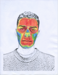
The author who most influenced my creative process was Dennis Wood. Color is such an important part of how we identify the world around us, and I knew that by utilizing color based on my own set of rules I could create what Wood calls a “reality that exceeds our reach”, and allows viewers to reimagine their own visual perception. I also played with his concept of postings, there-ness and this-ness. By mapping the sense of “being watched” through selective color, I assert that the relationship between viewing and being viewed is relevant and complex. My image is a map because it visualizes and localizes a sensation which is rather undescribable. It proposes that my physical appearance is only as others view it, and being that these perspectives are varied, I am asserting that there is no objective reality.
Adolf Wolf’s maps were probably the main artistic influence on my own map. His work is very abstract and relies heavily on the selective use of color and shape to convey meaning. I liked that his images have a sort of dynamic effect when you view them. The immediacy of his color choices sets the tone for the image, while the complex and meticulous placement of shapes allows for an entire narrative to unfold. I wanted to make an image that doesn’t unravel itself easily, but instead demands to be considered and picked apart over an extended viewing period.


