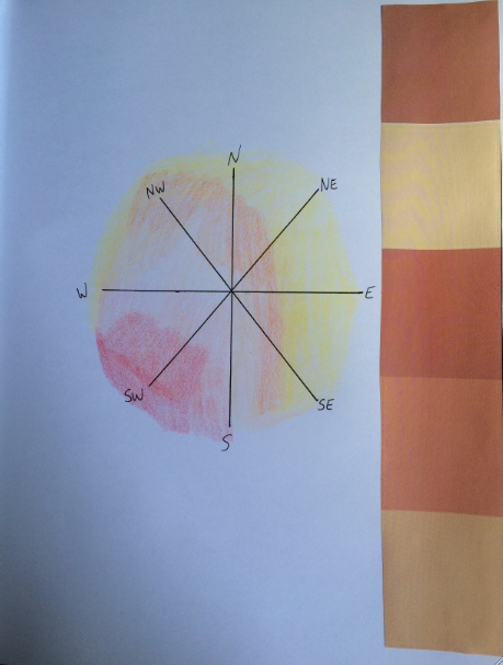
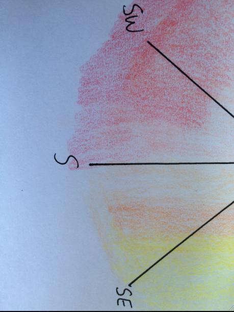
My map defines the invisible process of the way in which natural light adds to the beauty and theatricality of specific buildings in New York City. I feel as though sunlight that streams in through the windows of these architectural monuments adds to the beauty and warmth of the building itself, and ultimately leads to a type of performance put on by the interior of the structure. This “performance” leads to the audience (or people within the structure) paying attention to the way in which the light hits various parts of the room, allowing better understanding and absorption of the architecture.
Our initial discussions about what renders something “invisible” to society greatly influenced my thoughts the process behind figuring out this conference project. I feel as though light is something that is so common that it is frequently overlooked, yet it still possesses a beauty that in the rare moments it is recognized, there are always feelings of warmth and pleasure associated with this experience. In this map I hope to bring this invisible process to light and make this beauty available to be viewed consistently rather than in the brief moments of time when natural light is visible indoors.
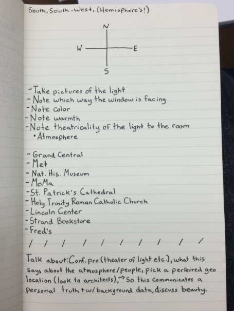
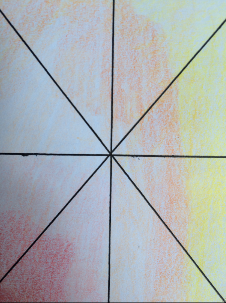
The vague areas of this piece are the how I will plot each building on the compass. I intend to pick a direction (south-west, as this tends to be the side of the building that gets the most sunlight, without acknowledging in the vast amount of factors that alter this statement such as floor level or proximity to other buildings) and place the most color in the surface in this part of the map, making these places/points deemed more “beautiful”.
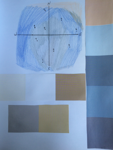
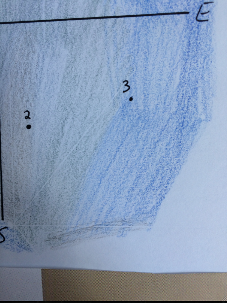
By choosing to map this process on photoshop, I will be able to attempt to copy the various color gradients of natural light through the multiple functions on paint. Additionally, the text and the straight lines of the compass will be done entirely on photoshop, making the map neater and allowing the pictures stand out against the soft background of the surface.
Artist Reference: Original maps and cartographers


