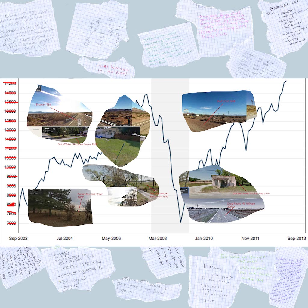
My map defines the invisible process of the Ordinary. Kathleen Stewart’s depiction of this concept in her ethnography Ordinary Affects inspired my attempt to adapt this into the format of a map. As an anthropologist, Stewart attempts to illustrate life in America without using oversimplifying terms and systems. In the introduction to Ordinary Affects, she states that “the notion of a totalized system, of which everything is is already somehow a part, is not helpful…in the effort to approach a weighted and reeling present.” Instead of using the typical academic social science semiotic jargon to explain phenomenon, she told a story about America through vignettes that followed affects, rather than symbols.
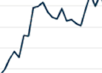
In my map, I hoped to create an alternative type of map of affects, as Kathleen Stewart wrote an alternative social science ethnography. Instead of creating a representational map of a distinctive system, I made a map of the ordinary details of life that are normally left out of maps. I used a chart of the stock market crash, because it is one image of a larger system comprised of statistics that many people use to define American Life. This system leaves out a lot of the smaller details of ordinary encounters. The stock market chart is intentionally low resolution: I played around with just tracing the shapes of the line rather than using the image from the Internet, but I realized that having the chart in low resolution would bring out rather than compete with the other details that I wanted to highlight, like the Google Maps screenshots and ripped up notes.
The images from Google Maps represent random, seemingly insignificant views of America that are often ignored in favor of zoomed out maps or images of places with higher populations. I did a series of psychogeographic “derives” to find these places on Google street view, and I decided to display them by “cutting” out parts of the stock market chart on photoshop. I wanted these cut outs to look more like rips in the surface of the chart, similar to the paper rips on the side of the notes, but I could not quite figure out how to do that unfortunately.
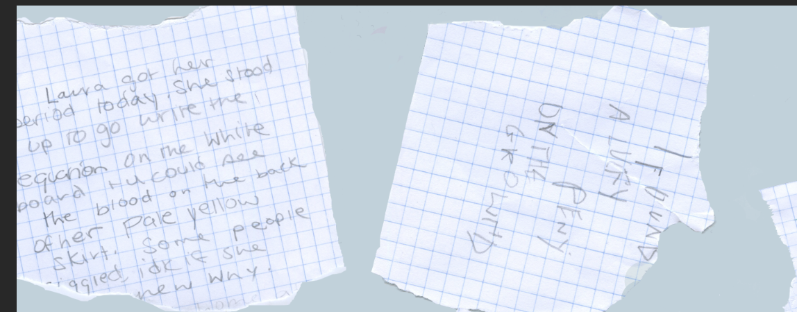
The notes on the border were the last development to this project. Because the stock market chart is rectangular, I did not use the entire 40 by 40 space. The map looked incomplete, and I was not sure how to add to it. After some of our class discussions, I decided to use the borders to add another narrative element to the map in addition to the “sign system” of marking where ordinary events occurred. I used ripped up notes to expand upon the idea of showing ordinary parts of life by writing (fictional) scraps of somewhat mundane topics, like grocery shopping lists or gossip. Aesthetically, one part of this that I wish I could improve is the handwriting. I found it really difficult to change my handwriting for each different note, and as a result they all look like they are by the same person. Additionally, I used the same type of paper for all of the notes, so if I had more time for this project I would have tried to collect different materials to write on. Also, I am not completely sure what my connection system is- In some ways, the lines on the chart represent a connection system, but this doesn’t play a large role in the content of my map.