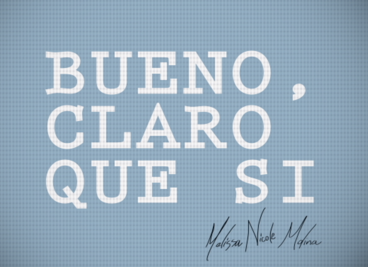
My conference project is a reflection on my heritage as a Cuban-American. Bueno and Claro Que Si are two phrases that come up quite often when in conversation with Cubans. The project is comprised of three separate videos. The first video is more of a reflection of who I am and why I look the way I look. The second video is a reflection on working at a sneaker store where most of the customers only speak spanish and I can only communicate in Spanglish. In the third video I used footage of my grandmother describing parties in Cuba, translated it (for the most part), and used kinetic text to type it in english.
Each video uses rotoscoping to include short animations relevant to the kinetic text. This was my mission when going into my conference project- to use kinetic text and short animation together. The short animations and text were all drawn out in advance in order to set up my animations with kinetic text first, make the small animations second. I tried using different effects, using shape motions to interweave text and animation, and using different colors.
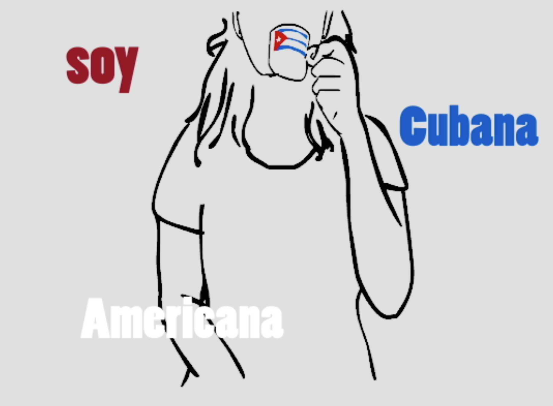
In the first animation I wanted to use the colors of the cuban flag, which also happen to be the colors of the American flag. On of the longest rotoscoping animations I made can be previewed above. I simply took a video of myself holding an expresso cup and holding it up to my mouth as if I were drinking from it. I then took that footage, created different frames from it, and drew over the video to create a short and sweet animation. I started with hair, then body, the expresso cup, then the coloring on the cup. Although I do like the first video I am more proud of the second half than the first.
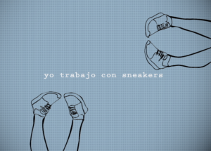
The second animation is a reflection of my time working at a sneaker store and working with customers who only speak and understand Spanish. I wanted to convey my frustration with customers, and the situation. In this projection I wanted to use a different color scheme than most of my projects in general and get away from using grey or white. I decided to use blue because it is a color involved with the company I work at. The video was planned with kinetic text and where I would insert short videos. I also played around with drawing simple circles and making them into borders. During my conference project work I also discovered the beautiful revelation that I could make my own images and videos into tiles using effects. I love the dangling feet with shoes in this animation and the idea is reprised again with a border of legs.
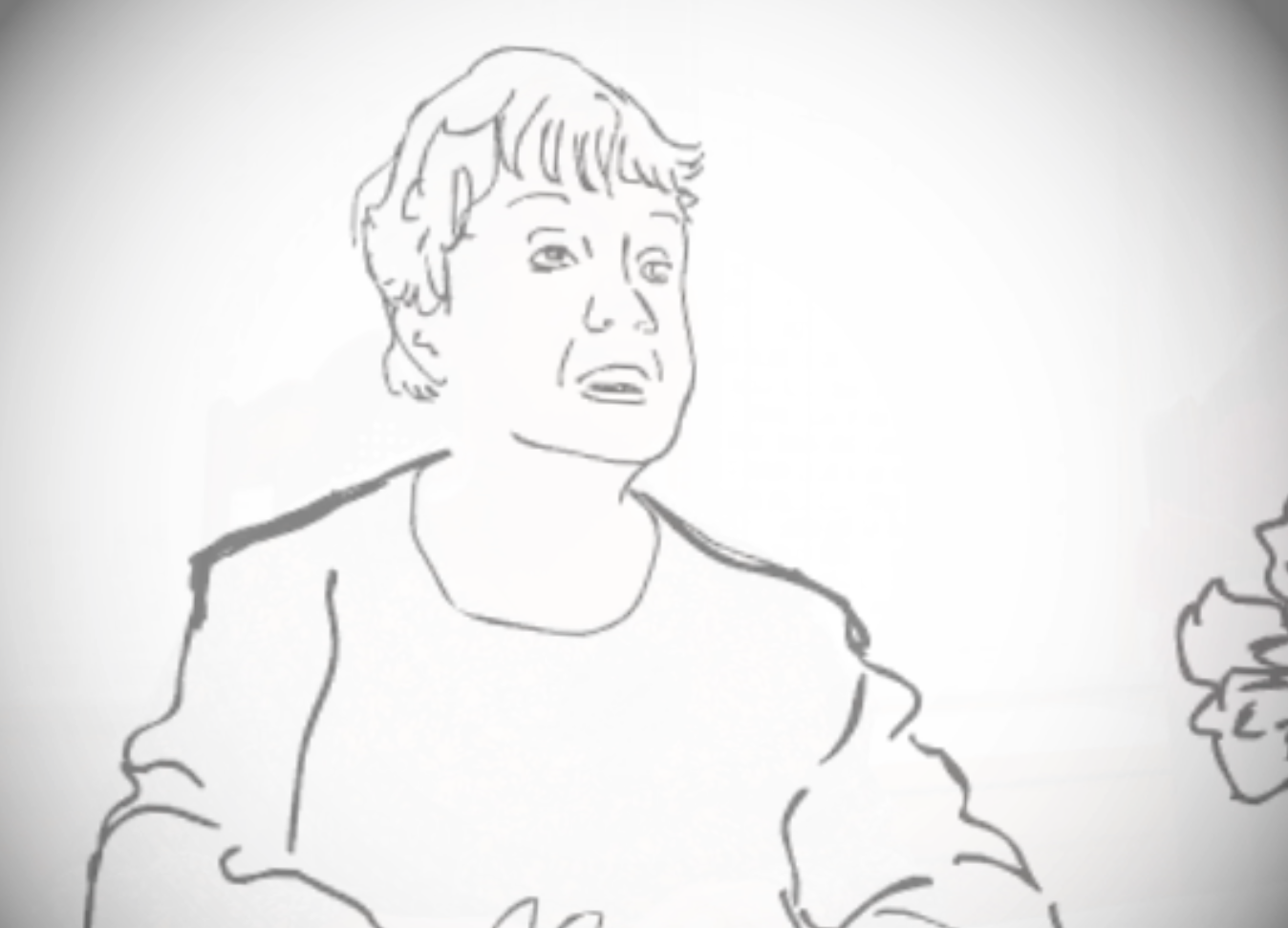
I had a hard time in the third animation because I am very bad at drawing faces, so I will often revise it over and over only to make the faces look even messier. I threw out another rotoscope section in the animation because I did not think it was well enough done. At the end of the video my grandmother plays the piano and I rotoscoped a piece. For this piece, I went in and erased the face, and although there is no face detail now I am still very much overall happy with how it came out. I used a photo my grandma has of Cuba hanging up in her kitchen throughout. This piece was definitely much more for me and my family than anything else. I have always been interested in the parties in Cuba, and the balls my grandmother would attend. The video footage was something I have had for quite some time, and used to help me write a screenplay I had been writing. I always intended to use the footage in this sort of manner and I am glad I finally was able to. I am very happy with how it came out.
Over all, my project was very time consuming but worth it and something I am definitely proud of. I do wish the three videos looked a little more similar only to make it more clear that the video are indeed part of the same project and series. There is a part in the second video where the kinetic text goes incredibly faster then I wanted it to, but I think it works only to express how frustrating it is to work in retail and have several people speaking to you at once. I left it alone, only for this reason and hope it is conveyed in this manner. The first video too, I wish I had done something slightly different with the beginning.
Working on the project I learned I work very slowly. I make mistakes, and immediately go back to perfect them. I had to learn to let go and not make every singly frame perfect. It was also a part of the look that I was going for. An artist I looked at was Julia Pott, a lot of her work looks a little messy but there is a sweet charm to it that I really like. I tried to copy this charm and I hope I got a least a little bit of it. I am very happy with how my project turned out!
