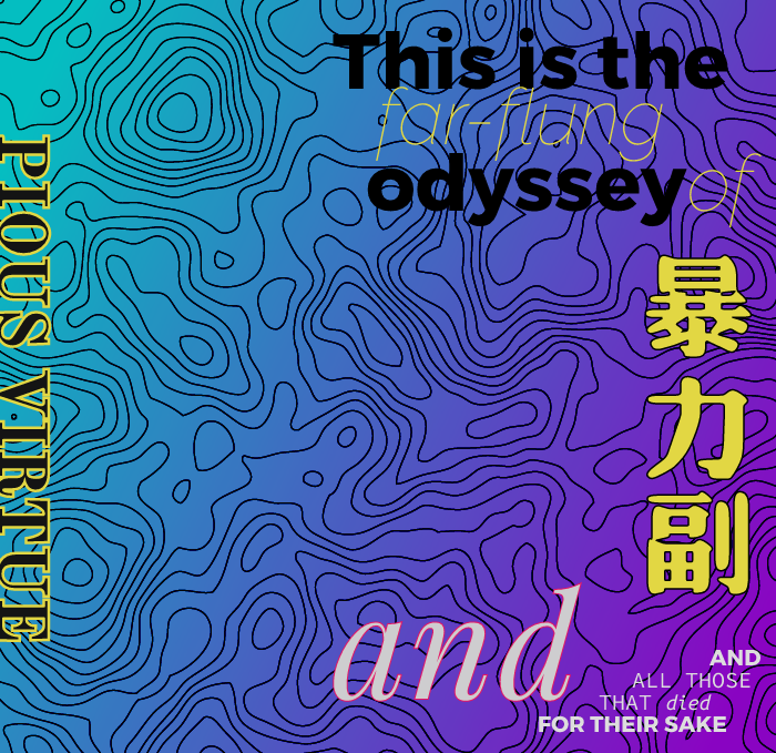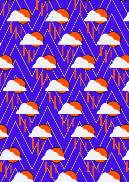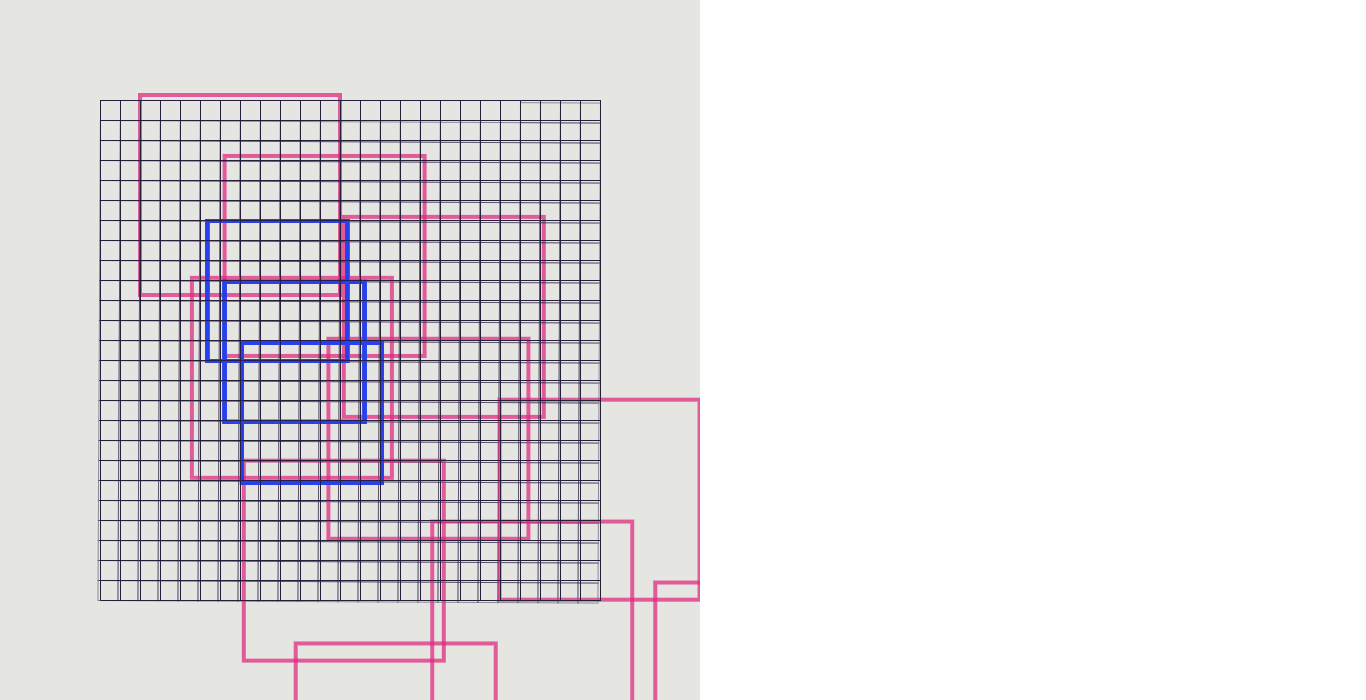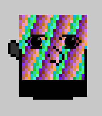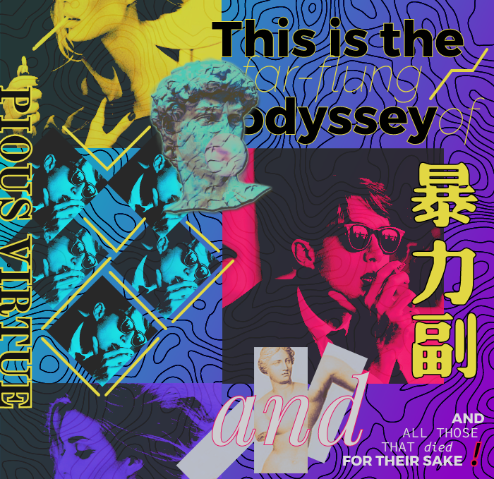
My collage began with a brainstorm of words and associations, held together by the single narrative of vice and virtue. Having just finished the Odyssey in my literature seminar, I was struck by the physical and psychological pleasures and seductions the narrative protagonist Odysseus had to temper himself against to make it back home after ten long years of war, and another ten years spent as a vagabond on the sea. While a handful of the seductions he has to overcome are supernatural, many of the “vices” Odysseus must ward himself against are almost impossible to overcome, simply because he is human. There were many personal lessons I could distill from reading the story of Odysseus and his battle homeward, as well as the the internal struggle that sometimes proved even harder than whatever his divine antagonists could cook up. With this in mind, I set off to make a collage to capture my interests in Greek myth, modern graphic design, vice, virtue, and the journey from adolescence into adulthood.
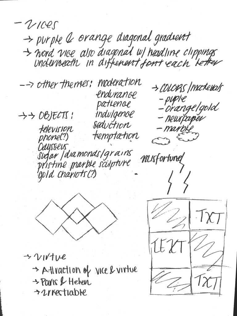
After brainstorming, I went in search of iconography and inspiration to guide the tone and mood of the collage. Creating a “third space” was not an easy task, and creating a specific tone and unique texture evolved constantly at every step in the collage process. Beyond just the images I selected for the collage, I had to be very careful about position and relationships. Questions such as: where do I want my audience to focus on? what elements of the collage am I naturally drawn to? what doesn’t look right? continually popped into my head. Many images or changed or discarded, and one of the hardest parts of this assignment was finding the correct typography to convey the tone I was seeking. Perusing through Google Fonts, some of there selection was either too comical or didn’t add to the atmosphere of the piece. Or worse, I would gather together a collection of fonts that practically looked the same. I found that I could spend hours browsing images and fonts online, but until I took the leap forward and threw the paint on the wall, I wouldn’t know if my design decisions would stick or not. Needless to stay, creating a collage was an exhaustive effort that felt even more meticulous than my self portrait. However, I also recognized after brainstorming that as long as I held onto the essence of my collage, the elements and imagery would naturally insert or subtract itself. The creation of the collage itself guiding my artistic selection.
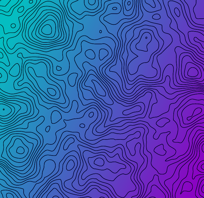
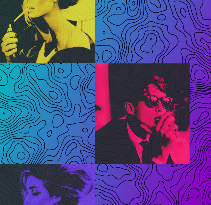
There was a host of digital and graphic icons and imagery I drew inspiration from. Since Robert Rauschenberg, collage has only been aided by the advance of digital imaging and processing. While I didn’t have very many fancy applications at my hands besides Photoshop, p5.js is a very robust drawing program that allowed me to edit, translate, rotate, scale, and manipulate in many other fashions the images i inserted into my digital canvas. After creating this collage, I come away with an even greater appreciation for the subtle art of position and placement. For example, I struggled as a beginning collage artist diversifying the placement of squares which gave my collage a very rigid and structured look. I can say I spent as much time thinking about where I was going to place and translate an image on the canvas as I did coding that translation, if not more. Even still using a great deal of squares and rectangles, I think I begun to achieve some diversity and nuance in the drawing the audiences’ attention to specific portions of the collage.
If there is one part of my collage I can latch onto and say that I am happy with, I would argue I am very happy with the color scheme and palette I was able to achieve. I love working with conflicting, opposite, and opposing colors, and in my brainstorm I was latched onto the idea of a gradient. While that original gradient changed in some dimensions, I really fell in love with the background I created using a topographical map and an overlay of color. While I sometimes felt the ideas of vice and virtue I was playing with didn’t always shine through, the highly pigmented color palette and hues cinch the collage together and keep the viewer constantly searching for information and creating inferences from association.
My creation of this collage comes from my own appreciation for the story of Homer’s Odyssey, my love fro graphic design, strong color palettes, and my own musings about mortal temptation. While not directly hitting the bullseye, I think I landed somewhere close.
