Installation Process
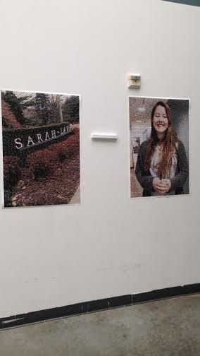
Our installation was very simple. We attached each mosaic print to to the wall with tape. For the wall text, we printed out the question “Do you see yourself in SLC? Do you see SLC in yourself?” This was then attached to a long piece of styrofoam and taped to the wall. It was placed in the middle of the two prints. Our installation space was near the elevator and staircase on the middle floor of Heimbold. We chose this space instead of the original space we were assigned to because it allowed the viewer to step back farther. This enhanced the user experience because it allowed the viewer to see the illusion of the mosaic better. It also had a lot of natural lighting in the space, which made the details in the project easier to see.
What went right?
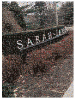
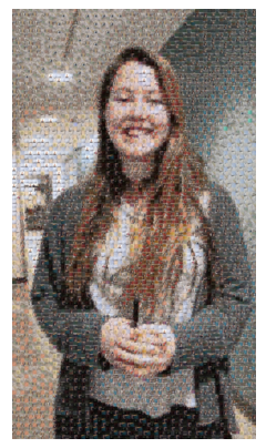
For this project, one of the main ambitions was for us to create something visually artistic. Though we juggled with various possibilities of what we could create artistically, it remained a staple in how we wanted to present our juxtaposition. The fact that we were able to maintain an artistically clever presentation was a success for this project. It was a greater success that our photographic mosaic turned out as well as it did. The final posters were detailed enough to be able to distinguish the smaller pictures that formed the greater. A fear we had while creating the posters was that the resolution would not be generous enough for people to identify the smaller photos, rendering our posters giant pixelated images.
What went wrong?
The major shortcoming of this project was the amount of pictures we took. We took enough to satisfy a minimal color palette, but our goal was to incorporate many student profiles in order to create a better representation of the student body and produce something more people could identify with visually. It took more effort and time than we had expected to ask the individuals we did represent, proving we had underestimated our ability to create a portfolio with many profiles. In the end it did not matter as much since the posters still came out clearly with all the people we had included somewhere. However, it would have created a better impact if more of the student body, and maybe even the facility, were portrayed among the smaller images. Another issue with the project was that we had problems printing. The first campus mosaic we had printed was on a shiny paper and the color came out very dark. We reprinted the mosaic of the campus to match the paper and texture of the student mosaic.


