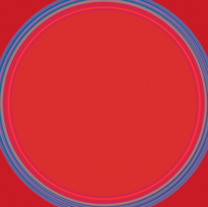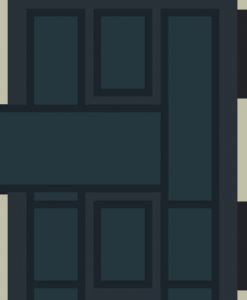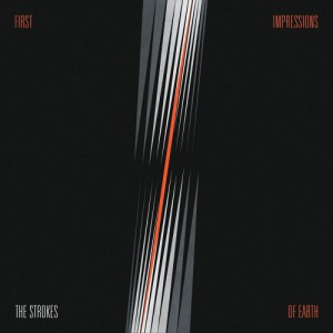
My project focuses on the works of Lothar Quinte, a German painter. One of his well known pieces is found on an album (First Impressions of Earth) by The Strokes, which is also one of my favorite albums. First Impressions is the third album of The Strokes – it’s much angrier and angstier that their other albums. The album serves as a stepping stone from their post punk sound to synthier rhythms. When I was younger the album art reminded me of guitar strings. I chose Quinte’s artwork (and First Impressions of Earth) because of his different variations of the same paintings. Most of Quinte’s paintings are also untitled. Despite this, they all feature bright yellows, reds, blues, and black in one variation or another. I was also inspired to choose art inspired by lines and geometric shapes due to our artist presentations on Vera Molnar and Bridget Riley. Even though their pieces seem simple, their use of lines and shapes is captivating and complex.
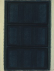
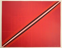
I selected five of Quinte’s paintings: Blue Fields, III (1963), Ohne Titel (1965), Untitled (1965), Ohne Titel (1969), and Ohne Titel (1973). Each of them are, in one way or another, variations of each other. When I first perused Quinte’s work I noticed the simplicity of vibrant colors. The pieces did not seem incredibly complex. However, if I looked closely there is more going on in the background – especially in Ohne Titel (1965). On the foreground it is seemingly just a red canvas with two diagonal white and black lines. If you look through the red canvas you can see different lines and circles. When I recreated this work I used alpha to make sure that these lines and circles in the background were still included yet hidden. Even in Blue Fields, III it seems like there are only three blue rectangles – if you look closely there are almost 24 rectangles. At first I thought that I should apply a gradient to adaptation because of the fading color. Again, when I looked closely Quinte is careful in making sure the lighter blue stays in one rectangle and the darker blue stays in another rectangle. Even though most of his work seems simple there is a lot going on in Quinte’s pieces. To quote Philip Galanter’s classroom definition of generative art, Quinte’s work “uses a system…which is set to some degree of autonomy contributing to or resulting in a completed work of art”. Despite not programming his artwork, Quinte uses a system of preciseness so that if the viewer looks closely they will see how carefully planned each shape is.
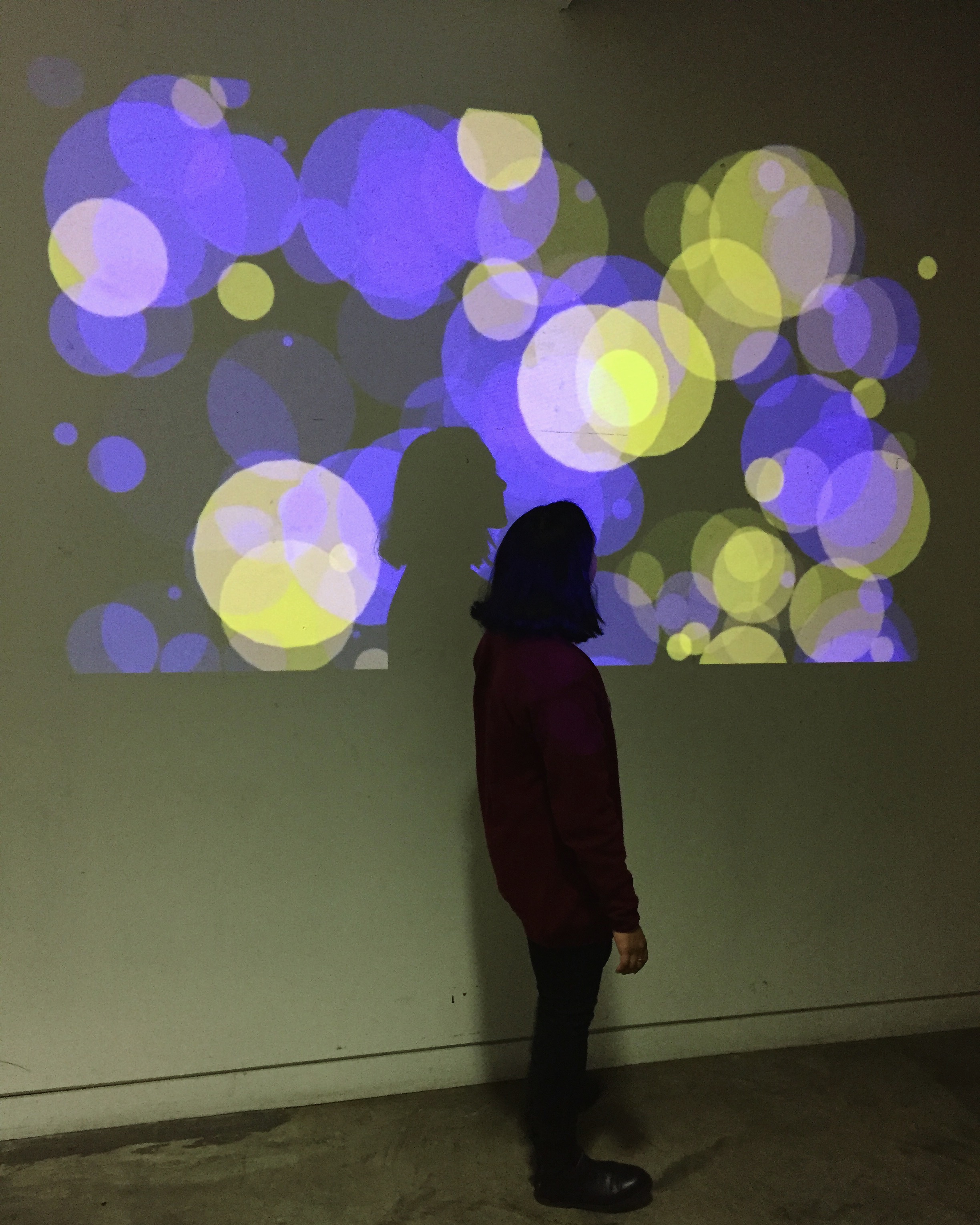
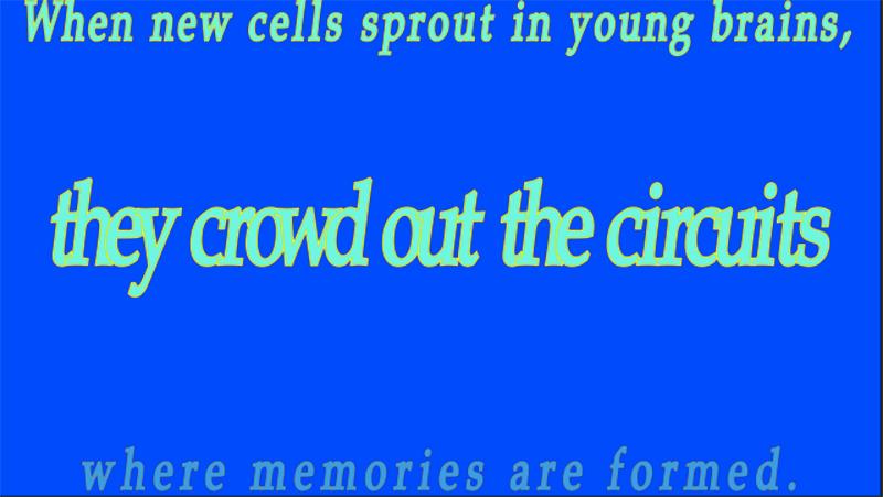
The goal of my project is to re-create and animate Quinte’s paintings using what we’ve learned in class. I used variables, loops, noise, and colors. My final project will have five 3 minute films based on Quinte’s artworks. I intend to uphold Quinte’s vibrancy but want to complicate his artwork more. I chose his work not only because of his use of lines and geometric shapes but because his artwork was featured on one of my favorite albums. I feel the same connection that I felt with First Impressions that I do with his work. I am reminded of listening to Julian Casablancas’s disconnected lyrics while waiting for the school bus to take me to a dreary, suburban middle school. This project was somewhat nostalgic and I am excited for the end result.
