“Chromointerference”, as artist Carlos Cruz-Diez dubs it, is when colors are side by side and their unique wavelengths obstruct one another and produce a new color, a color that isn’t actually there but is only a perception of the eye due to wavelength interference and light. Through studying more about Diez and the work of op artist like Victor Vasarely, Bridget Riley, Josef Albers, as well as Anni Albers I became deeply inspired by what different visual perceptions can be created.
Chromatic Induction Dual Frequency Permutation Lithograph by Carlos Cruz-Diez.
Serie Semana – Martes Lithograph by Carlos Cruz-Diez
Carlos himself in his “Chromosaturation” light installation at the University of Essex (he’s too cool!)
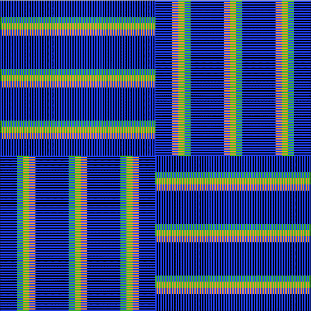
For my conference project, I created 10 animated gifs that focus on color, line, and viewer perception. I strived to manipulate viewer perception by creating movement/moire effects, as well as, an interference of colors.

This first gif is one that I wanted to be informative, as I am learning about color theory through this project and hope to teach someone else something new as well. The blue lines are above a moving gradient from orange to green. When the gradient passes through the blue lines the wavelength of the blue interferences with the gradient, producing a new gradient from pink to light blue.
Blue + Orange = Pink
Blue + Green = Cyan
I didn’t want the lines to cover the entire canvas so that the viewer could understand what was really happening in this gif.

This gif actually came from work I did in analog form. I had silkscreened a print that had the pink, yellow, and cyan interference and here I greatly expanded upon it and animated it! Though one of my more simpler gifs, I like this one the best. Maybe because I get to see my work translated from analog to digital form, which is cool. But I also like this one because it’s informative if you really study it and produces one of the most successful interferences (of my conference) in my opinion. I also noticed that black works best when creating color interferences. It defines the other colors more and makes them more pronounce.
The next three gifs were created by overlapping different color tiles that I made. Though I only rotated between 4 different colored tiles (red, orange, green, and blue), dependent on which ones were used and the background, an large array of different effects and combinations were created.

This gif was created just by overlapping red and green. Who knew it would produce a yellow color?! It was best executed on a black background. I had made the same gif with a white background but the color interference wasn’t as strong. There are only two layers interfering and just in a horizontal direction but the constant motion makes it feel as if there is more dimension than is actually present. I was pleased that this gif (and the following two) had both interference and a moire effect.

I created this gif by placing a green and blue tile over a gradient of red to orange. This combination produced an entire array of colors that feel very 60’s to me but also remind me of Easter morning. Everything is moving at the same speed, but the way the tiles interact with each other feel as if some parts are moving faster or slower than others. Due to the order I overlaid the tiles, some interferences appear in disappear which is neat.

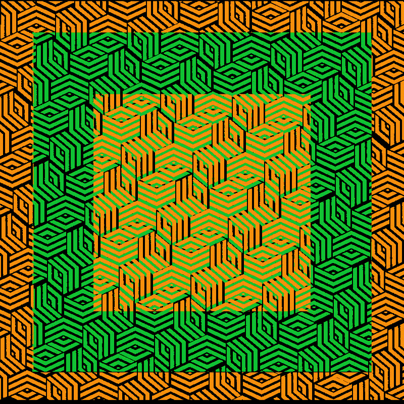
This one, for me, is somehow offputting and striking at the same time. The colors are horrendous in my opinion, but there’s just so much visually going on! This is the culmination of all four tiles (red, orange, green, and blue) interacting with each other over a black background and moving in both the horizontal and vertical direction.
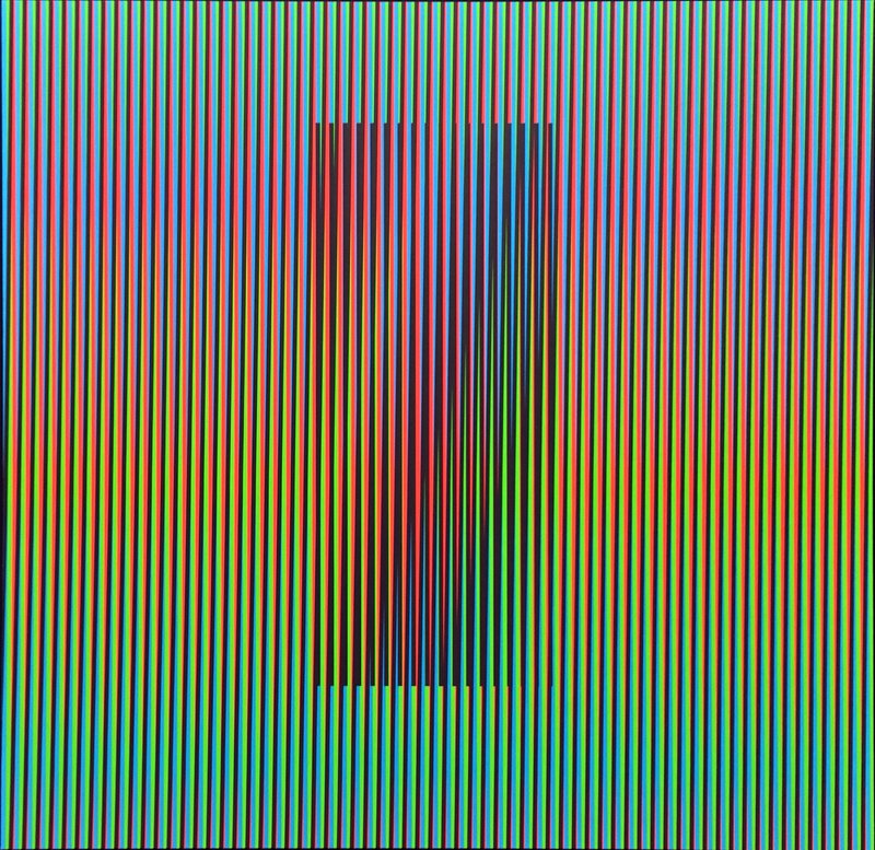
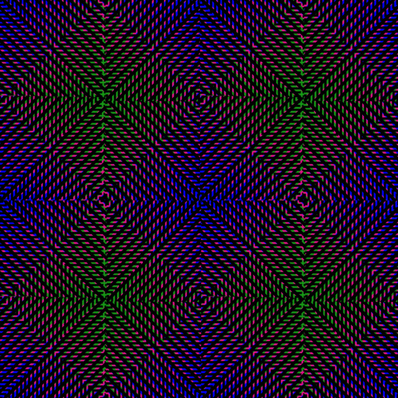
Here in this gif the two outer boxes reveal what’s interacting in the center. I like this gif particularly because it switches between interferences making you perceive a color and you seeing that actual color. It’s also one of the more dynamic gifs I made that you don’t have to turn away from. To me, it’s quite soothing, though it was the most difficult to make. Each box is a separate gif that I made into that pattern. Some boxes cave in and some boxes push out. There’s variance without it being overbearing.

Here I have rows of arrows crossing over a pattern. The interference here is created not by the colors crossing over another or just existing beside each other, but through the movement of the arrows over the pattern. The colors used were magenta, red-orange, and cyan. The best interference is in the middle where the arrow moves over all three colors. Though I will have to say that to see the best effect one should be standing a bit farther away in order to see the full interference.
That’s the thing though I guess about the entire project. These interferences work best on a smaller scale. All of my gifs are parts of larger scale work I made that I scaled way down and multiplied! The funny part is the best stills of the gifs are my thumbnails. You really experience the full effect.
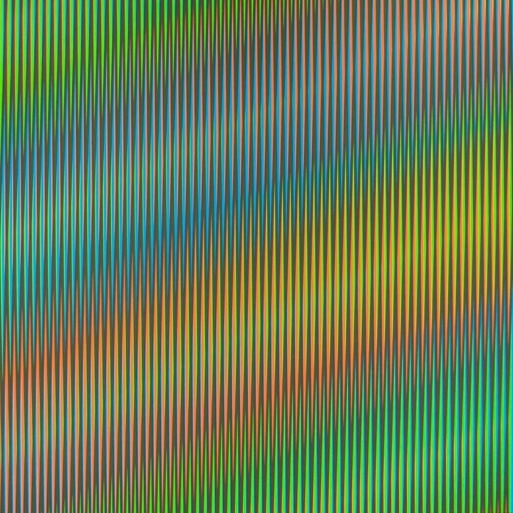
This gif kind of happened by accident and through the most trial and errors of any of the gifs I’ve made. I think I have 5 other versions of this gif. I liked this one best due to this particular moire effect. It reminds me of a kaleidoscope! It’s a combination of pieces of a gif I made that had a black tile over a pattern of blue, hot pink, green and black lines.
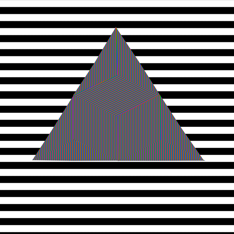
When studying more about color theory and interferences I looked into the color additive model. When red, green, and blue (RGB) light intersect one another they produce white (the combination of all colors). I was then super determined to see if I could produce a white pattern and gif just by using RGB. I was sadly, but also thankfully mistaken. The geometric shape I made at the center of the gif consists of several layers of an RGB gif I made. I thought if I could get the lines minuscule enough it would produce the effect I wanted. Instead of white, it produced a rainbow spectrum (which in turn actually makes sense)! I juxtaposed the shape in front of a rotating background of black and white lines. Since the shape is in the foreground and the background is rotating so fast, the lines almost look like they’re producing their own moire effect even though they’re not interacting with any overlapping lines themselves or scaling in size. I expanded more on RGB with this next and final gif. I think it shows both the RGB pattern but also the rainbow interference that is produced due to the moire effect in this gif.

This project was both wonderful and hard. It pushed me way out of my comfort zone. I was forced to use color! I don’t like to think I’m an artist or designer who is afraid of color, but there does seem to be a general black and white theme in my work across all forms. This project allowed me to learn about art history, color theory and produce an array of colors in my work, all things I never really did before. It was rewarding to be inspired by analog forms of art, especially as someone who prints and illustrates, and have that translate and breathe new life into my digital work.
