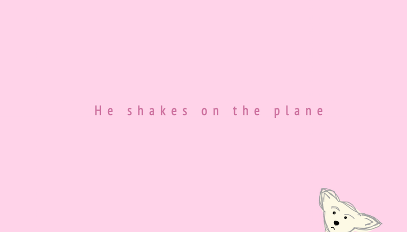
As I was searching for the words to include in my kinetic text project, I scrolled through the many notes saved to my computer. I wanted the text to read in the style of a diary entry. As my notes have always been very sporadic and personal, I felt that I would be able to find a suitable collection of text within that selection. A note I’d made in regards to the many problems my dog Davi has, with the goal of reading it off at the vet, stuck out as a nice contrast between the comedic element I was hoping to convey and the personal anecdote. Throughout my piece of kinetic text, I list off the various issues I had discussed with Davi’s vet, as well as other identifying factors I tell people when discussing Davi’s personal narrative.
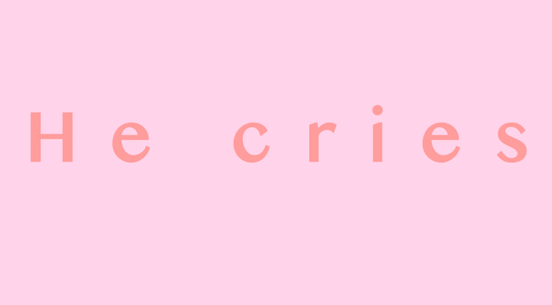
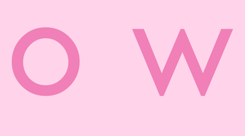
For the design of this project I was very interested in creating an aesthetic that would be attractive and engaging, something that could be appreciated on it’s own, if one weren’t paying attention to the text. For the look of the piece and the aesthetic of the text, I was inspired by the title sequence that appeared at the start of HBO’s Girls. I chose my usual color scheme of pale pinks and pastels. I felt it complemented the playful nature of the next while satisfying my need to create something visually appealing. It was very hard for me to decide whether or not to create the whole piece in different shades of pink or to work along the color spectrum. I frequently rely on shades of pink as a color palette, as I find it to be so aesthetically pleasing and have grown to see it at as a constant in my work.
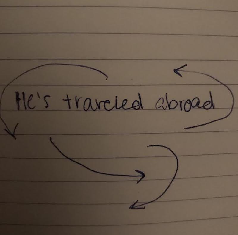
I struggled with motion. I was very certain of the text I would use and the aesthetic I wanted to achieve, but I found my engagement with motion was less inspired than the rest of the content of the piece. I would’ve liked to have created more intriguing motion, motion that could be appreciated outside of the text.
Choosing fonts for this piece was very difficult. It would have been very beneficial to do some research ahead of time, gathering a list of fonts I found to be aesthetically pleasing and unified. Instead, I scrolled through the option of fonts in After Effects upon the addition of each section of text. I found it difficult to choose fonts that were complimentary but not too similar. I find it can be distracting to have two fonts, one after the other, so similar they become almost indistinguishable. I was eager to utilize simple and modern fonts that would be both complimentary to one another, while remaining distinguishable. I am not sure I succeeded, but I found I am a big fan of Pt Sans Narrow. 
As always, I had some trouble with maintaining momentum throughout the whole piece. I found the first minute to be very instinctual, while the last three minutes were somewhat difficult to maneuver. When dealing with something as delicate and simple as text, it can be daunting to try and create an engaging piece without being overly repetitive. I had to remember that some elements of repetition can be appreciated when they are conscious decisions that aim to encourage a sense of design.
I had trouble with restricting my use of preset text effects. As tempting as they were, I found that they were easy to fall reliant on. This led me to experiment with font, size, placement and movement to create my own sort of effects. I found it was difficult to distinguish when the text had enough going for it and when it could benefit from a few more elements to make it more engaging.
Cutting to music is always tricky. I find great satisfaction in rhythmic editing, but I can become easily distracted when cutting to the tune of a song and I tend to start cutting to different beats and tempos rather than keeping with one rhythm. I found that working with the 3-second rule encouraged a more uniform rhthym. This was a very helpful discovery that I will be sure to utilize in future projects. Going about rhythmic editing it in a mathematical way can save time and can ensure a more cohesive rhythm.
Overall, I had a wonderful experience creating this piece. Though it was strenuous at times, I feel this studio prompt really tested my hand at After Effects, while challenging my ability to engage with text in video, resulting in a stronger understanding of both skills. Although there are some elements of the piece that I feel could be improved upon, such as my use of color and my implementation of motion and change, I am very happy with what I came up with.