For the first check-in of our systems class, I made a simple video game that goal was to get to a checkpoint while avoiding collisions with different obstacles, in the background, I put the png of a cyber- city sky. Although the game was simple, the opinion of its difficulty varied with every person I showed. While some found the colors of the obstacles and background appealing others hated the obstacle colors fluorescent character and found it to clash with the background. In addition, while found and the mouse control fluid and easy to maneuver, others thought it too loose and uncontrollable. Why was such a simple game getting such mixed opinions? I noticed the nature of the comments were purely perceptual, and in doing so became eager to experiment more on color, shape and control alterations in the game, keeping its goal controlled. The visual system is one of the most crucial systems in the human body, dictating emotional responses, choices, thoughts and most of all perception. In the world of video games, the way you perceive and register information in the brain is the main, if not the only, determining factor in it appears. But how much of the success of a newly released game is based on what you see and how much is based on how you see it? The simple idea behind the vision is the act of light falling onto your retina or your visual field. However, this visual field is not what we see. After the information is processed by your retina, the brain combines it with other senses and draws from past experiences. This equation creates our individualized perceptions of the visual field, our own “visual world.”(Barry, 1997 p. 44) The difference in the visual field and world is better explained in the Alfred Korzybski quote “ the map is not the terrain.” Yes, we all have the same “map” or visual field but we have unique terrains, or perceptions of this field, equating to our own visual world. Although each video game is completely individualized, I picked out three main aspects all games include a set of controls, some sort of obstacles, the theme in which they coincide. These three aspects, control, and theme, all seem to be key in-game perception, difficulty, and overall enjoyment.
For this conference, I ended up creating three unique games using concepts from Gestalt theory, which I will later go over. Although the games all share the same goal, they vary in control settings, shapes
and colors of obstacles and user icons, orientation, and other perceptual features i thought critical in shifting the perception of the game, My goal with these games was to understand How I can utilize these factors to create the conceptually and visually appealing easy to perceive…
The Code Overview
To create these games, I primarily worked with if conditional statements to form relationships between the users represented object as they move it across the surface. For the optical movements, I incremented the y-axis acceleration as various uppercase letters and created and if statement loop to allow them to repeat on the screen after a certain duration of frame counts. Then incremented the distance between the obstacles and the user as a new lowercase increment that is then put into if statements and called collision. From then the rest is just the conditional statements that trigger if there were to be a collision, such as a scale, color, collision number, text, and even sounds depending on the game discussed. For controls of the player’s icon, I incremented directions with keys and created the relationship where if a key is pressed the icon moves a given amount.
Background in Gestalt Theory
The emergence of the idea of Gestalt psychology started in the late 1800s with a series of remarks made by Ernst Mach’s an Austrian physicist and philosopher in his 1886 book. In this writing Mach discusses the comparisons between geometrical shapes and their properties. “In examining two figures which are alike [gleiche Gestalten] but differently colored, we recognize their sameness of form [gleiche Form] at the first glance, in spite of the difference of color-sensation.” (Mach 1886, 43, translation from Mach 1914, 105) Gestalten, for Mach, appear as a consequence of equality in the sensation of stimuli when noticed “at a glance” and how they are given directly, not deduced or abstracted. He argued that the geometrical similarity of two whole figures would be given by the lower level equality of their figure and size (Mach 1886, 47; Mach 1914, 109). Mach utilizes the term Gestalt to indicate the characteristics of a whole that is dependent on the configuration of its parts. This idea catalyzed one of the starting points for Ehrenfels’ much more focused discussions of Gestalten in 1890. As he points out in his 1890 article “Über ‘Gestaltqualitäten’” (“On ‘Gestalt Qualities’”), groups of stimuli, such as a group of dots or characters are organized according to a pattern like quality seen in the whole image rather than just the individual parts. (Barry, 1997) A triangle is more than just the intersection of lines- it possesses its “triangular” characteristic. This emerging idea of form and its organization and perception was named ‘Gestaltqualitäten.” in the summer of 1910 this idea was pushed further by the father of Gestalt psychology, Max Wertheimer in his investigation of the illusion of movement, specifically Am and Phi movement previously discussed and conducted a series of experiments involving a stroboscope and two stimuli. Depending on the speed of the alteration between these stimuli, two stimuli could be shown or when — in high alterations one, and when the speed continued there was a presence of no stimuli but rather the idea of pure movement((Barry, 1997 p. 46). From this experiment Wertheimer concluded that something has occurred similar to the topics in ‘Gestaltqualitäten’” the relationships between and the sum of parts undeniable shapes the whole.
My Games and their Physiological ties
Just like in gestalt theory, relationships were essential in the course, the work is done with the establishment of relationships, initialized through code, whether it was conditional relationships or —-, is essential to creating the system I needed for the games. Without the establishment of a relationship, between the user and the obstacles, and the user with the scenery the goal and idea behind the game couldn’t be perceived. This idea of game perception also mimics the idea of visual perception and the perceptual relationships we have with different objects shapes and colors, from this parallelism. Is began to strive to enhance the perception of each game using different rules of the theory, in order to imply different thing and achieve different reactions, and emotional responses.
Game one: Bubble
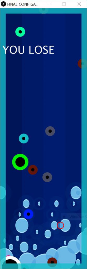
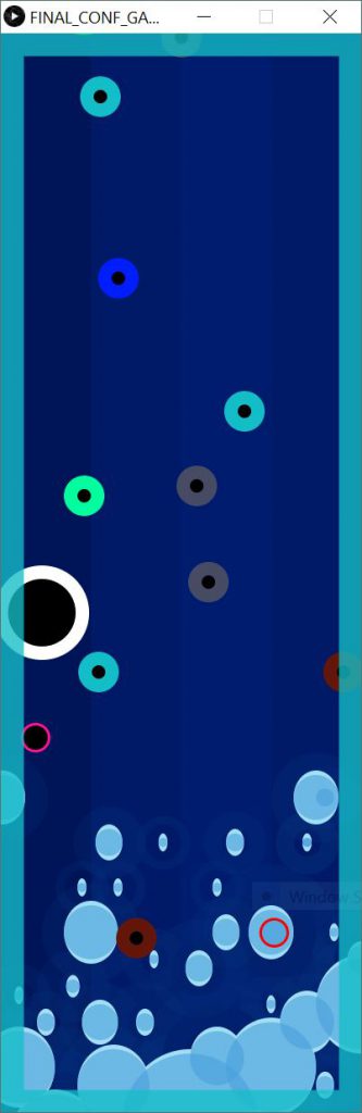
The bubble was the first game I made, based on the initial check-in i did, the concept of a bubble is to avoid the multicolor bubbles falling for as long as you can, after 10 or so collisions, you lose.
The bubble was made with a vertical orientation, where obstacles, or in this case multicolor bubbles would fall from the top of the screen. The user must control the x-axis with a mouse in order to stay alive. The theme behind the bubble originated as cyberpunk and then became more aquatic, the
The bubble was the most limiting to make of all the three games. Its orientation created limited space for the system to run, and it made collisions easy. My primary goal for Bubble was to create clearly visible obstacles, but not so that they were easy to avoid, when playing my check-in game, many thought that the similarities between the foreground and background, confuse them on the premise of the game, creating a hurdle in the relationship of the user and the obstacles. To help the players perception, I used the gestalt concept of figure and ground The differentiation between the foreground and background or the positive and negative space of an image composition tells the viewer what to prioritize and focus on.
The ability to differentiate a constellation from the night sky is the differences in the components of the figure and ground and how much cohesion or segregation they have with regard to each other Because these two things are analogous, the player perceives ambiguity in the result of the composition. The figure and the ground alternate based on whichever we perceive them to be, however, once the ambiguity is acknowledged the ability to only perceive it the initial way is practically impossible. (Levine & Shefner, 1991 p. 259,270) This idea of segregation between these two components is essentially the idea of a focal point, needed to make the game more understandable. After separating the foreground from the background, I noticed that all I had done is create two perpetual layers, of which, only the moving ones were focused on, this made it easier to perceive and therefore easier to understand the premise, it also made it easier to play. Good continuation which is based on the idea of pattern perception and perceptual logic was considered in resolving this. It states that when One’s visual perception has the ability to follow the implied continuation in order to complete whatever shape is most implied by said arrangement, depending on the level of synchronous the grouped components have, such as the orientation and direction of implied motion or level parallelism, all affect the amount unification that good continuation created (Levine & Shefner, 1991 p 264-5). These laws have been utilized particularly by artists like Monet in the late 1800s. By his use of stretched out blobs and dots of various densities, he created the illusion of barriers without his explicit drawing of them. For him, each area of contrast between different color, densities, and textures acted like the barriers and lines in his artwork. The perception of similar colors was because of the logic promoted by good continuation. When initially making all the obstacles one color, people could easily attend to how to avoid them, they utilized the perpetual of good continuation, to make a logical assumption of what the optical is, in response, iI did the opposite, making all the obstacles different colors so no assumption could be made based on it. consequentially, the game was perceived as harder for almost all that played. In order to atone to both these requirements, I chose a background or theme and then contrasted the obstacles and the user icon, although this made Bubbles, in my opinion, the least appealing, it was the easiest to perceive.
Fire Ball
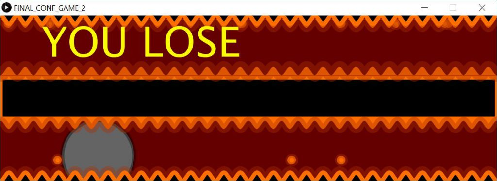
Without Noise Background 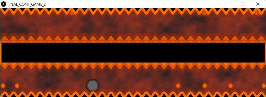
The fireball was created to be everything bubbles wasn’t, the connectedness and lack of mouse movement Created low visual appeal from Bubbles. Consequentially when creating Fireball My two main goals were regarding space and visual appeal. When starting out, I immediately changed the orientation to horizontal, yet kept the obstacle direction vertical giving the user more area to avoid them, and in addition, allowed control movement on the y-axis as well as the x, however, changed the movements to arrow keys instead of the mouse in response to the “ease” it created. The theme of the fireball is pretty self-explanatory, fireballs will appear from the side of the screen on the top and bottom and gradually progress horizontally across it. To lose the game, like Bubble, the user must endure a number of collisions. In this game, however, I strove to add another aspect in for difficulty. I created a positive linear conditional relationship between the scale of the user icon, and the number of collisions it has indeed. This extra conditional relationship was made in attempts to allow me to focus more on the visual aspect of the game, without interfering too much with its difficulty. I worked a lot with color to help with the perception of this game, although keeping in mind the idea of foreground and background I strove to choose colors that were contrasting yet complementary. Because I chose the theme of a fiery cage, I had guidelines and a variety of colors to choose from, unlike Bubble where I could only mainly work with shades of blue. The only perceptual problem I have in a fireball was the spacing in the user and the obstacles, too much space. Initially wanted to put multiple rows of collisions, but after four tries knew I would be best to stick with two, especially because I was focusing on the visual appeal, and the messiness of 4 rows was uninviting. In attempts to avoid the perception of clutter, I looked at gestalt theory of symmetrically similar to the concept learned in class The ideas behind Gestalt symmetrical is directly correlated to our perceptual association and implication. In this principle, the law of symmetry is the Gestalt grouping law that states that elements that are symmetrical to each other tend to be perceived as a unified group. Similar to the law of similarity, this rule suggests that objects that are symmetrical with each other will be more likely to be grouped together than objects not symmetrical with each other. This idea goes beyond grouping to emotional responses catalyzed as well. Symmetry has a direct correlation to the perception of stability and control in an image. This can also be used as a de-stressor. The emotional impact of symmetrically was huge in conveying a visually appealing game. Stress is inequivalent to adrenaline and creates negative feedback for the user. My goal was to use the open space I had, to eventuate the symmetricity of the double row obstacles. As a result, I coded a divider rectangle that separated the cream into two active parts and created two columns. This not only visually soothed the player but surprisingly further added to its difficulty. Because the screen is split, the brain now perceives each section as two separate screens. This removes the ability to focus on the screen as a while, and the obstacles. Therefore forcing the player to shift attention throughout the game. A technological issue I had that I had to suffer in order to meet my perceptual goal for Fire Ball was the fiery background depicted in the photo. This background was created by the noise variation relationship we learned in class a few weeks prior, enabling me to create the idea of smoke or clouds. As a result, the speed of the game slowed and created lag time.
Jungle Dodge
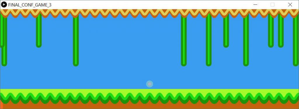
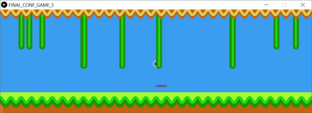
The last game created was Jungle dodge, In this final game, I strove to combine the perceptual understanding of the concept of the game like in Bubble, and the visual appeal of Fire Ball. I kept the horizontal screen, but changed the x-axis to mouse control and kept the y-axis arrow keys. In doing this I wanted to regain the fluidity and allow more space to be taken up but avoid allowing complete control that the mouse has. In addition, I shifted the shapes of the obstacles to rounded tip rectangles of different length, this made it so that one would have to use the whole screen in playing and make use of the gap. I also incremented color for the first time in the games. Along with the gestalt rules discussed earlier, color is also an essential way to help convey perceptual and visual appeal. In many cultures alike Red speaks emergency while Blue speaks calmly. Working off this, I incremented the color, starting at a light blue, to after every collision, shift to a deep red, the sense of early this creates is perfect in alerting the player of his success in the game and mimicking the games intended emotional response as the game goes on. I also added the text collision to appear in a matching color to the icon in order to reinforce this gradual feeling, in the two games prior, many players said that they were unaware of the collisions had even with a correlating sound, this gives the game a sense of time attached.


